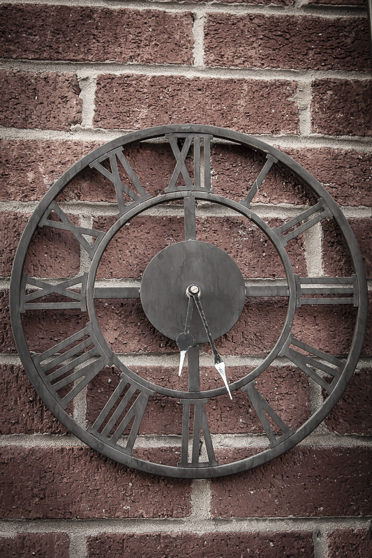
Garden clock

Hi Kristien. Yes definitely more space along the edges but a nice image for all that. Love the lines and shapes in the brickwork and clock as well as the different textures.
 
Yes, I think it needs a bit more space around it to let it "breathe". There is a fairly obvious darkening of the corners and I'm wondering if that is deliberate as I'm not sure it helps the photo?
 
Would make a great picture when the sun is out and you could see the shadows!

Yes, I was thinking the same.
Quite a nice subject and some strong lines / patterns, but it could do with some more interesting light to give it a lift.
I don't think that the vignette around the image is really doing it any favours either.
 
Back
Top