Garden Portrait

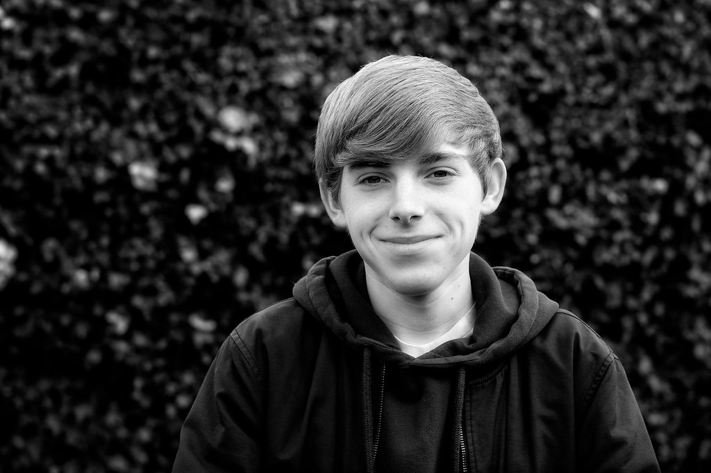
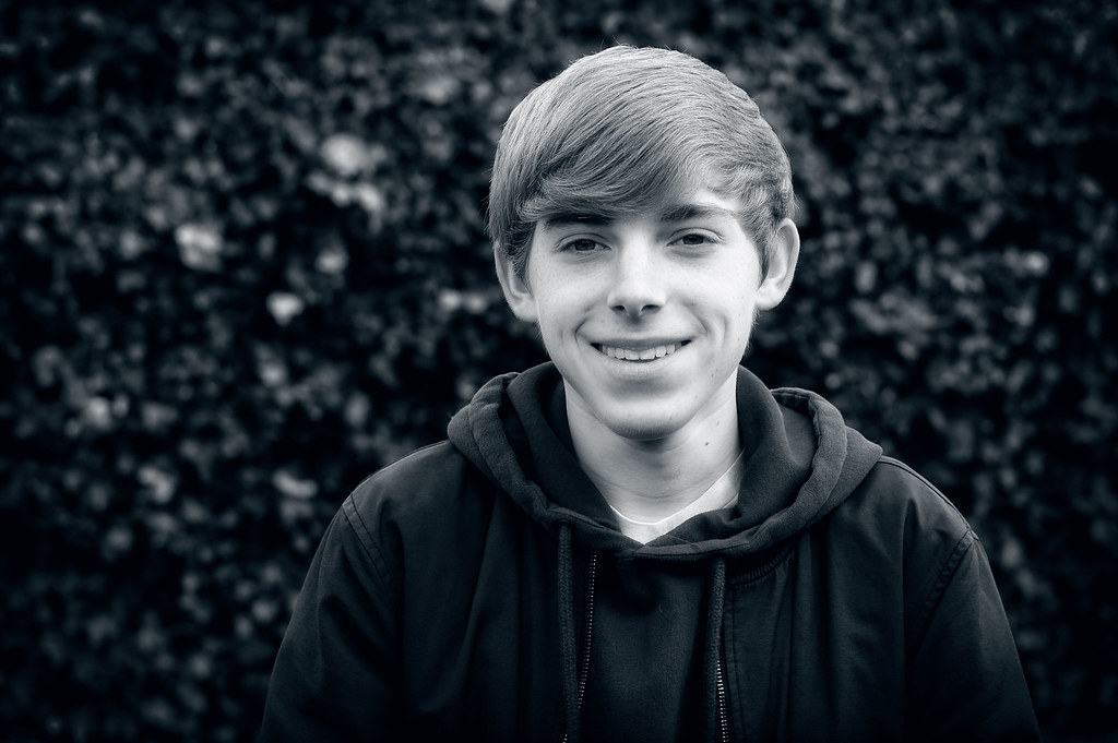
Better leaving them in colour. Far too black your conversions but for the skin and hair tones.
 
The thing is to get a more full tonal range before you go for the high contrast. I would expect the young lad's jacket to be more or less the same shade of grey as it is on the colour photo, and then see how the other colours render. @Kodiak Qc may be able to help you more than me as I have only done real B&W and no conversions.
 
I would expect the young lad's jacket to be more or less the same shade of grey as it is on the colour photo…


Reasonable expectation Charles! :agree:

Colours have not only chrominance values but bring
along their respective luminance value as well.

Some software are better capable to not represent co-
lours but still preserve the luminance in each of the six
channels.

A conversion is not a simple, brutal desaturation!
 
I like the 3rd one personally.
On the number 4, i'm not keen on the blue tint.

I don't mind at all your black and white being really black, the face is bright up and that the main focus point of the photo so I think it work. Also the lights falls on the jacket and the shoulder and make the silhouette stand out against the background which work well. On the third you have slightly more blur in the background which i like too. So yes third one is my favorite one!
 
I agree with Simon. You really need the right tonal values to make a truly great mono conversion, the correct image/lighting combination is key. There has to be good levels of whites, which many seem to overlook.
 
The last one is my pick of the bunch. Everyone is going to have a different opinion.
 
Back
Top