

OP
- Messages
- 1,075
- Name
- Georgina
- Edit My Images
- Yes
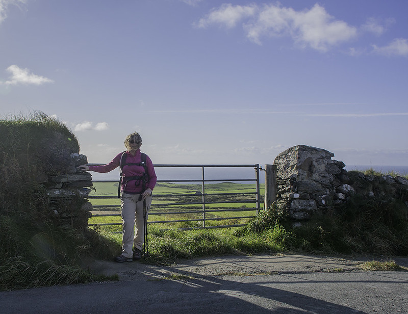
Week 36 - You - Couldn't really decide if this was a you or me but anyway. This is me doing my training for my Machu Picchu trek. It was blowing a hooley and I balanced my camera on the wall on the other side of the road and used the timer to dash across and be in the picture. Not a great one and not very flattering but it seemed to fit the theme
 You by Georgina Shaw, on Flickr
You by Georgina Shaw, on Flickr
Last edited:
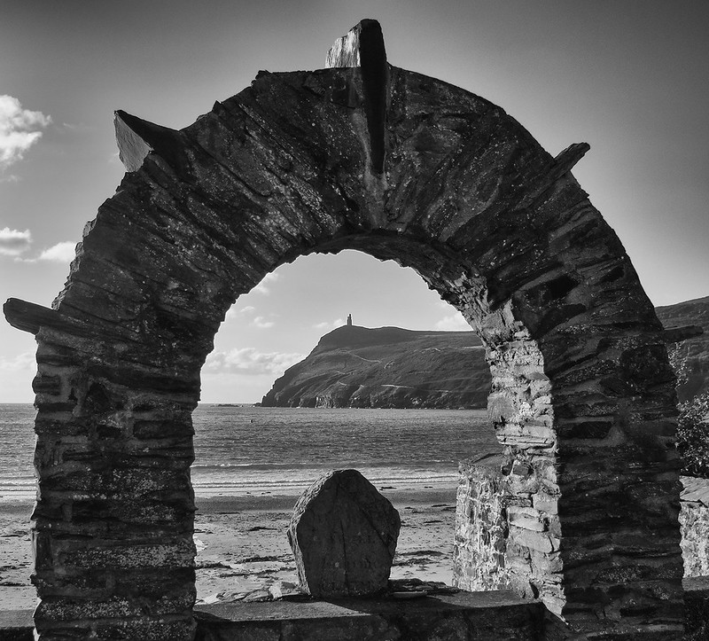 Arch
Arch


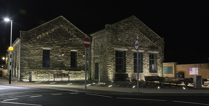 Display1
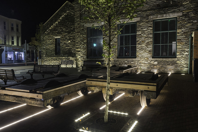 Display2
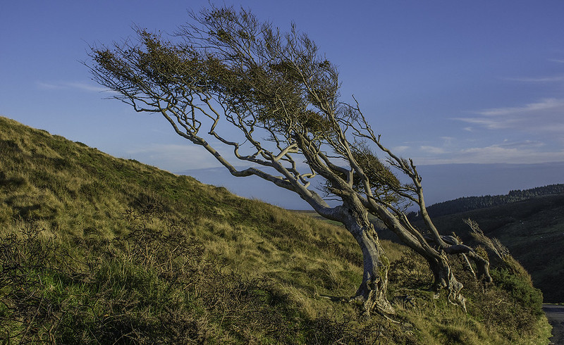 Bent
Bent Wooden