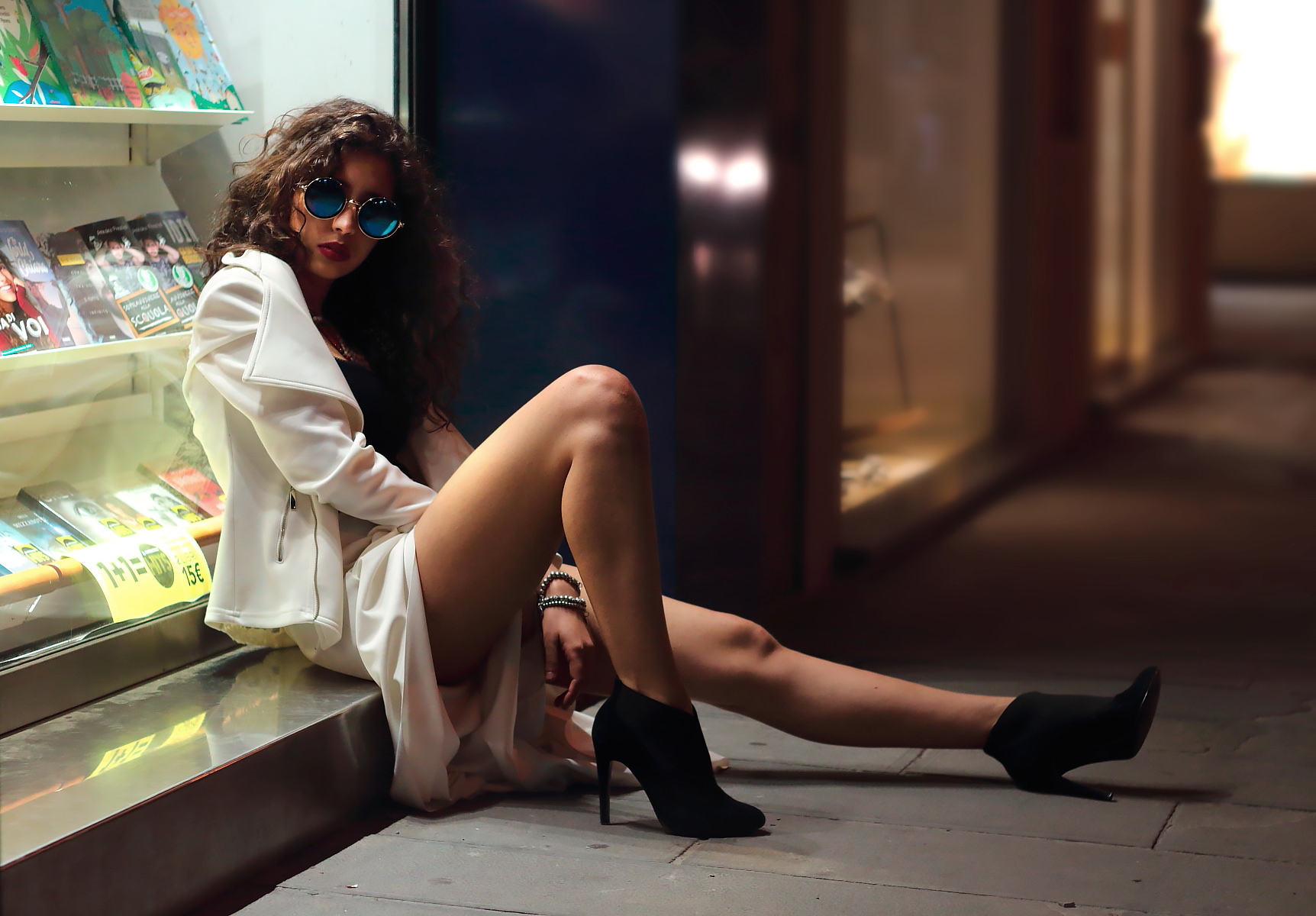
Nifty shot... but I think her legs look a little too waxy. Looks like you turned the clarity right down on them in conjunction with turning down sharpness.
Unfortunately my attention is drawn to the highest contrast region - which is the book behind her right shoulder.
I think.. if you'd moved her to her left a little so her head was completely surrounded by the blue wall and she was illuminated by the edge of the light from the window it would have been superb.
This site uses cookies to help personalise content, tailor your experience and to keep you logged in if you register.
By continuing to use this site, you are consenting to our use of cookies.