Harsh Honest feedback required..!!!!!

..MD..

Helen Shapiro
Messages
10,257
Name
MonkeyDave
Edit My Images
Yes
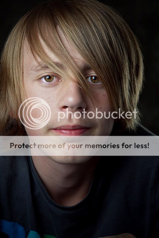
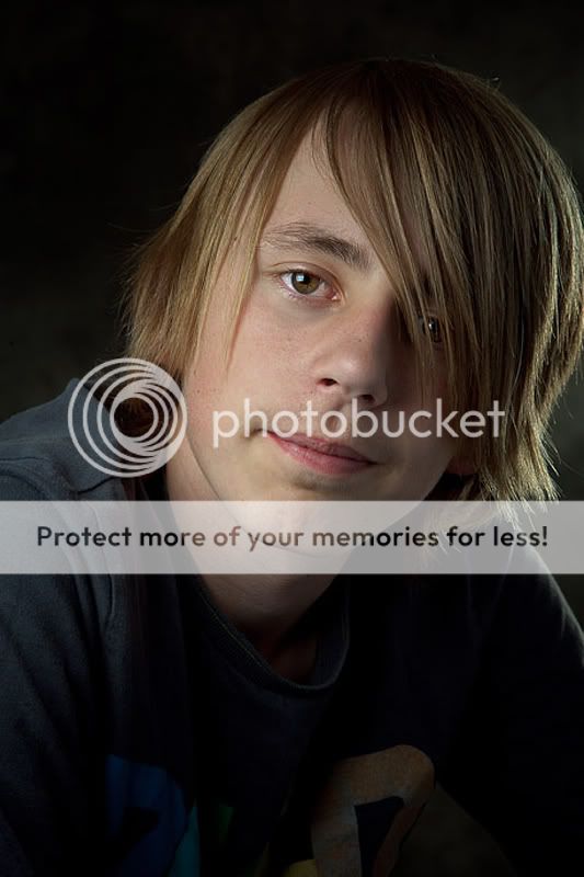
Please can I have everyones thoughts on these two images.. Be you a newbie "To photography" Or a old hand who has been in the buisness for years..!! I would love to hear your thoughts..!

I am trying to steer away from the white b/g with my work " I still do alot of it for people" But would rather try different styles...


So your thoughts on these two for starters please....!!!!


1
matty1.jpg


2
matty_2.jpg


Do they work or are they CARP....!


Regards MD(y)
 
You have the same problem as me (Unless you meant it) where the lightest part of the picture has attracted all the flash ... then i look at your exif and it says flash did not fire? so am I going mad? :)
 
You have the same problem as me (Unless you meant it) where the lightest part of the picture has attracted all the flash ... then i look at your exif and it says flash did not fire? so am I going mad? :)


Yes I meant to go bright It maybe my monitor not playing ball it looks bright but not over done..!!!

Flash did fire ..:shrug: Not sure i that the remote trigger I use..! ?


Regards MD(y)
 
Remote triggers won't show in the EXIF. Bet you used centre focus point though!?
 
Remote triggers won't show in the EXIF. Bet you used centre focus point though!?

Why do you say that Andrew..!! I normally use centre focus and recompose my image .." I just dont trust the other points for some reason.." Although saying that on this shoot I did change and use the top points for alot of the shots...


Dave:shrug:
 
Because his eyes are in the centre of the frame - not a good place to be - and there is a lot of dead space at the top - normally a sign of centre point focus. :)

Don't know if you use Nikon but if so try 52pt 3D - let the camera hold the focus point while you compose the shot.
 
Because his eyes are in the centre of the frame - not a good place to be - and there is a lot of dead space at the top - normally a sign of centre point focus. :)

Don't know if you use Nikon but if so try 52pt 3D - let the camera hold the focus point while you compose the shot.

Ahh thank you ..;) I see what your saying . I am a canon man but will look into our focusing properly...

Dave(y)
 
as to your original question - I do like the lighting - and I like the backgrounds - I am so tired of all the copycat white background stuff that's around - a nice change! :)
 
Hi Dave,

I am not a newbie, and most certainly not an expert(!), but I do agree with Andrew in that I do prefer the dark background to the white which we see a lot on here. I love the lighting!
 
Hi Dave,

I am not a newbie, and most certainly not an expert(!), but I do agree with Andrew in that I do prefer the dark background to the white which we see a lot on here. I love the lighting!


Thank you Simon..;) " I am prob one of the worst offenders of the white b/g stuff" :naughty: But now I am happy with my setup and work flow I am looking for more interesting images...
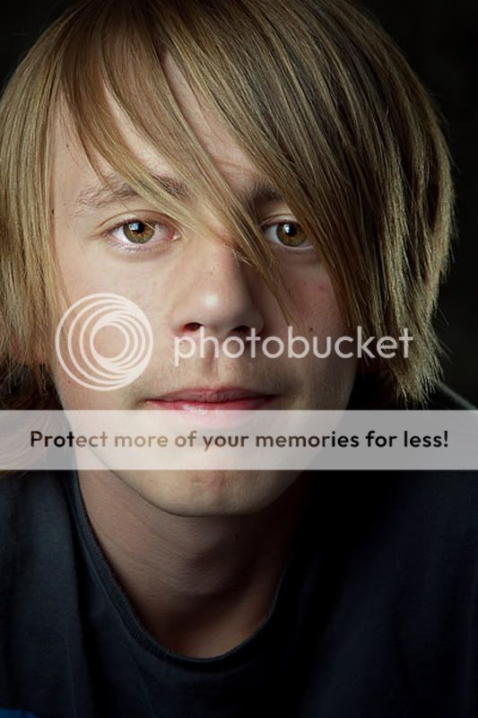

Belive it or not these images are less work than the white stuff.....:nuts:


Regards MD(y)
 
just my opinion, (am a newbie to the forum, so feel free to ignore !)....

given the subject, ie Trendy Young Dude, I would try for a more snappy background and funky pose .. maybe jet black b/g with no lighter areas to distract from the lad's eyes and a pose with attitude...the second pose to me is a bit of an older persons...
like the lighting tho
 
Hi Dave!

Ok honest opinion, the lighting doesn't really gel for me, the main is to strong and as a result his skin seems too bright and harsh. It just doesn't match the feel of the dark background, maybe try a very light grey instead if you want to keep the bright skin, I just think it clashes here, I also feel (for me at least) that the hair light is a touch too strong, it catches my eye and it shouldnt, should give subtle separation but instead I notice it as a light.

As for the images themselves, not really getting much personality from them? :shrug: What were you aiming for? Or maybe this was more a light/background test?

All in my opinion of course (y)
 
just my opinion, (am a newbie to the forum, so feel free to ignore !)....

given the subject, ie Trendy Young Dude, I would try for a more snappy background and funky pose .. maybe jet black b/g with no lighter areas to distract from the lad's eyes and a pose with attitude...the second pose to me is a bit of an older persons...
like the lighting tho


Thank you for taking the time.. I may try the black b/g I have and I will look t better posing ..!!! (y)
Hi Dave!

Ok honest opinion, the lighting doesn't really gel for me, the main is to strong and as a result his skin seems too bright and harsh. It just doesn't match the feel of the dark background, maybe try a very light grey instead if you want to keep the bright skin, I just think it clashes here, I also feel (for me at least) that the hair light is a touch too strong, it catches my eye and it shouldnt, should give subtle separation but instead I notice it as a light.

As for the images themselves, not really getting much personality from them? :shrug: What were you aiming for? Or maybe this was more a light/background test?

All in my opinion of course (y)


Thank you young man.. I have a real trouble with rim lighting.. " I think its cos I'm tight and try and get two things to do everything in lighting.. Lol :LOL:


Yes more of a lighting test I did get some with smiles and smirks and whatnot But these are the images he would like....

But I aint young now so what would I know...!!!!!:LOL:

Dave(y)
 
lighting is ok, a tad harsh but on the right lines. It could really do with a very minor retouch though, the red mark under the right eye is distracting.
 
Thank you young man.. I have a real trouble with rim lighting.. " I think its cos I'm tight and try and get two things to do everything in lighting.. Lol :LOL:

Yes more of a lighting test I did get some with smiles and smirks and whatnot But these are the images he would like....

But I aint young now so what would I know...!!!!!:LOL:

Dave(y)

What are you using as the rim light?
 
lighting is ok, a tad harsh but on the right lines. It could really do with a very minor retouch though, the red mark under the right eye is distracting.


I see what your saying but thats part of the model "Not a mole or spot" so it stays

What are you using as the rim light?


This was my main light shot through a umbrella


MD(y)
 
Too bright and too magenta for me, the backgrounds are not an issue as your backgrounds are always interesting for me.

You are too critical of your work Mr Woodfield, it is all subjective anyway.

Any way it would not be me if I did not do you an edit.....(you are my photoshop stock image resource :D )

matty2.jpg
matty1b.jpg


matty_2b.jpg


I changed the WB in ACR, lowered the exposure by 1 1/2 stops...and cropped that is it.

And a not so green try just to show that I know.
 
Last edited:
Too bright and too magenta for me, the backgrounds are not an issue as your backgrounds are always interesting for me.

You are too critical of your work Mr Woodfield, it is all subjective anyway.

Any way it would not be me if I did not do you an edit.....(you are my photoshop stock image resource :D )

matty2.jpg


matty_2b.jpg


I changed the WB in ACR, lowered the exposure by 1 1/2 stops...and cropped that is it.

Exposure is a bit better and I agree there is a fair amount of magenta in the originals, but these are waaayyy green :puke: Maybe somewhere in the middle :thinking:
 
Exposure is a bit better and I agree there is a fair amount of magenta in the originals, but these are waaayyy green :puke: Maybe somewhere in the middle :thinking:
Green is the new black....;)

I am merely demonstrating editing my view, I know it is greener than the original but you seem to forget I only have a processed jpeg to play with, cut me a tad of slack and I will be happy.
 
Green is the new black....;)

I am merely demonstrating editing my view, I know it is greener than the original but you seem to forget I only have a processed jpeg to play with, cut me a tad of slack and I will be happy.

:LOL:


After looking at yours I can see the light/ red again ....


Thanks again Tom.....


And yes I try to be critical of my images as I want to be the best I can....


Dave:wave:
 
Hey no harm meant! Didn't mean to offend.


:LOL: Tom is cool he was just pointing out the fact he had a small image to play with.....(y)


Thank you both for your help...(y)


Regards MD(y)
 
^ edit added to show less green...........

I am cool?....thanks Dave....you have made my year......lol
 
Dave, you use a 1 series body. You have nothing to worry about with the outer focus points, mate.

I agree you have too much red in there though and this is a theme in all of your shots. Perhaps invest in a proper white balance and colour checker.
 
More Top work MD!

I really like the poses, particularly the second. Great light fallout and I like to see a change from the white BG..this mottled grey is something we don't see very often.

Looking on my PC screen rather than ipad I can see that there is a slight red cast, not loads. I did a wee tweak in CS5 and moved the magaenta slider +7 green.

I think in Toms edits Matty looks a wee bit seasick :p ..I like the crops on the edits though. :)

This is with the colours tweaked and exposure reduced 0.25...


matty_2 by Cris_L, on Flickr

I'm really struggling with WB too as you know, so when you crack it I'm all ears! :bonk:
 
I'm really struggling with WB too as you know, so when you crack it I'm all ears! :bonk:

Chris ive got a really nice grey card if you want it free of charge :LOL::LOL:

I really like the images Dave and as has been said, your to hard on yourself :D
 
I'm really struggling with WB too as you know, so when you crack it I'm all ears! :bonk:

Chris ive got a really nice grey card if you want it free of charge :LOL::LOL:

I really like the images Dave and as has been said, your to hard on yourself :D

I need to get a Grey card actually neil...its the only way I'm going to sort this properly! :)
 
Nice shots but and I say but because this is probably just the way I prefer things and I havent read all the responses.
A hair light on the opposite side to the main light without a hair light on the same side throws the balance off for me.
I think if the hair light was extremly subtle on the right it might be ok, the back light itself should be enough to keep the subject seperated.
I personally would also try and get the main light a touch higher to throw the shadow down from the nose instead of accross. I would also be happy with a bot more contrast on either side for a male portrait.

again this is just how I prefere things and we each have our own way.
 
I really like these, they seem to just... Pop.

Thank you

It's all about the purpose of the image. If you're trying to get a nice portrait of the guy, you've achieved that. It's hard to give critique on such a basic image. You've used the hairlight and keylights well, his expression is good .. other than that, it's all about how he feels about the image.
It was all anout the lighting..!! I have some with smiles and serious looks but I liked these for the test..

Dave, you use a 1 series body. You have nothing to worry about with the outer focus points, mate.

I agree you have too much red in there though and this is a theme in all of your shots. Perhaps invest in a proper white balance and colour checker.

Cheers Dean & yes I need to sort out a test..!!!!

More Top work MD!

I really like the poses, particularly the second. Great light fallout and I like to see a change from the white BG..this mottled grey is something we don't see very often.

Looking on my PC screen rather than ipad I can see that there is a slight red cast, not loads. I did a wee tweak in CS5 and moved the magaenta slider +7 green.

I think in Toms edits Matty looks a wee bit seasick :p ..I like the crops on the edits though. :)

This is with the colours tweaked and exposure reduced 0.25...


matty_2 by Cris_L, on Flickr

I'm really struggling with WB too as you know, so when you crack it I'm all ears! :bonk:

Cheers for the comment and edit Cris(y)

I'm really struggling with WB too as you know, so when you crack it I'm all ears! :bonk:

Chris ive got a really nice grey card if you want it free of charge :LOL::LOL:

I really like the images Dave and as has been said, your to hard on yourself :D

Cheers Beil & look after that card matey its worth alot...!!!!

I need to get a Grey card actually neil...its the only way I'm going to sort this properly! :)


Lol

Nice shots but and I say but because this is probably just the way I prefer things and I havent read all the responses.
A hair light on the opposite side to the main light without a hair light on the same side throws the balance off for me.
I think if the hair light was extremly subtle on the right it might be ok, the back light itself should be enough to keep the subject seperated.
I personally would also try and get the main light a touch higher to throw the shadow down from the nose instead of accross. I would also be happy with a bot more contrast on either side for a male portrait.

again this is just how I prefere things and we each have our own way.


Cheers for the feedback matey... I will look into my lighting..


Regrads Dave(y)
 
Back
Top