Hertsmans 2018 52....Rural/Bright/Elegant/Derelict added

I love the gun shot. The reason being that although the gun is not old I can imagine it is because the button and the colour of the jacket behind reminds me of an old Confederate uniform from US.
Cheers

Blimey... I am miles behind on your posts !!

Aged - Nice idea, good angle and I am liking the rustic background, I bet that prop didn't last long after the shoot :D

Sharp - Ahhhh another techno-wiz idea, good thinking out of the box again and nice 'sharp' focus on the LCD display :)

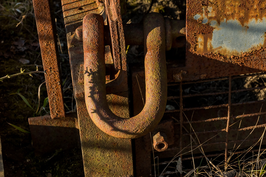
Guard - Ooooo more weapons, I like the metalwork on these and glad to see it has not had tooooo much use, I guess you can only rob so many banks a year :whistle:

Not so much behind as me being Dean..... Cheers for dropping by

Mark

Love the detail on the metal work and trigger guard.
Nice background in the aged image.

Sharp is not doing it for me, I feel all the strings should be sharp, not just the tuning thingy which does not look sharp to me as it is dirty.

Pete
Thanks Pete

Great bit of catching up - all on theme for me

The Aged one - that beer sounds bloody lovely. Is it local to you Mark?

Sharp - i'm gonna guess that's a 'sharp' chord although I know nothing about music. Spot on though

Guard - love this. Great engraving detail
Ian, not a local beer, just another from Tescos, the Sharp is showing the 3rd string as being sharp, given standard tuning
Guard is my pick of the 3 too....

Aged - Nice take on the theme I like the composition the background works really well with the subject

Sharp - I like that the DoF is just about right for me focusing your eye on the digital tuner.

Guarded - Very nice lovely details in the the engraving
Cheers Mark

Age(ing) - fits the theme, but I feel there is a better composition to be had.

Sharp - fits the theme, and works for me, and good use of DOF.

Guard(ed) - as Mark said a nice lovely image with nice engraving, well done on the catch up.

Thanks Mandy

Guard
I'm liking the shotgun, nice detail and it works well being laid on a shooting jacket/coat (well it looks like a jack).
Yeah, Im quite pleased with how the BG worked out tbh,,,,,

Hi Mark,

Aged - Liking Aged for the textures you've captured in the wood vs the glass. Not certain the positioning of the bottle in the frame is right, it feels a bit tight at the top perhaps?
Sharp - Not knowing what the gauge is supposed to be showing, I'm assuming it's indicating the note being played is slightly off, hence sharp. Interesting image.
Guard - I like the way the image fades from bright to almost black in the shadows, it emphasises the guard. :)

Thanks Tim, the bits of wood were to short really, so I had to make it fir where I could, Sharp is indeed in reference to the actual string being plucked, and I agree, Guard is the best of the 3

Great catch up Mark! The one that stands out for me is guard. Great composition, great mix of textures and colours and good lighting (y)
 
So, we move onto Thick.....I had a number of ideas for this, and actually took several shots. Disappointingly, a lot of them didnt process as well as Id hoped.
Im offering two shots here, and Im guessing neither of them will be particularly well recieved....one for the crop and two for the color tones, but heyho, onwards and upwards....

Thick shackle....
Thick (1 of 2) by Mark P, on Flickr

Thick buttresses...
Thick (2 of 2) by Mark P, on Flickr
 
Shackle for me, rust always has such lovely tones and enhanced by the light
 
Hi Mark,

The shackle shot for me. Some nice textures caught there and the angle of the light helps make it 3D.
The angles in the buttress shot are all wrong, it feels like it's falling to the left to me. There might have beena better shot there, or perhaps crop.
 
Thick

I like the shackle, it's just a little busy. It has got some good textures and colours.
 
The thick shackle for me, great colours and textures!
 
Ah rusty old locks, bolts & shackles ... don't ya just love them! (y)
 
Hi Mark, Sorry going back a bit, trying to get around to everyone

Over - I like the people over the sea. good sky and the colours of the coats makes them stand out well. I hope they are going to some unseen land and not just going to drop in the water!
Age - Nice product shot and I really like the bg you picked it goes very well with the theme too
Sharp - Not too sure about this one. I think it needs a little more in focus but a good idea
Guard - Like this one, Unusual subject but lovely details and good pov
Thick - I'll go for the shackle too. Interesting colours and textures but maybe needs the shadows lifting a little to bring out more of the detail in the bg

:D
 
For me both are on theme, thick rust is a nice colourful shot. My choice is the #2 as it clearly shows how thick the two buttresses :cool:
Thanks Dave

Shackle for me, rust always has such lovely tones and enhanced by the light
Cheers Chris

Like your idea for thick, nice texture and details. But the strong shadows spoiled the shot a bit.
The light at the time was horrible, really watery low sun,Ive played arounnd in LR to make it look much better than the OOC.

Lovely textures and colours in the rusty shackle Mark. nice mixture of light and shade too.
Thanks John

Hi Mark,

The shackle shot for me. Some nice textures caught there and the angle of the light helps make it 3D.
The angles in the buttress shot are all wrong, it feels like it's falling to the left to me. There might have beena better shot there, or perhaps crop.
Hi Tim, I couldnt get a better angle on the butresses at theres a big old tree that spoils the shot. I liked the angle to look at, but its a bit of a pants pic tbh

Shackle shot is my preferred image. Looks like a nice bit of light was on it at the time of taking the picture. I would crop a bit off the left hand side. Looks a little under exposed.
Thanks Micheal, as I said ^^^, the light was awful and Ive tried to balance it as best as poss in LR

Shackle for me love the texture and details in the rust of the metal.
Thanks Mark

The thick shackle for me, great colours and textures!
(y)
Ah rusty old locks, bolts & shackles ... don't ya just love them! (y)
:ty:

Hi Mark, Sorry going back a bit, trying to get around to everyone

Over - I like the people over the sea. good sky and the colours of the coats makes them stand out well. I hope they are going to some unseen land and not just going to drop in the water!
Age - Nice product shot and I really like the bg you picked it goes very well with the theme too
Sharp - Not too sure about this one. I think it needs a little more in focus but a good idea
Guard - Like this one, Unusual subject but lovely details and good pov
Thick - I'll go for the shackle too. Interesting colours and textures but maybe needs the shadows lifting a little to bring out more of the detail in the bg

:D
Thanks Georgina, lots of good feedback there....

Thick - the shackle for me as well, nice colours and textures and nicer fit for the theme for me.
Thank you Mandy
 
Very nice abundance of lovely chocolate, but I have to ask.....

What's with all the bubbles in the background?
 
Very nice abundance of lovely chocolate, but I have to ask.....

What's with all the bubbles in the background?

Might as well quote my own quote and look stooopid all in one go - I actually didn't even notice the title for this, hence me asking about the bubbles in the background. Sometimes I worry myself :LOL::LOL:
 
Catching up on comments lots of photos since my last visit, All fit their themes I particularly like the guard picture the BG and the colour tones.really suit it.
I like the Abundance of Bubbles too very Yummy.
Hmm chocolate
 
The Aero is quite beautiful, never realised before. Maybe some pieces of that, strategically arranged, would make a nice shot.
 
Not sure the extra bubbles in the bg were needed, but gotta love a crunchie or a mint aero. Good colours and certainly lots of bubbles :)
 
Nice Photos of the crunchie and aero bars, nice and sharp, nice colours, on theme and the bubbles in the background add to the theme but not required.

Pete
 
Before I answer individual comments, I thought I neede to add a little back story about the foam bubbles.....in my original idea, I also had a nice fizzy glass of Lemonade, (more bubbles), so they knind of made a bit more sense. I can see now I tighten the frame up, they are clearly superfluous...live and learn eh ?

Yum, just Yum. What more is there to say?
Only change I would make is to replace the bubbles in the background with whipped angel delight ;)
yum yum, thanks Tim

Catching up on comments lots of photos since my last visit, All fit their themes I particularly like the guard picture the BG and the colour tones.really suit it.
I like the Abundance of Bubbles too very Yummy.
Hmm chocolate
Thank you !

Nice clean shot of the chocolate not sure on the BG bubbles
Cheers Allan, see above

The Aero is quite beautiful, never realised before. Maybe some pieces of that, strategically arranged, would make a nice shot.
Funnily enough, I wasnt planning on Mint Aero but couldnt get the standard - now its done, I love the contrasting green, but hate the taste!

Abundance - Nice take on the theme you've got some love details in there.

Not sure the extra bubbles in the bg were needed, but gotta love a crunchie or a mint aero. Good colours and certainly lots of bubbles :)
I know Georgina, see top post....

Abundance - I am not so sure on the background bubbles, but it fits the theme with the abundance of bubbles.
I detect a common crit lol

Nice Photos of the crunchie and aero bars, nice and sharp, nice colours, on theme and the bubbles in the background add to the theme but not required.

Pete
Thanks Pete

Abundance is a nice shot, would of been a cracker but with the BG it ruins it for me.
Cheers Dave, hopefully my top post explains my thinking....
 
Really really wish Winter would just do one now, so fed up with weather spoiling the limited times I can get out and about.

My heavy shot had to be called off due to to weather, so I had to do a quick and dirty Lego job to get that box ticked.

Much happier with Wet though....

Heavy
Heavy (1 of 1) by Mark P, on Flickr

Wet
Wet (1 of 1) by Mark P, on Flickr
 
Heavy is very well executed and a great fun shot.
Wet is simply a beautiful shot, very well lit and perfectly taken. Top Shot.
 
Agree on this weather as it`s snowing bad here now :(

Heavy is a well thought out and taken shot, good placing of the legomen :)
Wet, what a cracking shot this red rose is Mark, I really do like the shot, good bit of dof and sharp rose and water drops on the petals. IMO 100% one hell of a shot (y)(y)(y)(y)
 
:) Heavy is really well set up, I like it.

Wet is gorgeous, spot on!
 
Nicely staged for the heavy image Mark - I really can't get my head around people's fascination for the toy figures but it works perfectly for you.

Love your wet image. Great detail and lighting. The DOF is perfect too
 
Heavy- lego figures not a fan.

Wet droplets on a flower, I'm a big fan. Not too many highlights to spoil the image. Lovely colours and OOF background help to isolate the flower.

Pete
 
I like your set up for heavy Mark and your shot for wet is very nice
 
Wet
I was looking to do the same thing, but the wife seems to have knicked my spray bottle (to use on the horses).
It's a lovely shot, good detail and colours.
 
Two good shots I not a fan of Lego pics but you have set it up well and a classic kind of pic of the rose very good
 
Heavy - Nicely set up fits the theme for me nice bright colours.

Wet - Lovely image stunning in fact not a lot else to add!
 
Back
Top