

You are using an out of date browser. It may not display this or other websites correctly.
You should upgrade or use an alternative browser.
You should upgrade or use an alternative browser.
Hertsmans 2018 52....Rural/Bright/Elegant/Derelict added
- Thread starter Hertsman
- Start date
- Messages
- 2,625
- Name
- Bernd
- Edit My Images
- Yes
abundance - great shot, although I think the Aero looks better than it tastes! Nicely composed and bonus points for adding extra bubbles in the background!
heavy - nicely set up, good fun shot. Not so funny for the poor Lego man buried under that rock though...
wet - lovely shot, great DoF, great colours, nothing to criticise!
heavy - nicely set up, good fun shot. Not so funny for the poor Lego man buried under that rock though...
wet - lovely shot, great DoF, great colours, nothing to criticise!
- Messages
- 5,432
- Name
- Andrea
- Edit My Images
- Yes
Ooh, I do like Abundance! Great idea to choose two bars with lots of bubbles to provide lots of interesting textures and colour, and it's an attractive arrangement too.
Heavy is nicely arranged and conveys the theme very effectively. Like you, I'm fed up with the weather getting in the way of opportunities to get out with the camera but you coped well here")
Wet is a lovely shot, full of rich colours and tones and the water drops are sharp and add vital interest.
Heavy is nicely arranged and conveys the theme very effectively. Like you, I'm fed up with the weather getting in the way of opportunities to get out with the camera but you coped well here
Wet is a lovely shot, full of rich colours and tones and the water drops are sharp and add vital interest.
OP
- Messages
- 3,413
- Name
- Mark
- Edit My Images
- Yes
Thank you very much....Heavy is very well executed and a great fun shot.
Wet is simply a beautiful shot, very well lit and perfectly taken. Top Shot.
Agree on this weather as it`s snowing bad here now
Heavy is a well thought out and taken shot, good placing of the legomen
Wet, what a cracking shot this red rose is Mark, I really do like the shot, good bit of dof and sharp rose and water drops on the petals. IMO 100% one hell of a shot
Cheers Dave, appreciated.
Thanks Chris!
Wet is gorgeous, spot on!
Nicely staged for the heavy image Mark - I really can't get my head around people's fascination for the toy figures but it works perfectly for you.
Love your wet image. Great detail and lighting. The DOF is perfect too
Lego is just a bit of fun when you cane get anything else right! Cheers ....
Thank youHeavy- lego figures not a fan.
Wet droplets on a flower, I'm a big fan. Not too many highlights to spoil the image. Lovely colours and OOF background help to isolate the flower.
Pete
I like your set up for heavy Mark and your shot for wet is very nice
Thanks Dominic.....Wet
I was looking to do the same thing, but the wife seems to have knicked my spray bottle (to use on the horses).
It's a lovely shot, good detail and colours.
Two good shots I not a fan of Lego pics but you have set it up well and a classic kind of pic of the rose very good
Thank yuo Mark....Heavy - Nicely set up fits the theme for me nice bright colours.
Wet - Lovely image stunning in fact not a lot else to add!
Harsh light indeed, even with a diffuser and 0.7 of a stop Flash comp....wnated the bright catchlights to jump out tho.....Heavy .... oh what fun you've been having.
Wet ... and so you should be happy, the light is a bit harsh but still good.
Thanks for the bonus on the bubbles B, nobody else liked them......abundance - great shot, although I think the Aero looks better than it tastes! Nicely composed and bonus points for adding extra bubbles in the background!
heavy - nicely set up, good fun shot. Not so funny for the poor Lego man buried under that rock though...
wet - lovely shot, great DoF, great colours, nothing to criticise!
Thank you very muchOoh, I do like Abundance! Great idea to choose two bars with lots of bubbles to provide lots of interesting textures and colour, and it's an attractive arrangement too.
Heavy is nicely arranged and conveys the theme very effectively. Like you, I'm fed up with the weather getting in the way of opportunities to get out with the camera but you coped well here
Wet is a lovely shot, full of rich colours and tones and the water drops are sharp and add vital interest.
Glad it made you smile.....Heavy - A fun set-up that made me smile
Wet - great shot the rose really stands out from the BG.
OP
- Messages
- 3,413
- Name
- Mark
- Edit My Images
- Yes
Hmmm, Juxtathingy....what a nasty little theme. Seems easy if you are good with PS, but then, for me, it becomes Graphic Design and not photography.
Anyways, after much deep thought and some trial and error, its done.
Juxtaposition...
"With life, comes Death"
 Juxtaposition (1 of 1) by Mark P, on Flickr
Anyways, after much deep thought and some trial and error, its done.
Juxtaposition...
"With life, comes Death"
Juxtaposition (1 of 1) by Mark P, on Flickr- Messages
- 754
- Name
- Daniel
- Edit My Images
- No
Like the choice for the theme Mark, executed very nicely!
- Messages
- 4,640
- Name
- Pete
- Edit My Images
- Yes
Mark
As others have already said, a great Image, nice colours, good details, nice and Sharp.
Pete
As others have already said, a great Image, nice colours, good details, nice and Sharp.
Pete
LC2
Negan
- Messages
- 10,448
- Name
- Tim
- Edit My Images
- Yes
Hi Mark,
Heavy - As you say, it does the job, given the weather... Interesting use of astroturf as the background. Been changing your lawn?
Wet - Well, that's a subject we shouldn't have too much trouble with Nicely taken, good use of DoF, great droplets and an uncluttered background. I suspect you're happy with this one
Juxtaposition - Great idea for the theme and well executed
Heavy - As you say, it does the job, given the weather... Interesting use of astroturf as the background. Been changing your lawn?
Wet - Well, that's a subject we shouldn't have too much trouble with
Nicely taken, good use of DoF, great droplets and an uncluttered background. I suspect you're happy with this one Juxtaposition - Great idea for the theme and well executed
- Messages
- 2,435
- Edit My Images
- No
Catching up on my comment rota ---
Heavy - I like Lego figures - must dig out the ones my kids had. Fun shot - well composed and lit.
Wet - Lovely colours and highlights. Perhaps a little too wet, I take it you sprayed the water on? The size distribution of drops is quite varied while I would expect rain drops and dew to have a less varied size range.
Juxtaposition - Death, decay and new life. Excellent for theme and great colours.
- Messages
- 616
- Name
- Ross
- Edit My Images
- Yes
Like the Juxta shot. Life vs Death. Very deep. Nice colours and composition.
OP
- Messages
- 3,413
- Name
- Mark
- Edit My Images
- Yes
Thank you Stan, praise indeed....What a great image and a great idea. Love the composition and the square crop, sharp details and the texture too.
Cheers DaveTwo for the price of one, great shot filling the frame well. Light and Dark is one and the other Life and Death so well done.
Thank you Allan, appreciate your comments.excellent interpretation of the theme and well executed sharp with great colour
Nice bit o'thingamyposition there!
Hi Mark - works for me, nice warm tones - sharp - works with the theme, what more can you ask for!
Thank you, thats what I like too....Good idea, Mark. Perfect for the theme and lots of textures and details to look at too. I especially like the fresh green of the buds
Great shot for the theme, nicely done
Indeed Susie,the idea was last minute but worked well I think, thanks for dropping byHi Mark, perfect choice for the theme, loads of lovely detail in those decaying leaves, and then that lovely fresh bud ready to burst into life.
Cheers ChrisReally well composed with great tones and colours, I really like that
Thanks D... clever interpretation, simple props, nicely done. There's some lovely detail there.
Like the choice for the theme Mark, executed very nicely!
Mark
As others have already said, a great Image, nice colours, good details, nice and Sharp.
Pete
Blimey ! cheers BGreat image, well composed, nothing to criticise!
Tim, the astroturf is an offcut I nicked off a job a while back and have been waiting for a chance to use....Hi Mark,
Heavy - As you say, it does the job, given the weather... Interesting use of astroturf as the background. Been changing your lawn?
Wet - Well, that's a subject we shouldn't have too much trouble with
Juxtaposition - Great idea for the theme and well executed
Wet - deffo happy, but then its right in my comfort zone, so I should be....
Juxta - a chance idea that worked better than expected !
Glad you like my Lego shot, I know they are a little marmiteCatching up on my comment rota ---
Heavy - I like Lego figures - must dig out the ones my kids had. Fun shot - well composed and lit.
Wet - Lovely colours and highlights. Perhaps a little too wet, I take it you sprayed the water on? The size distribution of drops is quite varied while I would expect rain drops and dew to have a less varied size range.
Juxtaposition - Death, decay and new life. Excellent for theme and great colours.
Wet - yes, just used a std spray bottle - not sure rain would be equal size but catch your drift
Juxta - thanks, Im pleased with it too
Thank you Ross, apppreciatedLike the Juxta shot. Life vs Death. Very deep. Nice colours and composition.
Thanks Dominic, glad you like....Juxtaposition
Nice muted colours that help emphasize the green buds.
OP
- Messages
- 3,413
- Name
- Mark
- Edit My Images
- Yes
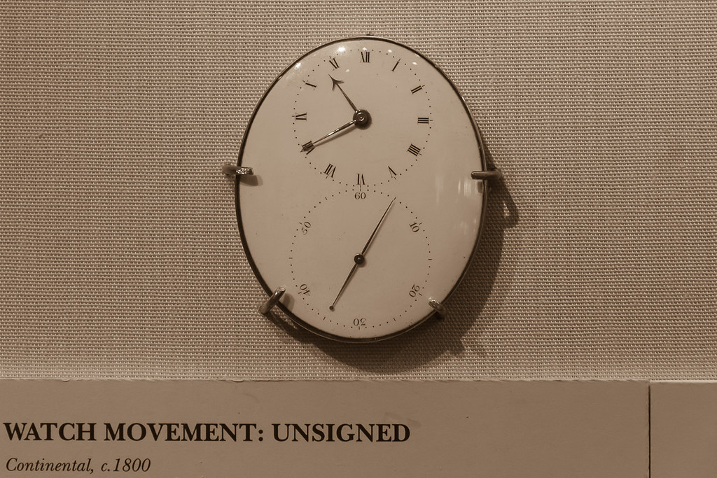 Oval (1 of 1)
- Messages
- 4,562
- Name
- Mark Gameson
- Edit My Images
- Yes
Hi Mark
Catching up on my comments
Juxtaposition great image fills the frame nicely great textures and colours
Oval - not really sure about the writing nice find for the theme with the colour palette I wonder if a b&w conversion would work better
Catching up on my comments
Juxtaposition great image fills the frame nicely great textures and colours
Oval - not really sure about the writing nice find for the theme with the colour palette I wonder if a b&w conversion would work better
- Messages
- 4,640
- Name
- Pete
- Edit My Images
- Yes
Mark
Nice find for Oval, like the colours, not sure about the light reflecting on the top of the face, while writing adds history, it deos nothing for the picture so maybe better cropped out.
Pete
Nice find for Oval, like the colours, not sure about the light reflecting on the top of the face, while writing adds history, it deos nothing for the picture so maybe better cropped out.
Pete
- Messages
- 5,432
- Name
- Andrea
- Edit My Images
- Yes
That's a good find for the Oval theme, Mark. The light was obviously challenging - presumably on fixed display somewhere inside - but it's a really interesting subject. The text provides its age but I think as an image it would work better without the text as the watch itself is a great subject.
- Messages
- 9,095
- Name
- Mandy
- Edit My Images
- Yes
Heavy - a lovely fun bright image for the theme.
Wet - a perfect image for the theme, lovely flower.
Juxtaposition - a very good take on the theme.
Oval - fits the theme, I think I would prefer the shot to just be of the clock and not to have the writing in the bottom.
Wet - a perfect image for the theme, lovely flower.
Juxtaposition - a very good take on the theme.
Oval - fits the theme, I think I would prefer the shot to just be of the clock and not to have the writing in the bottom.
- Messages
- 616
- Name
- Ross
- Edit My Images
- Yes
Nice Oval find. I think for me it needs to lose the label underneath. Either a tighter crop to get rid of it or a wider shot to include all of it.
OP
- Messages
- 3,413
- Name
- Mark
- Edit My Images
- Yes
Thanks DaveOval wall clock on theme, but for me I don`t like the writing on the bottom.
You are of course, very right, it does look very flat, sadly.Not keen on the writing either or the sepia makes it look very flat
Thanks Mark - it is a Sepia conversion believe it or not!Hi Mark
Catching up on my comments
Juxtaposition great image fills the frame nicely great textures and colours
Oval - not really sure about the writing nice find for the theme with the colour palette I wonder if a b&w conversion would work better
You may well be right Pete, I was unsure tbhMark
Nice find for Oval, like the colours, not sure about the light reflecting on the top of the face, while writing adds history, it deos nothing for the picture so maybe better cropped out.
Pete
Thanks Chris, its in the Clockmakers museum in the science museum, so ot the easiest think to captureWell seen, it's a nice looking watch movement but looks like the lighting was not helping you.
Thanks, I was as pleased with Juxta as I was dipleased with my oval shot tbf,,,,Juxtaposition - I like that. The natural tones are lovely and the new green buds stand out well against the dead leaves.
Oval - what an interesting time piece great find.
Thanks DCertainly unusual, and the way it's fixed to the wall. But have to agree with @Allan.H and others above.
Thanks, was a tricky shot that I didnt quite nail sadlyThat's a good find for the Oval theme, Mark. The light was obviously challenging - presumably on fixed display somewhere inside - but it's a really interesting subject. The text provides its age but I think as an image it would work better without the text as the watch itself is a great subject.
Thanks Tim, its a sepia conversion,mainly because the whole display was a hideous Beige that barely looked any better tbh.Well, I don't mind the label under the clock, it gives it context.
Is it a sepia finish, or are they the actual colours. I could easily believe it looks like that IRL.
Good interesting find
A common but fair crit for Oval Mandy, thanksHeavy - a lovely fun bright image for the theme.
Wet - a perfect image for the theme, lovely flower.
Juxtaposition - a very good take on the theme.
Oval - fits the theme, I think I would prefer the shot to just be of the clock and not to have the writing in the bottom.
....you are not alone B....Nice looking watch, by I don't like the writing at the bottom or the reflections on the top of the watch...
Neither would have worked terrible well tbh Ross, Im just going to forget this one and move on lolNice Oval find. I think for me it needs to lose the label underneath. Either a tighter crop to get rid of it or a wider shot to include all of it.
Thanks Susie, we saw the same interest in the item it would seem.....I really like the subject choice for Oval Mark, but it's lacking a bit of ooomph, super delicate face on that watch..
Already converted to sepia sadly...Nice clock, though I don't like the writing. It could also perhaps do with different processing, maybe an aged sepia look.
Not a great week for me this one, oh well, onwards and upwards...