Well.
Ive never felt completely stumped with a theme as I have this week.
My initial thought was a Crocodile as they havent really evolved much at all.
Them overnight, I thought a Chimp would be perfect, as we are evolved from them.
Got up this morning and drove to Whipsnade - only to discover it totally and I mean TOTALLY rammed with pushchairs and screaming kids. Not my idea of fun.
Decided to bail out and thought I could go to Tring Natural History Museum and get my Ape shot there.
Then I had an idea that I THOUGHT would work well.....
ONLY it didnt....
After I had shot it I wasnt happy, and the results on screen only confirmed my misery.
So, for my first time on the 52, I am submitting an image that I know is pure rubbish, and I hate that.
TBH,I couldnt even make up a decent shoehorn in the time available......
Anyway, this bag of Sh1t is "Evolved"
 Evolve
 by
Mark P, on Flickr


")
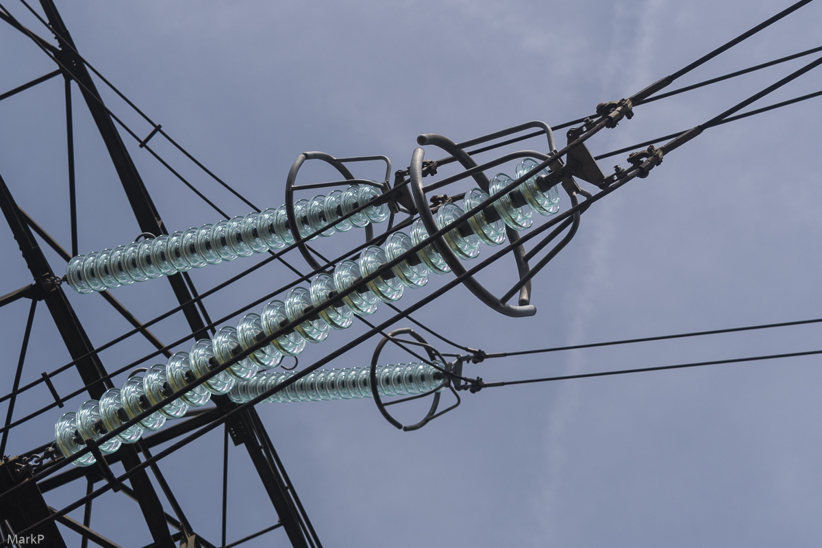 Power-2
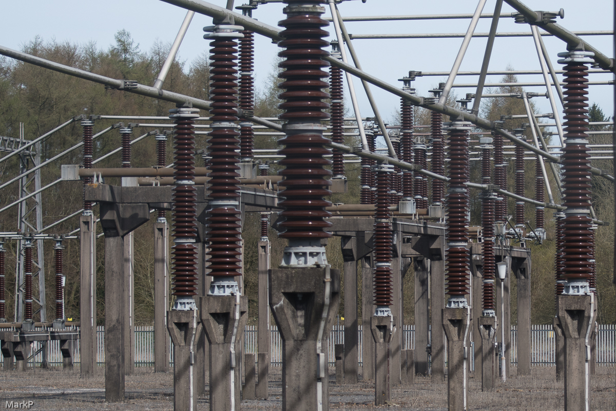 Power
Power
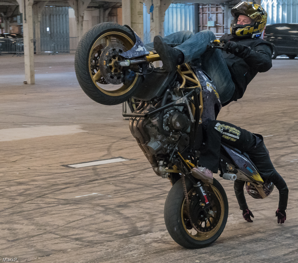 Kickback-11
 It is a bit tight but I like it.