

You are using an out of date browser. It may not display this or other websites correctly.
You should upgrade or use an alternative browser.
You should upgrade or use an alternative browser.
weekly Hertsmans 52 for 2017 Rustic,Festive, weather added-and DONE !
- Thread starter Hertsman
- Start date
OP
- Messages
- 3,413
- Name
- Mark
- Edit My Images
- Yes
Thanks John, and I agree on the agric picAgriculture bang on theme Mark; colours all seem a bit muted or a lack of contrast though.
Great capture of the weasel. Beautiful creature and graceful in a deadly sort of way.
Agriculture is a good idea but not really sure it works as it stands, but I really don't know what you could do, sorry
100% agree Allan. Ive had another play, but its still really flat..
Exactly !I think agriculture work quite well really. Lighting wise it looks a bit flat, but i like the concept. Not everything has to be tractors and combines
Cheers AndyGraceful, indeed, I really live how they weave through the undergrowth. Mean little critters as well
Cheers.
My choice of the two has to be the crazy critter, lovely little things, so well spotted
Ta !
OP
- Messages
- 3,413
- Name
- Mark
- Edit My Images
- Yes
Agriculture ... clever one for the theme, nicely set up on well-used chopping board.
Graceful ... good detail on the focus point, well caught.
Thanks Dood, I do try and avoid cliches wherever possible.....
 Fruit
Fruit- Messages
- 3,250
- Name
- Emma
- Edit My Images
- Yes
Hi Mark...heading in for a big catch up!
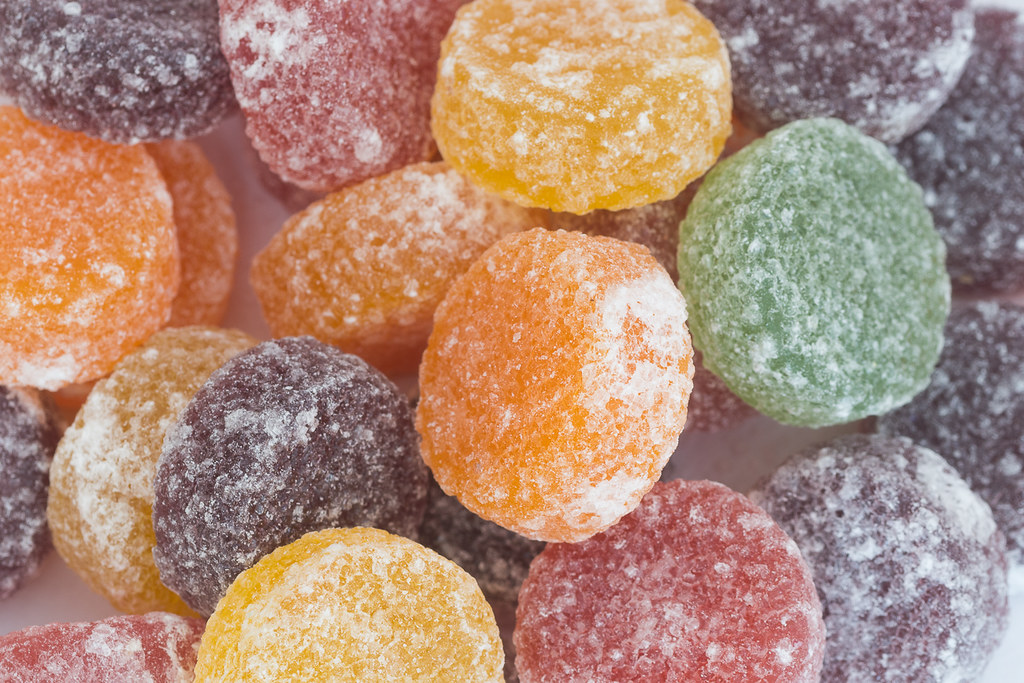
I really like the crops for pleasure and tiny - It's great the way that many heads on the 52 canhelp us see what we've missed. Excellent panning skills on the bike
Face - I love this - a really classic shot and beautifully lit to avoid reflections and harsh highlights.
Agriculture - really like the thinking behind this and the textures in the chopping board, but maybe not the stain - it's a bit distracting I think. I'm forever cloning out felt tip pen and food stains when I use our coffee table or chopping boards for a shot!
Graceful - lovely focus on that bright eye.
Fruit - nice colourful frame filling shot and spot on dof for me - what's not to like?!
- Messages
- 5,432
- Name
- Andrea
- Edit My Images
- Yes
Hi Mark, a bit of a catch-up from me as I fell behind for a while.
Face is a classy, simple shot that meets the theme perfectly. Lighting is well controlled and I think your choice of focus point works well.
Agriculture - nice to see something different and I think you've done well; I like the subtle, natural tones too.
Graceful - they certainly can move like liquid so this is a fitting choice for the theme and I like the details you have captured in the face and coat.
Fruit - great idea - well done Super colours and details, and you made the right choice to get in close and fill the frame. I bet they tasted good afterwards, too
Face is a classy, simple shot that meets the theme perfectly. Lighting is well controlled and I think your choice of focus point works well.
Agriculture - nice to see something different and I think you've done well; I like the subtle, natural tones too.
Graceful - they certainly can move like liquid so this is a fitting choice for the theme and I like the details you have captured in the face and coat.
Fruit - great idea - well done
Super colours and details, and you made the right choice to get in close and fill the frame. I bet they tasted good afterwards, too
OP
- Messages
- 3,413
- Name
- Mark
- Edit My Images
- Yes
Thanks DaveFruit is a good clear colourful shot Mark, like the tight shot too
2 whole packets, and ONLY one Green one.....I did think of Fruit Pastilles too, nicely done love the colours in it
yepLike the idea, bet you enjoyed the props after too.
Thanks Em - Face is a fave of mine, whilst Agric didnt quite work for me,and Fruit was an instant idea that worked well.Hi Mark...heading in for a big catch up!
I really like the crops for pleasure and tiny - It's great the way that many heads on the 52 canhelp us see what we've missed. Excellent panning skills on the bike
Face - I love this - a really classic shot and beautifully lit to avoid reflections and harsh highlights.
Agriculture - really like the thinking behind this and the textures in the chopping board, but maybe not the stain - it's a bit distracting I think. I'm forever cloning out felt tip pen and food stains when I use our coffee table or chopping boards for a shot!
Graceful - lovely focus on that bright eye.
Fruit - nice colourful frame filling shot and spot on dof for me - what's not to like?!
CheersHa! ... great idea. And filling the frame nicely.
Thanks for input, its always nice to receive...Hi Mark, a bit of a catch-up from me as I fell behind for a while.
Face is a classy, simple shot that meets the theme perfectly. Lighting is well controlled and I think your choice of focus point works well.
Agriculture - nice to see something different and I think you've done well; I like the subtle, natural tones too.
Graceful - they certainly can move like liquid so this is a fitting choice for the theme and I like the details you have captured in the face and coat.
Fruit - great idea - well done
 Vehicle2
- Messages
- 13,760
- Edit My Images
- Yes
I just love the fruit pastel photo and what a great idea with a splendid product to nibble on when finished with !!! - real nice sugary detail, nom nom nom
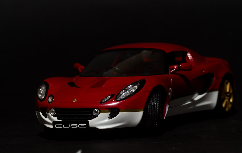
I also like the Lotus image for vehicle, though the little white patch bugs me a tad on the bottom, the rest is a nice dark look that suits the sporty car... cool
I also like the Lotus image for vehicle, though the little white patch bugs me a tad on the bottom, the rest is a nice dark look that suits the sporty car... cool
OP
- Messages
- 3,413
- Name
- Mark
- Edit My Images
- Yes
Thanks Dave, glad you like it....I love this vehicle shot Mark, think it is one of my favourite ones this week. Love the colours and how they go together and a great BG to set it off well
I just love the fruit pastel photo and what a great idea with a splendid product to nibble on when finished with !!! - real nice sugary detail, nom nom nom
I also like the Lotus image for vehicle, though the little white patch bugs me a tad on the bottom, the rest is a nice dark look that suits the sporty car... cool
Dammn you lot are hard to please.....
(I still havnt got the habit of perimeter patrol sorted !)Have an edit....
 Vehicle3 by Mark P, on Flickr
- Messages
- 5,432
- Name
- Andrea
- Edit My Images
- Yes
Good idea when the weather isn't cooperating, Mark. I didn't notice that little white bit until DK pointed it out but the edit gets rid of it nicely! The bright colours of the car stand out well against the dark background and I like the little points of light in the lights, wing mirror and rear wheel.
- Messages
- 7,548
- Name
- susie
- Edit My Images
- Yes
Fruit who doesn't love props we can eat ...I can never stop at just one of those, they are soooo moreish, excellent idea for the theme. I like the close crop.
Smashing lighting on the car for Vehicle, it emphasises that sleek dark expensive look.
who doesn't love props we can eat ...I can never stop at just one of those, they are soooo moreish, excellent idea for the theme. I like the close crop.Smashing lighting on the car for Vehicle, it emphasises that sleek dark expensive look.
OP
- Messages
- 3,413
- Name
- Mark
- Edit My Images
- Yes
If you've never tried it, shiny stuff is a nightmare to shoot nicely, and I know this isnt that great tbh....
My other idea was a piece of cake - any idea how hard it is to make that look interesting ?!?
Piece of Jewellery.....
 Piece (1 of 1) by Mark P, on Flickr
My other idea was a piece of cake - any idea how hard it is to make that look interesting ?!?
Piece of Jewellery.....
Piece (1 of 1) by Mark P, on Flickr- Messages
- 3,250
- Name
- Emma
- Edit My Images
- Yes
You did well - the highlights must have been a nightmare! I love the blue on black too. It might have been nice to see it more symmetrical, perhaps with the chain going from corner to corner, or at least to the same height on both sides, and the pendant central. But I know all this is easier said than done in set up shots!
LC2
Negan
- Messages
- 10,448
- Name
- Tim
- Edit My Images
- Yes
Hi Mark,
I'm not seeing the Agriculture & Graceful shots on the main page or your thread (I can when I click through to flickr thugh).
Agriculture - Very different take on the theme to the others I've seen so far, but spot on. Great textures and a well told story.
Graceful - Bang on with the focus there, which can't have been easy as those little buggers are quite lively.
Fruit - Another alternative take on the theme. Clever. Nicely done and the complimentary colours of the green and orange pastels draw the eye.
Vehicle - I actually like the semi lo-key feel to most of the shot. The re-edit deals with Dean's comment, which to be fair was about the only thing that could be picked up on, hence pointing to the fact that it is a really good image.
Piece - Nicel control of the lighting, I really like the colour, but those to oof white bits at the bottom detract.
I think I would have gone for a deeper DoF to keep more in focus.
OP
- Messages
- 3,413
- Name
- Mark
- Edit My Images
- Yes
Piece of jewellery and cake is damn hard to get right so agree. On the jewellery shot, I like the bg as it really does enhance the piece well
Good take on the theme, well lit and a nice colourful piece of jewellery.
Thanks guys
Totally agree with you about shiny stuff, i was trying dropping fruit into a glass of water the other day, i found it really quite hard to light.
I really like the vividness of this blue jewel on the black bg.
Cheers
You did well - the highlights must have been a nightmare! I love the blue on black too. It might have been nice to see it more symmetrical, perhaps with the chain going from corner to corner, or at least to the same height on both sides, and the pendant central. But I know all this is easier said than done in set up shots!
That's OK, it is a nightmare to light but you have done alright, I think Emma's point about the chain is correct, product photography is a pain but with a little patience
Agree about the symmetry, this Topaz is on a "wire" rather than a soft linked chain so it doesnt sit nicely....
wasn't sure about the car at first, harsh light and shadows .... but it's a grower.
As for shiny things, I tend to avoid them. I think you've done well with Piece. Interesting compo too.
Thanks D
Hi Mark,
I'm not seeing the Agriculture & Graceful shots on the main page or your thread (I can when I click through to flickr thugh).
Agriculture - Very different take on the theme to the others I've seen so far, but spot on. Great textures and a well told story.
Graceful - Bang on with the focus there, which can't have been easy as those little buggers are quite lively.
Fruit - Another alternative take on the theme. Clever. Nicely done and the complimentary colours of the green and orange pastels draw the eye.
Vehicle - I actually like the semi lo-key feel to most of the shot. The re-edit deals with Dean's comment, which to be fair was about the only thing that could be picked up on, hence pointing to the fact that it is a really good image.
Piece - Nicel control of the lighting, I really like the colour, but those to oof white bits at the bottom detract.
I think I would have gone for a deeper DoF to keep more in focus.
Lots here, so thanks Tim.
I always try quite hard to be left of centre and not shoot the obvious. Im a bit of a contrary git at the best of times, so sticking to rules/guidelines isnt in my DNA.....
You've done really well with that jewellery Mark, shiny things are a pain to get right, beautiful colour in the stone, personally I like the composition, I think it works really well.
Thanks Susie, glad you liked it.
OP
- Messages
- 3,413
- Name
- Mark
- Edit My Images
- Yes
Take number 300265....
Still not quite convinced the idea has legs....
Contrast
 Contrast (1 of 1) by Mark P, on Flickr
Still not quite convinced the idea has legs....
Contrast
Contrast (1 of 1) by Mark P, on Flickr
OP
- Messages
- 3,413
- Name
- Mark
- Edit My Images
- Yes
Dark contrasting BG sets off the shot well Mark, paper hoops looks good
Sshhh, its another contrast point !
- Messages
- 14,766
- Name
- Michael
- Edit My Images
- No
I can see where you were wanting to go with this. For me it's not quite there, it needs a little more punch. I see you were at iso 1000 and f36? According to flickr. If correct I would shoot at something in the mid range, f8-f11. Going for a very contrasty b+w pp would work I think