weekly Hertsmans 52 for 2017 Rustic,Festive, weather added-and DONE !

A very nice butterfly display Mark, I think you did a good job on the reflections not showing as it can be a PITA with this sort of shot, just the little bit on the bottom LHS still on theme and very good (y)

Thanks Dave, that was WITH a polariser as well, so you can imagine how bad the reflections were in reality......

And I know its not bang square in the frame, but anyone that sees these will know where they were shot and recognise the difficulty in getting fully square on.....
 
Last edited:
Catch up on comments, good display photo but I don't like the subject, would prefer to see them flying. Nice arch through an arch. Your tattooed arm for your is on theme and nicely done. Occupation I like the small flashes of colour in the gems.
 
Good colours in the display of butterflies and well handled through glass
 
Nice find for Arch ... its been pointed out, more light on FG arch would add.

Some pretty good butterfly detail there, considering.
 
Some very colourful butterflies you've got there Mark, nice display. You've done well to limit the reflections in the glass too
 
Display - Good control of reflections, just enough at corner so you know there is glass and to give depth.
 
Very well done with that photo through glass Mark, the butterflies are really clear even when zoomed in close, they certainly make a colourful Display.

Good colours in the display of butterflies and well handled through glass

Nice find for Arch ... its been pointed out, more light on FG arch would add.

Some pretty good butterfly detail there, considering.

Some very colourful butterflies you've got there Mark, nice display. You've done well to limit the reflections in the glass too

I never like to see dead things behind glass but this is definitely a great display, Mark, and you've done so well to control the light and reflections. Good choice for the theme (y)

Display - Good control of reflections, just enough at corner so you know there is glass and to give depth.

Very good control of reflections yes and handy to have with you, I am a bit lazy on that front of having one in my kit bag all the time but rarely attach it !! - A good link for the theme that's for sure :)

Thanks everyone thats commented. These are part of the Natural History Museums collection in the smaller Tring musuem, which is minutes away from me.
These days, collections like this are not the done thing, and quite rightly, but it does have a huge historical significance.....
 
I like the shot Mark, good use of the dark background
 
....These are part of the Natural History Museums collection in the smaller Tring musuem,.....
That takes me back, last visited that museum while doing Teacher Training in Oxford 1978/79, supposed to learn how to organise a school visit, while as a biologist I found it fascinating I'm not sure I would take a school trip there.
 
Last edited:
velvet underground-Andy Warhol :banana:, needs to be brighter and colour balance looks off, I think :thinking:
 
I like it but yes a Levels tweak might improve it or maybe you should see this as an opportunity to go OTT warholesque.
 
Bent, a nice shot of the nana Mark, nice BG :)
Cheers Dave

I like the shot Mark, good use of the dark background
Thanks Tilz

That takes me back, last visited that museum while doing Teacher Training in Oxford 1978/79, supposed to learn how to organise a school visit, while as a biologist I found it fascinating I'm not sure I would take a school trip there.
Its hugely popular on a crappy winter sunday as its FOC entry.....

Good thinking(y)
Thanks Shirley

The banana looks a tad dark, but that could be my monitor, a nice solid background that is for sure, and now with Brexit guess we can have bent bananas again soon (y) :banana:
Indeed!

velvet underground-Andy Warhol :banana:, needs to be brighter and colour balance looks off, I think :thinking:

Well done Allan, I tried to balance the shot between the original and a straight up photo, and Im not sure it worked as well as I hoped

I like it but yes a Levels tweak might improve it or maybe you should see this as an opportunity to go OTT warholesque.
I dodnt want to go full on Dood, as above, I tried to balance it between the Warhol and reality, and prb failed....

Why didn't I think of that one ...the perfect choice ...well done to you Mark :) I think it need a tad more brightness but I like the starkness of the black, it really shows it off well.
Thanks Susie
 
Very nicely done, good light picking out he details without any harsh highlights and a good black background. A tiny nit-pick is the cropped off word "made" on the left but that is being very picky, it is a very good photo.
 
What craftsmanship ... nicely caught. Tight in the frame top & bottom which I like. LHS ... its been mentioned.
 
Hi Mark,

Display - Subject doesn't do a lot for me, but I can appreciate the effort gone into the shot, minimising reflections in the glass and ensuring that the flutterbys themselves are vibrant.

Bent - Bang on theme. Is it me, or is the background a little noisy?

Wood - The pic of the 3 for me this one. I love the textures and the detail. Lighting is very well controlled and the tight crop really emphasises the mechanism.
:clap:
 
Hi Mark,

Display - Well done avoiding all the refections, they are a nightmare on things behind glass. Think we all feel slightly disturbed by seeing these types of specimen cabinets now but they are a good record of all the different species
Bent - Good idea, nice dark bg but the banana is a little dark too
Wood - Great detail but not sure about the crop but I think thats just because I want to see more of it

:D
 
The Gun is a nice clear pic but perhaps a little more of it would have been good
 
Bent
Good contrasty image. It's definitely bent, I'd like to see the banana a bit brighter. But still a good take on the theme.

Wood
I really like this. It works well with the black background.
 
Very nicely done, good light picking out he details without any harsh highlights and a good black background. A tiny nit-pick is the cropped off word "made" on the left but that is being very picky, it is a very good photo.
Thanks Chris, I hadnt thought of that tbh, as I was concentratiing on the wood.....

Nice clean wood SHOT :D Like the BG as it does enhance the photo but agree with Chris about the crop.
Cheers Dave

I like that, very nicely lit and black background. Good details and colours too. The crop is too tight at the top and bottom IMHO and missing out the word 'Made'. Nevertheless, a very well captured image.
Thanks, I sense a theme developing here.....

Beautifully lit Mark. It really brings out the texture of that wood. Good BG too(y)
Cheers John

I really like that Mark, very eye catching and a great choice for the theme.
Thank you Susie

Wooden, that's a well crafted shotgun. Pit about the cropped text and a different POV may also work.

Cheers.
I get what you mean, but I find Guns and Guitars both hard to shoot nicely as they are so slender and get lost in the frame unless tightly cropped.

What craftsmanship ... nicely caught. Tight in the frame top & bottom which I like. LHS ... its been mentioned.
Cheers Dood

Hi Mark,

Display - Subject doesn't do a lot for me, but I can appreciate the effort gone into the shot, minimising reflections in the glass and ensuring that the flutterbys themselves are vibrant.

Bent - Bang on theme. Is it me, or is the background a little noisy?

Wood - The pic of the 3 for me this one. I love the textures and the detail. Lighting is very well controlled and the tight crop really emphasises the mechanism.
:clap:
Praise indeed, thank very much Tim.

Hi Mark,

Display - Well done avoiding all the refections, they are a nightmare on things behind glass. Think we all feel slightly disturbed by seeing these types of specimen cabinets now but they are a good record of all the different species
Bent - Good idea, nice dark bg but the banana is a little dark too
Wood - Great detail but not sure about the crop but I think thats just because I want to see more of it

:D
Thanks, I did play around on the crop of the gun, but the wood detail got lot in larger crops....

The Gun is a nice clear pic but perhaps a little more of it would have been good
Cheers Allan, see above

Bent
Good contrasty image. It's definitely bent, I'd like to see the banana a bit brighter. But still a good take on the theme.

Wood
I really like this. It works well with the black background.
Ta !


Thanks all forthe comments, I know Ive been a bit slack of late....
 
Hmm, so whilst not doing full battle with my Health of late, I am certainly having (and losing) a few skirmishes, really hoping to get this sorted in the nest month or so.
Anyway, Wall/ed left me competely blank, really didnt get a feel for the this theme or any motivation at all sadly - first time for me on the 52.
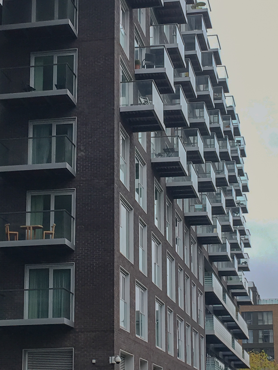
The shot Ive put up is only a phone pic as I grabbed it whilst in Docklands the other day. Its not great, but the building does have potential......

Possibly my weakest shot ever in my 52...

Wall
Wall (1 of 1) by Mark P, on Flickr
 
We all get those themes that do nothing for us but you have done it now and can move on, interesting building though, I agree with Susie too
 
Hi Mark

Wood - only a minor niggle from me... i'd prefer to see a tad more on the left to keep the text un-clipped, other than that love the detail in this and the nice warm colours, that along with the even light and dark background make it a great image (y)

Sorry to hear about your health, your snap of the building looks a nice gritty urban image which is fine with me for the theme :)

Hope you get better soon mate !!
 
Wall is interesting enough and the angle from which you took it means the balconies give diagonals that I find lead the eye through the photo.
 
I like this. But I thought it was Symmetrical !! Thinking .....crop 20% off the bottom and lets see more balconies LHS. Wall, Symmetrical, whatever, it's still a nice find.
 
Back
Top