

You are using an out of date browser. It may not display this or other websites correctly.
You should upgrade or use an alternative browser.
You should upgrade or use an alternative browser.
weekly Hertsmans 52 for 2017 Rustic,Festive, weather added-and DONE !
- Thread starter Hertsman
- Start date
OP
- Messages
- 3,413
- Name
- Mark
- Edit My Images
- Yes
Thanks Susie, onwards and upwards......Hi Mark , it's actually very interesting I like it, I would have cropped it though to the left vertical corner. Good idea to use your phone to keep up")
Thanks for the comment AllanWe all get those themes that do nothing for us but you have done it now and can move on, interesting building though, I agree with Susie too
Cheers DK....Hi Mark
Wood - only a minor niggle from me... i'd prefer to see a tad more on the left to keep the text un-clipped, other than that love the detail in this and the nice warm colours, that along with the even light and dark background make it a great image
Sorry to hear about your health, your snap of the building looks a nice gritty urban image which is fine with me for the theme
Hope you get better soon mate !!
Getting there I hope Dave....A nice gritty wall shot Mark, good lighting and good that you got a shot in. Hope you feel better soon.
Thanks Chris, it was the diagonals that caught my eye intially...Wall is interesting enough and the angle from which you took it means the balconies give diagonals that I find lead the eye through the photo.
See? London, the city that never stops giving....I like this. But I thought it was Symmetrical !! Thinking .....crop 20% off the bottom and lets see more balconies LHS. Wall, Symmetrical, whatever, it's still a nice find.
Cheers Tim, I think the sky was just totally blown by the phone and Ive just tried to babalnce the image out a bit in LR....Hi Mark,
Wall - We all have PABD moments Mark, and as they go, this isn't bad.
Plenty of detail in the subject matter. Bit of an odd look to the sky though. Banding?
OP
- Messages
- 3,413
- Name
- Mark
- Edit My Images
- Yes
And So we move forward and finally catch up after being behine the 8 ball for a few weeks....
Really think I should buy some new work boots, as these are clearly WORN out.....
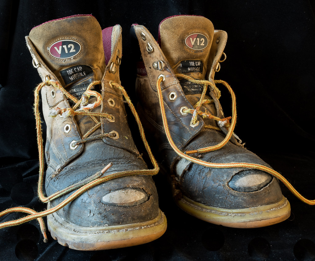 Worn (1 of 1) by Mark P, on Flickr
And , here is some nice natural SYMMETRY.....
 Symmetry (1 of 1) by Mark P, on Flickr
Really think I should buy some new work boots, as these are clearly WORN out.....
Worn (1 of 1) by Mark P, on FlickrAnd , here is some nice natural SYMMETRY.....
Symmetry (1 of 1) by Mark P, on FlickrLC2
Negan
- Messages
- 10,451
- Name
- Tim
- Edit My Images
- Yes
Just when I thought I'd got to the end of a mammoth 2 and a bit pages of comment catch-up, I refresh and you've added a couple more Mark
Worn - Bang on theme. Good strong black background, plenty of detail.
They look like they've seen some significant usage.
Symmetrical - Use of the same background eh? Still it works well with the green, so it's all good Sharp crisp shot.
I hope you did the apple before the boots, otherwise I'm not sure how edible teh crops would be at the end.
OP
- Messages
- 3,413
- Name
- Mark
- Edit My Images
- Yes
Just when I thought I'd got to the end of a mammoth 2 and a bit pages of comment catch-up, I refresh and you've added a couple more Mark
Worn - Bang on theme. Good strong black background, plenty of detail.
They look like they've seen some significant usage.
Symmetrical - Use of the same background eh? Still it works well with the green, so it's all good Sharp crisp shot.
I hope you did the apple before the boots, otherwise I'm not sure how edible teh crops would be at the end.
Sorry Tim !
I love these boots, they are like wearing slippers, but sadly the soles are worn through now, so I will have replace.......
Worn is a great shot and very nicely on theme, a great BG not too dark to really set off the boots.
Symmetrical, a clever shot to use the apple up and lying down. Great lighting and good focus
Cheers Dave
I have a large piece of black velvet that is very usefull for generic type shots, I use it too much probably.....
LC2
Negan
- Messages
- 10,451
- Name
- Tim
- Edit My Images
- Yes
Can't you get them re-soled?Sorry Tim !
I love these boots, they are like wearing slippers, but sadly the soles are worn through now, so I will have replace.......
I did that for years with an old pair of German Army Para boots I used to wear on the motorbike.
- Messages
- 11,087
- Name
- Allan
- Edit My Images
- No
Both good images for the theme, the use of the apple for symmetry is a nice idea, the lighting on the apple facing us is not as good as the one lying flat it looks little brighter
I did a couple of shots of my walking boots but didn't go with it in the end and they are much more worn than mine
I did a couple of shots of my walking boots but didn't go with it in the end and they are much more worn than mine
- Messages
- 7,548
- Name
- susie
- Edit My Images
- Yes
Love those boots Mark, there's nothing like a real comfy pair of boots, perfect choice for the theme and composition is spot on.
The Apple, the idea is so simple but it works really well ...why didn't I think of that one!
There's a bit of a crease in the velvet in front of the Apple, I think that helps to stop it looking floaty, good idea to use that.
The Apple, the idea is so simple but it works really well ...why didn't I think of that one!
There's a bit of a crease in the velvet in front of the Apple, I think that helps to stop it looking floaty, good idea to use that.
- Messages
- 104,475
- Name
- The other Chris
- Edit My Images
- Yes
Worn, spot on for the theme, there are a few wrinkles in the background, bottom left but a really good take on the theme.
Symmetry is nicely done (nit-picking again about a few wrinkles) good composition, well lit, nice and sharp.
Symmetry is nicely done (nit-picking again about a few wrinkles) good composition, well lit, nice and sharp.
- Messages
- 662
- Name
- John
- Edit My Images
- Yes
Worn really great Mark. I was thinking alo ghte same lines but yours make mine look pristine Agree about the laces but the wrinkles in the velvet work well for me adding to the "ground" effect.
Lovely idea for symmetry and well shot
Must go and find some black velvet
Agree about the laces but the wrinkles in the velvet work well for me adding to the "ground" effect.Lovely idea for symmetry and well shot
Must go and find some black velvet
OP
- Messages
- 3,413
- Name
- Mark
- Edit My Images
- Yes
Thanks AllanBoth good images for the theme, the use of the apple for symmetry is a nice idea, the lighting on the apple facing us is not as good as the one lying flat it looks little brighter
I did a couple of shots of my walking boots but didn't go with it in the end and they are much more worn than mine
Love those boots Mark, there's nothing like a real comfy pair of boots, perfect choice for the theme and composition is spot on.
The Apple, the idea is so simple but it works really well ...why didn't I think of that one!
There's a bit of a crease in the velvet in front of the Apple, I think that helps to stop it looking floaty, good idea to use that.
Cheers Susie, Im quite pleased witht he apple tbh...
Thanks AnsyWorn, yup, worn.
Nice detail and lighting. Not sure if I'd like all the laces in, think I would.
Good clean BG works well also.
Cheers.
Worn, spot on for the theme, there are a few wrinkles in the background, bottom left but a really good take on the theme.
Symmetry is nicely done (nit-picking again about a few wrinkles) good composition, well lit, nice and sharp.
As Susie mentioned Chris, they help ground the shot in my view.
Thanks John, its cheap down the market, but by god does it collect fluff!Worn really great Mark. I was thinking alo ghte same lines but yours make mine look pristine
Lovely idea for symmetry and well shot
Must go and find some black velvet
Cheers DoodA couple of good ones Mark.
Some serious Worn out boots, good lighting and detail, perfect for the theme.
... and the apple is a nice idea too.
OP
- Messages
- 3,413
- Name
- Mark
- Edit My Images
- Yes
.....here is Colourfull...sadly not quite as good as it looked in my head, but hey ho....
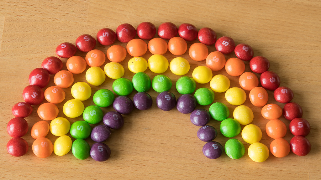 untitled (1 of 5) by Mark P, on Flickr
untitled (1 of 5) by Mark P, on Flickr
OP
- Messages
- 3,413
- Name
- Mark
- Edit My Images
- Yes
 untitled (11 of 11)
- Messages
- 7,548
- Name
- susie
- Edit My Images
- Yes
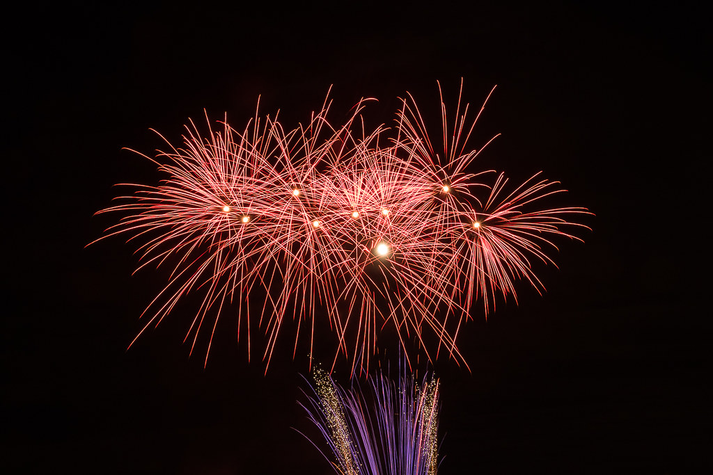
Hi Mark, love the firework, the Skittles work really well too, I'd like to see them either all with a 's' on or none at all, but that's just my OCD setting in. Super colourful idea perfect for the theme, one you could problem fiddle about with on different backgrounds, a reflection on black would look good too.
LC2
Negan
- Messages
- 10,451
- Name
- Tim
- Edit My Images
- Yes
Hi Mark,
Loving the effort and execution put into the rainbow shot. I think that is my preference of the two.
The fireworks look sharp though. Comparing your shot and Chris's the difference seems to be the aperture used.
So possibly longer exposure but smaller aperture is the way to go.
Loving the effort and execution put into the rainbow shot. I think that is my preference of the two.
The fireworks look sharp though. Comparing your shot and Chris's the difference seems to be the aperture used.
So possibly longer exposure but smaller aperture is the way to go.
- Messages
- 671
- Name
- Nigel
- Edit My Images
- Yes
Worn - bang on theme but they are more f****d than worn
Colorful - Nice idea with the skittles but should of made sure they all had the S face up, fire work shot it good too.
Colorful - Nice idea with the skittles but should of made sure they all had the S face up
, fire work shot it good too.- Messages
- 5,432
- Name
- Andrea
- Edit My Images
- Yes
Hi Mark, you've posted some cracking images since my last visit
Wood shows some excellent control of light to get the detailed textures in the wood and the lovely warm glow of the metal against a deep black background. I'm not so bothered about not seeing all of 'Made' on the top left, but I would have left just a touch more room at the top to really contrast against the metal. It's a super-looking subject and you've done it justice with that image.
Sorry you've been having health issues and it was a good idea to use your phone to keep on track with your 52 (I must remember that!). You found an interesting building for Wall and although you'd probably have done it differently with more time and your 'proper' camera, it does the job for the theme and you found an good angle to show so many balconies and windows too.
Those boots are perfect for Worn and again you've shown off lots of textures by controlling the light and using a dark background. I hope you'll keep them, even when you have replacements, as they're excellent subjects for photos!
Symmetry and the apples are a good idea. I would never have thought of that, and it's another nicely composed and lit still life.
Skittles - yummy, I find them hard to resist! Great choice for Colourful and it must have taken some time to set up
OP
- Messages
- 3,413
- Name
- Mark
- Edit My Images
- Yes
Cheers, they didnt last long afterwards...I bet that took some setting up. I quite like it, but if I'd have done it there would only be one row (because I would have eaten all the others
Thanks AllanI know what you mean about it not working out quite as you thought it would but it is colourful
Cheers TilzNice shot of the fireworks but I love the skittles rainbow, great idea for the theme
fireworks are great! they always photography well.
the other one ... hmmm I think another two minutes spent on presentation ... on a white BG, with - I don't know - maybe flash bounced off the ceiling .... might add.
Yeah, prob right TBH D...
OCD indeed Susie - Id not even noticed the S until you mentioned it !Hi Mark, love the firework, the Skittles work really well too, I'd like to see them either all with a 's' on or none at all, but that's just my OCD setting in. Super colourful idea perfect for the theme, one you could problem fiddle about with on different backgrounds, a reflection on black would look good too.
thanks DaveFireworks shot for me, great colours and well taken.
Rainbow neede more time than I gave it tbh Chris, but thanks anywayI like the skittles rainbow, good idea, might work better on a darker background? Nice fireworks shot
Hi Tim, I wanted to use my remote trigger and use some quite long expo, but my cable release wouldnt talk to my D500, so I just set to 4 sec and got waht I gotHi Mark,
Loving the effort and execution put into the rainbow shot. I think that is my preference of the two.
The fireworks look sharp though. Comparing your shot and Chris's the difference seems to be the aperture used.
So possibly longer exposure but smaller aperture is the way to go.
Yaeh, that.Worn - bang on theme but they are more f****d than worn
Colorful - Nice idea with the skittles but should of made sure they all had the S face up
Hi Mark, you've posted some cracking images since my last visit
Wood shows some excellent control of light to get the detailed textures in the wood and the lovely warm glow of the metal against a deep black background. I'm not so bothered about not seeing all of 'Made' on the top left, but I would have left just a touch more room at the top to really contrast against the metal. It's a super-looking subject and you've done it justice with that image.
Sorry you've been having health issues and it was a good idea to use your phone to keep on track with your 52 (I must remember that!). You found an interesting building for Wall and although you'd probably have done it differently with more time and your 'proper' camera, it does the job for the theme and you found an good angle to show so many balconies and windows too.
Those boots are perfect for Worn and again you've shown off lots of textures by controlling the light and using a dark background. I hope you'll keep them, even when you have replacements, as they're excellent subjects for photos!
Symmetry and the apples are a good idea. I would never have thought of that, and it's another nicely composed and lit still life.
Skittles - yummy, I find them hard to resist! Great choice for Colourful and it must have taken some time to set up
Thanks for the detailed reply, always nice to read your thoughts. Im glad you didnt hung up on the "Made" thing, as the topic was wood after all....I love my old boots, for character alone if nowt else...My symmetry shot is one of my personal faves fro the year tbh, came out really well I thouht.
OP
- Messages
- 3,413
- Name
- Mark
- Edit My Images
- Yes
Catchup time for me....
Height....or not much of....
 untitled (1 of 3) by Mark P, on Flickr
Remote shutter release....(lightings not great, but its all Ive got)
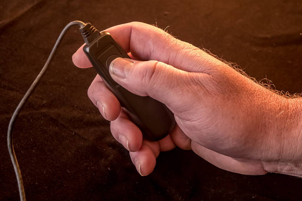 untitled (3 of 3) by Mark P, on Flickr
Reshoot - Wall....
 untitled (2 of 3) by Mark P, on Flickr
Height....or not much of....
untitled (1 of 3) by Mark P, on FlickrRemote shutter release....(lightings not great, but its all Ive got)
untitled (3 of 3) by Mark P, on FlickrReshoot - Wall....
untitled (2 of 3) by Mark P, on Flickr- Messages
- 13,760
- Edit My Images
- Yes
Hi Mark
I trying to catch up a tad too and while checking your shots out I must say I love your fireworks pic, the colours go really well and a fantastic black sky to set them off too
Height is a good take for the theme, the crop really suits it too, I am glad you kept the sign in as that splash of red is nice
Remote - Perfect idea for the theme and real good detail - and good to get a re-shoot in, ignoring the wonky horizon that is a stonking wall and I would have liked it taking up more of the frame, I think it leads into the frame nicely
LC2
Negan
- Messages
- 10,451
- Name
- Tim
- Edit My Images
- Yes
Hi Mark,
Height - The signage there really does spell out the height.
What a pity that evidently a lot of people can't read and have hit the bridge protection...
Nicely symmetrical and it leads your eye through the image.
Remote - Well... Someone had to Functional and to the point.
Re-shoot : Wall - I have to agree with Allan, the shot isn't straight (judging by the house) but that really is a great piece of wall.
is it a remnant of a fortification of some kind? I like that you've taken the shot along the wall, it emphasises the length of it.
Height - The signage there really does spell out the height.
What a pity that evidently a lot of people can't read and have hit the bridge protection...
Nicely symmetrical and it leads your eye through the image.
Remote - Well... Someone had to
Functional and to the point.Re-shoot : Wall - I have to agree with Allan, the shot isn't straight (judging by the house) but that really is a great piece of wall.
is it a remnant of a fortification of some kind? I like that you've taken the shot along the wall, it emphasises the length of it.
- Messages
- 9,075
- Name
- David
- Edit My Images
- Yes
Height ... some people are lucky, we don't have bridges like that here in London. ... quite a find.
Remote ... not keen on that BG I'm afraid. Just an OOF floor would be better imo.
That's some wall. But looks wonky and the distant house confirms it.
... quite a find. Remote ... not keen on that BG I'm afraid. Just an OOF floor would be better imo.
That's some wall. But looks wonky and the distant house confirms it.
OP
- Messages
- 3,413
- Name
- Mark
- Edit My Images
- Yes
Thanks Allan, Remote was always going to be a PABD, I know its a weak shot....well spotted image for height, "remote" not really doing anything for me though I did expect to see more remote controls, "Wall" thats one hell of a wall though the picture is not straight
Hi Mark
I trying to catch up a tad too and while checking your shots out I must say I love your fireworks pic, the colours go really well and a fantastic black sky to set them off too
Height is a good take for the theme, the crop really suits it too, I am glad you kept the sign in as that splash of red is nice
Remote - Perfect idea for the theme and real good detail - and good to get a re-shoot in, ignoring the wonky horizon that is a stonking wall and I would have liked it taking up more of the frame, I think it leads into the frame nicely
Thanks Dean
Hi Mark,
Height - The signage there really does spell out the height.
What a pity that evidently a lot of people can't read and have hit the bridge protection...
Nicely symmetrical and it leads your eye through the image.
Remote - Well... Someone had to
Re-shoot : Wall - I have to agree with Allan, the shot isn't straight (judging by the house) but that really is a great piece of wall.
is it a remnant of a fortification of some kind? I like that you've taken the shot along the wall, it emphasises the length of it.
Cheers Tim seems like a theme running through these comments....lol
Thanks Chris, Im quietly pleased with my Height shot.Tend to agree with the above, height is a really good idea for the theme and the wall is nice and sharp throughout and I like the detail in the flint close up leading into the distant scene
Thanks DaveA nice little catch up Mark, of the lot my pic is wall. A great looking long old flint wall, really leads the eye right in to the shot
Height ... some people are lucky, we don't have bridges like that here in London.
Remote ... not keen on that BG I'm afraid. Just an OOF floor would be better imo.
That's some wall. But looks wonky and the distant house confirms it.
Remote is pants, I know...
Height
Looks good, nobody said it had to be high, just that it was height and 8'9" is the height of the bridge.
Remote
I think it could have been a bit more imaginative, but we all get that theme that does nothing for us.
Time and the 52 wait for no one and time is always against me....
And finally, an edit....
The Wall, squared....
 wall2 (1 of 1) by Mark P, on Flickr
Last edited:
OP
- Messages
- 3,413
- Name
- Mark
- Edit My Images
- Yes
So, we move onto Build....
This shot is a fun one for me, as it means a return of Day Geckos to my house, after selling my breeding pair of Giant Day Geckos...
Ive really missed these fascinating yet funny critters, and had set my mind to set up a marine Reef tank - but following hours of research, the amount of money and work involved scared me right off. Susbsequently, Id been stashing spare cash away for the reef - approx cost £3k (!!)....
I then realised another Gecko viv would be way more fun and about a tenth of the cost....
Soo, this is the start of my new Day Gecko viv BUILD....
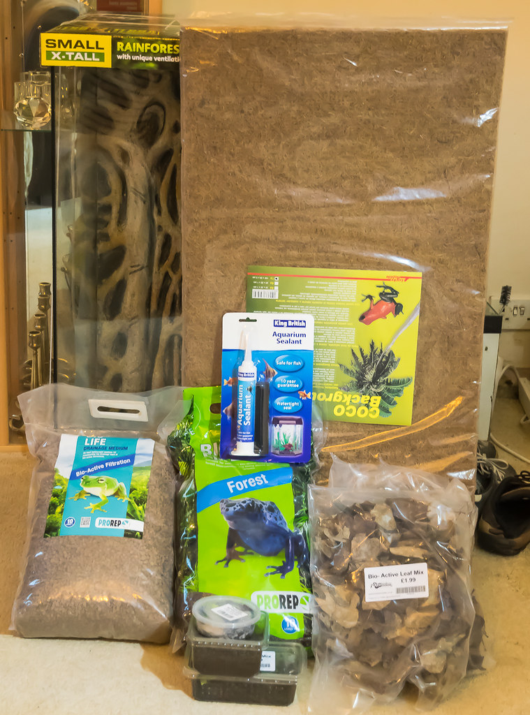 Build (1 of 1) by Mark P, on Flickr
This shot is a fun one for me, as it means a return of Day Geckos to my house, after selling my breeding pair of Giant Day Geckos...
Ive really missed these fascinating yet funny critters, and had set my mind to set up a marine Reef tank - but following hours of research, the amount of money and work involved scared me right off. Susbsequently, Id been stashing spare cash away for the reef - approx cost £3k (!!)....
I then realised another Gecko viv would be way more fun and about a tenth of the cost....
Soo, this is the start of my new Day Gecko viv BUILD....
Build (1 of 1) by Mark P, on Flickr
Last edited: