Critique Homage to Cartier Bresson

Messages
1,156
Name
Chris
Edit My Images
No
Just spent a day or so in Bristol and trying to get more comfortable with urban shots more generally.

I thought this stairway was reasonably interesting and just as I was composing the picture a runner appeared at the top and - for me - added a lot more interest

1247-1385831299-24f2df929aef7bdc9e749b521ff5793c.jpg


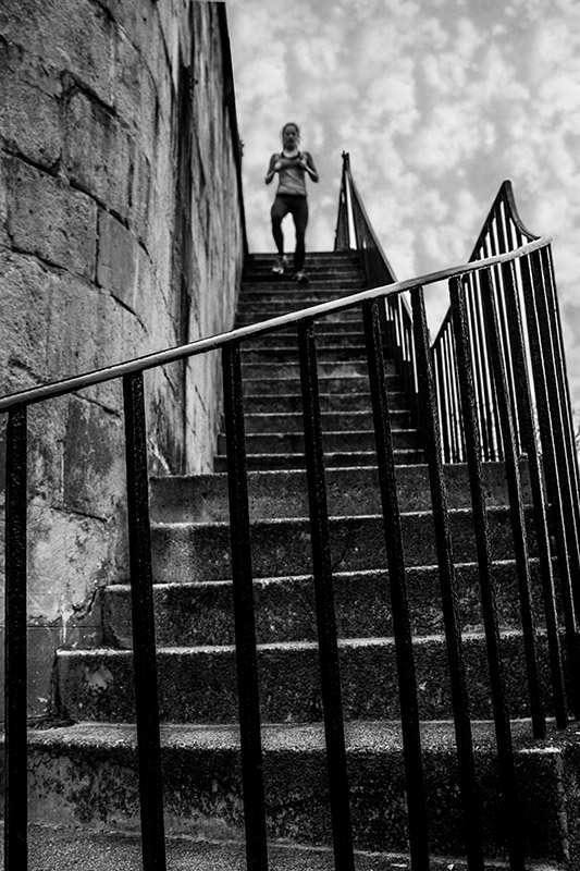
I couldn't help but think of the famous Cartier-Bresson picture, although I have to say that it wasn't particularly in my mind when I first saw the steps.

I have taken a bit of care in trying to get it how I want it so any suggestions on how it could be done differently welcomed.
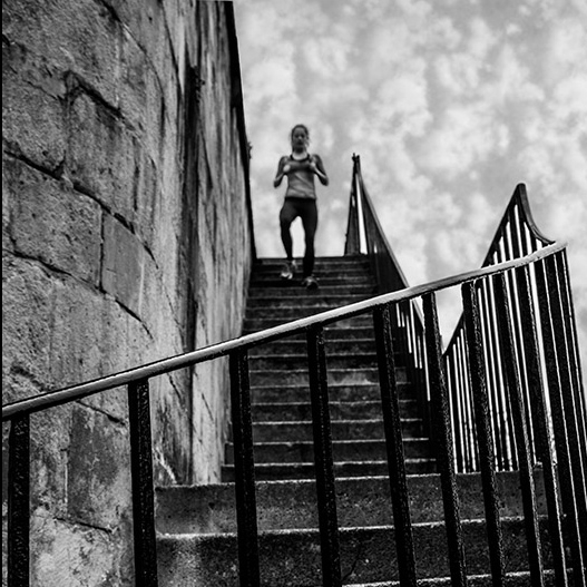
 
Compositionally I like it. The runner looks a little distorted, lucky it was blurred too much.
 
Compositionally I like it. The runner looks a little distorted, lucky it was blurred too much.

Thanks for the feedback - the Cartier-Bresson bike rider was blurred too, although in my case it resulted from the aperture priority resulting in a slow shutter speed on a very dull day.
 
Last edited:
I like it, perhaps a square crop losing the bottom third would place more emphasis on the runner?
 
Like this:

1252-1385880334-e98c2db4c8e81b590bd702ba0aa9a614.jpg
 
Not sure of the crop, I prefer the original. For me it loses to much of the railings at the bottom, which being at an angle compared to the rest of the image adds tension and focus. The main focus on the crop is now the runner, not on the steps and railings. With Cartier Bressons image, the cyclist in silhouette is an initial focus point as it's highlighted against the light background but the main shape and structure becomes the dominent. With your original crop, the railings draw the eye to the person and sky.
 
Seeing both images together they both work for me, I wasn't looking to replicate HCB just to remove the emphasis from the foreground railings.
 
Thanks for your comments Byker - your image analytically abilities are probably better developed than mine.

Are you saying that the way you see it the Cartier-Bresson image has the dark cyclist against a light background (positioned at thirds) and that is what you look at first and then the eye is drawn up the curling stairs towards the viewer but in mine you start with the stairs/railing and your eye is drawn away from the viewer to the runner the top of the stairs.

If so I didn't see it that way - for the Cartier-Bresson I see the eye starting at the top of the stairs and being drawn down them towards the cyclist. In mine it is the same except the eye is drawn up the stairs to the focal point ie in both the eye is drawn towards the person.

Getting a bit philosophical etc for me, but a bit now and again is good for the little grey cells (well what's left of mine anyway):) It helps to explain why I like or dislike a picture even if it doesn't necessarily help to produce it in the first place
 
Back
Top