

You are using an out of date browser. It may not display this or other websites correctly.
You should upgrade or use an alternative browser.
You should upgrade or use an alternative browser.
weekly IanD's 52 For 2018 (Week 11 - Wet)
- Thread starter IanD
- Start date

OP
- Messages
- 1,566
- Edit My Images
- Yes
As above WB is off it’s easy to fix though, a nice idea
Thought i'd fixed it in the second attempt

OP
- Messages
- 1,566
- Edit My Images
- Yes
You don't need someone else to mention WB
Was there something up with the WB then

- Messages
- 4,562
- Name
- Mark Gameson
- Edit My Images
- Yes
HI Ian
Nice original idea for people the only issue I have is the white balance (I don't think anyone hasn't mentioned that)
Nice original idea for people the only issue I have is the white balance (I don't think anyone hasn't mentioned that
)- Messages
- 4,640
- Name
- Pete
- Edit My Images
- Yes
Prefer the breakfast to the people to be honest, it does take long to look at the photos inside and there's nowt to read in it, (same for a lot of papers these days)
Should I mention the white balance, perhaps not.
Pete
Should I mention the white balance, perhaps not.
Pete
- Messages
- 7,548
- Name
- susie
- Edit My Images
- Yes
Hi Ian ....I thought the first one had a nice warm glow
Sorry I’m late hopping in but better late than never ....you’ve captured a brilliant expression on the dogs face, he looks a real beauty and very wistful!
Good thinking with The People, that breakfast Is distracting though .... you can’t beat a fry up.
Sorry I’m late hopping in but better late than never ....you’ve captured a brilliant expression on the dogs face, he looks a real beauty and very wistful!
Good thinking with The People, that breakfast Is distracting though .... you can’t beat a fry up.
OP
- Messages
- 1,566
- Edit My Images
- Yes
People ... nothing like a different take .... full marks for that, but that OOF Full English is a bit much. Of course the newspaper is the subject, but just wondering if the focus on the fryup would work better.
That was really bothering me too David, but like you say, was all about the newspaper
OP
- Messages
- 1,566
- Edit My Images
- Yes
good thinking for a different take on the theme. just needed tweeking
The white balance maybe?
- Messages
- 9,095
- Name
- Mandy
- Edit My Images
- Yes
People - a nice different take on the theme, I agree with the others comments.
OP
- Messages
- 1,566
- Edit My Images
- Yes
Could not make my mind up on these two but running out of time and light to get done. Not entirely happy but job done
Stark tree and stark field - B&W or colour?
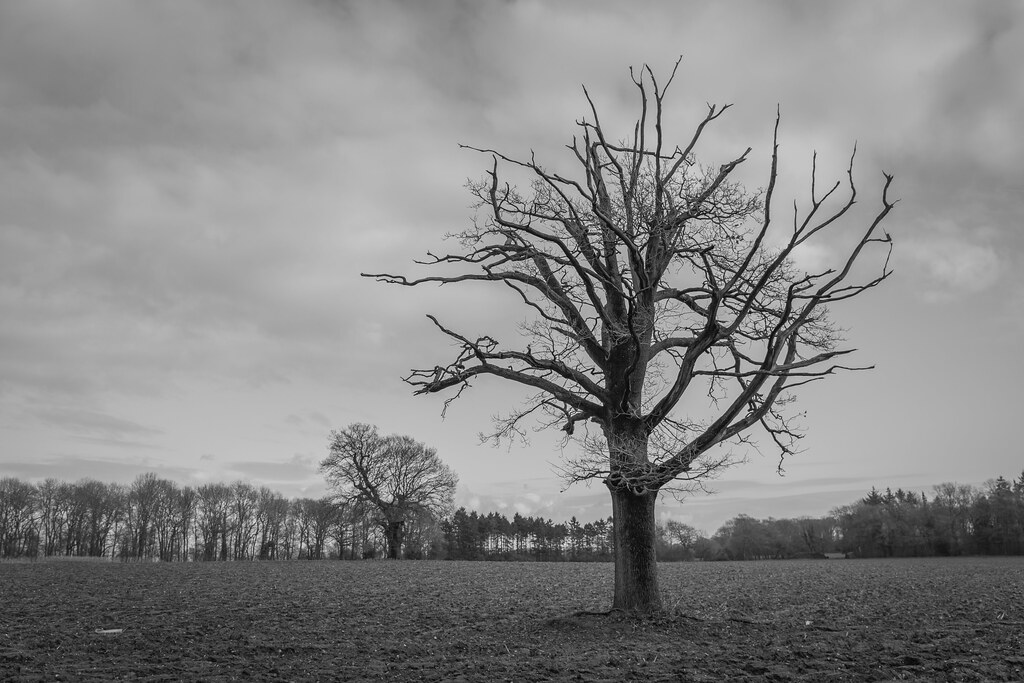 Tree b&w by ***tuttifrutti***, on Flickr
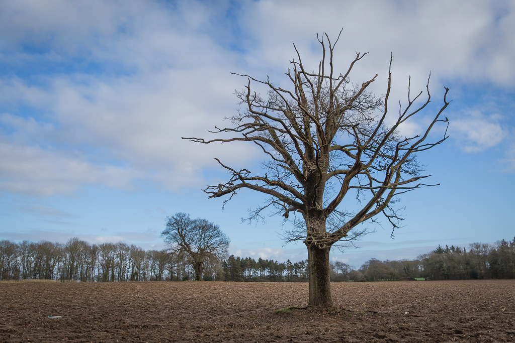 Tree colour by ***tuttifrutti***, on Flickr
Stark tree and stark field - B&W or colour?
Tree b&w by ***tuttifrutti***, on FlickrTree colour by ***tuttifrutti***, on Flickr- Messages
- 4,562
- Name
- Mark Gameson
- Edit My Images
- Yes
I'd usually go B&W but in this case I think I would go with the colour version as the tree stands out more from the sky
OP
- Messages
- 1,566
- Edit My Images
- Yes
B&W and add a bit more oomph to the sky
That's what I wanted to do (in Lightroom) but couldn't figure out how. If I pulled the shadows back, increased black, changed exposure, then it would also affect the tree and lose it's detail
- Messages
- 174
- Edit My Images
- Yes
Really like the B&W photo but think I prefer the colour. Couldnt tell you why.
- Messages
- 4,640
- Name
- Pete
- Edit My Images
- Yes
Colour looks best, but if you can get more out of the sky in the B&W it would fit the theme nicely
OP
- Messages
- 1,566
- Edit My Images
- Yes
Okey dokey folks, how does this work for you learned folks
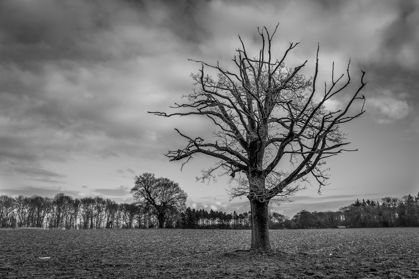 Tree b&w edited by ***tuttifrutti***, on Flickr
Tree b&w edited by ***tuttifrutti***, on Flickr- Messages
- 1,473
- Name
- Paul
- Edit My Images
- Yes
much better, more contrasty and PS, you cannot half cook a breakfast, or was that a plate to share
- Messages
- 13,760
- Edit My Images
- Yes
Theme wise the B&W version but much preferring the colour image, it appears to have higher contrast for me... looking again before I press 'Post Reply' and NO, I change my mind, the Colour works better for the theme too
- Messages
- 9,095
- Name
- Mandy
- Edit My Images
- Yes
Stark - the colour image for me as well, but having a had a closer look at your second B&W image I also like that as well, you have managed to lift the sky and make it a bit more interesting.
- Messages
- 662
- Name
- John
- Edit My Images
- Yes
Prefer the B&W Ian, better in the second version. Colour version is good but it's the shape that makes it stand out starkly against the sky.
- Messages
- 4,562
- Name
- Mark Gameson
- Edit My Images
- Yes
Having seen the second b&w image Ian that is the pick of the three the tree really grabs your attention
OP
- Messages
- 1,566
- Edit My Images
- Yes
 Over
Over