Jökulsárlón aurora

Messages
29
Name
Pete Johns
Edit My Images
Yes
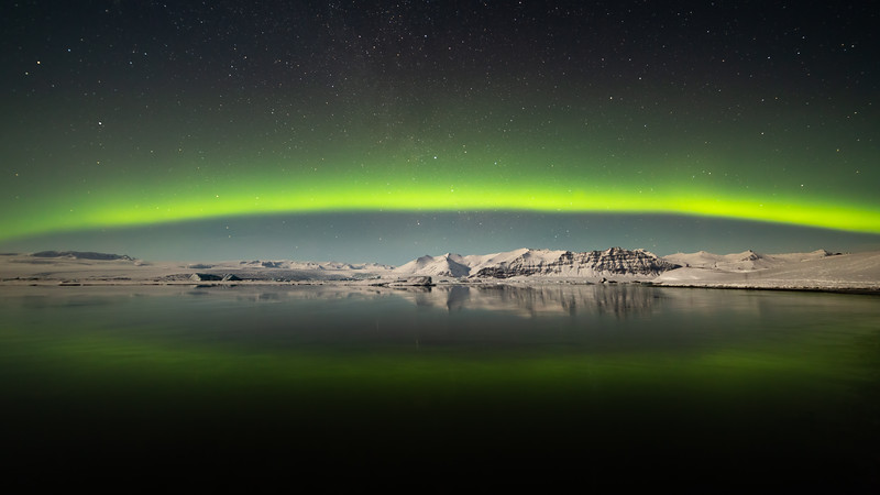
Ok, massive cliche time! I took this one back in 2016 after a couple of weeks touring Iceland. On the very last day of shooting, I finally managed to get in the right place at the right time.


I entered this shot into the International Astronomy Photographer of the Year competition in 2016 but got nowhere with it, which is my usual place with photography competitions!. However, it was interesting to see a shot from the same location on the same night make the selection the same year- https://www.theguardian.com/science...-of-the-year-2016-shortlist-in-pictures#img-3
Why do you think that shot was selected over mine?

Hope this doesn't come across as sour grapes, I really don't care about the competition, but just curious why one was picked over the other? I'm not sure if I did something wrong with the composition or where the processing could have been better. Feedback and thoughts welcomed!
 
Agree with Holty, stronger colour and more contrasty and it is slightly more dynamic with the closer view and making more of the slight diagonal. Yours is more traditional with great symmetry. Comps tend to have judges see images for a second or two and that bit of punch probably got it through or perhaps your image was seen after this was chosen and they didn't want two very similar images. That isn't to take away from yours which is a stoater too. Try it with similar processing to the other one and see if you like it better or not
 
The shot who got selected has too much saturation to my taste.

I have seen and shot a lot of northern light and I actually start to find it very annoying when the pictures have over the top saturation, really stronger colour doesn't make a picture better. Nowadays, anyone with enough money can make any rubbish northern light display (barely visible to the naked eye) look sensational by using f1.8, iso 50000, and wacking saturation up in photoshop. (I'm not talking of this shot really but just it's just a general observation of what I see on my local aurora group on facebook). I've stared shooting northern light 10 years ago with a canon 30D and a wide angle at f3.5 wide open. A good display can be shot at iso 400, f3.5. Camera have gone a long way since. People can even film the aurora now which is incredible.

I do like the clarity he has in the mountain but I find yours more natural and I like the way you capture the whole arc and a bit of milky way. What a stunning landscape to be. It really is a dream to go on one of these places some day.
 
The winning picture has way too much contrast and far too high a black point.

The more I look at this...the more I like the OPs picture and the less I like the winner.

A word of advice to the OP. Don't judge your pictures as how they did in a competition.

They're judged by people, and probably by people who don't share your taste or even by people you have nothing in common with.

I saw a video of Charlie Waite critiquing an image, saying what he liked about it and I realised I have in terms of taste absolutely nothing in common with him.

He just likes and looks for things in a picture that I don't. And that's fine...but when you enter a competition you can't expect to win or do well when they're judged by people who see it differently to you.

I like your picture, I prefer it to the winner. Others here don't. That's life.

Just shoot, compose and edit how you like and ignore the noise and competitions.
 
Thank you all for the comments, most helpful.

I've had a go at re-processing the image. Top one is the same as I posted original, second one is new.


Changes made:
- Mountains in the background are now more white. Actually less realistic as the aurora gave them a slight green tint, but I think it looks cleaner on the image
- Less harsh processing on the night sky, resulting in a reduced 'green' effect outside of the aurora
- Slight bump to the colours on the aurora itself
- Used Topaz DeNoise for the first time to clean up the image
- Small crop

Improvement or not?
 
Last edited:
  • Like
Reactions: KJJ
your second edit is much better. feels less... hazy, clearer with better contrast and more natural colour in the mountains and sky
 
The winning picture has way too much contrast and far too high a black point.

The more I look at this...the more I like the OPs picture and the less I like the winner.

A word of advice to the OP. Don't judge your pictures as how they did in a competition.

They're judged by people, and probably by people who don't share your taste or even by people you have nothing in common with.

I saw a video of Charlie Waite critiquing an image, saying what he liked about it and I realised I have in terms of taste absolutely nothing in common with him.

He just likes and looks for things in a picture that I don't. And that's fine...but when you enter a competition you can't expect to win or do well when they're judged by people who see it differently to you.

I like your picture, I prefer it to the winner. Others here don't. That's life.

Just shoot, compose and edit how you like and ignore the noise and competitions.


:plus1: x100!
 
To me, instantly I see a huge difference between the two. The winning image I wouldn't say is perfect, but its good,
Unfortunately my instant reaction with your yours is that its a reject. Way too much green for a start, the whole image lacks interest and punch. The rich blues in the winning shot add a lot as well, which yours is lacking.

Sorry if that seems so harsh, but in my environment, I'm shooting for clients and I know what they do and don't like, and I know that if they were standing over my shoulder looking at your image as I took and / or processed it, they would be rejecting it, or making suggestions to achieve the image they need, which would be more like the winning shot.
 
Firstly, let me say that I have never had the pleasure of seeing the Northern lights but I do admire most shots that I see of this wonderful natural event.
If I had taken your shot I would definately be framing it and hanging it on the wall.
As for the competition winner I can see why the judges have probably gone for it, I think the mountains are larger in the frame and more detail is on show. The image is more dynamic and the 2 people on the RHS also add to the overall image by adding a sense of scale. I don't think it's perfect though - if it was mine I would be cloning out the annoying light flecks in the foreground five in total, these draw your eyes away from the distant view where the main subject is.
.
 
I much prefer your first edit. I think the reflection in the water is nicer, I like the more generous space given to the sky. I'm not a fan of oversaturation, even if competition judges are and that winning image is ridiculously overcooked to my eye. But then, I don't win competitions either...:grumpy:
 
Back
Top