Why black and white? The roof is a lovely colour.. what do you feel making it black and white achieves?
Sorry, but it's a bit messy. I'm not one of these people who slams everything unless it obeys traditional rules of composition, but this is just messy. You've got edges of buttresses poking in from the sides, it's slightly disorienting and gives no sense of scale, yet is not close enough to show me detail if that's what you intended.
Lots of noise in the shadows speaks of a lot of shadow recovery, so quality isn't that great either.
Not working for me, sorry.


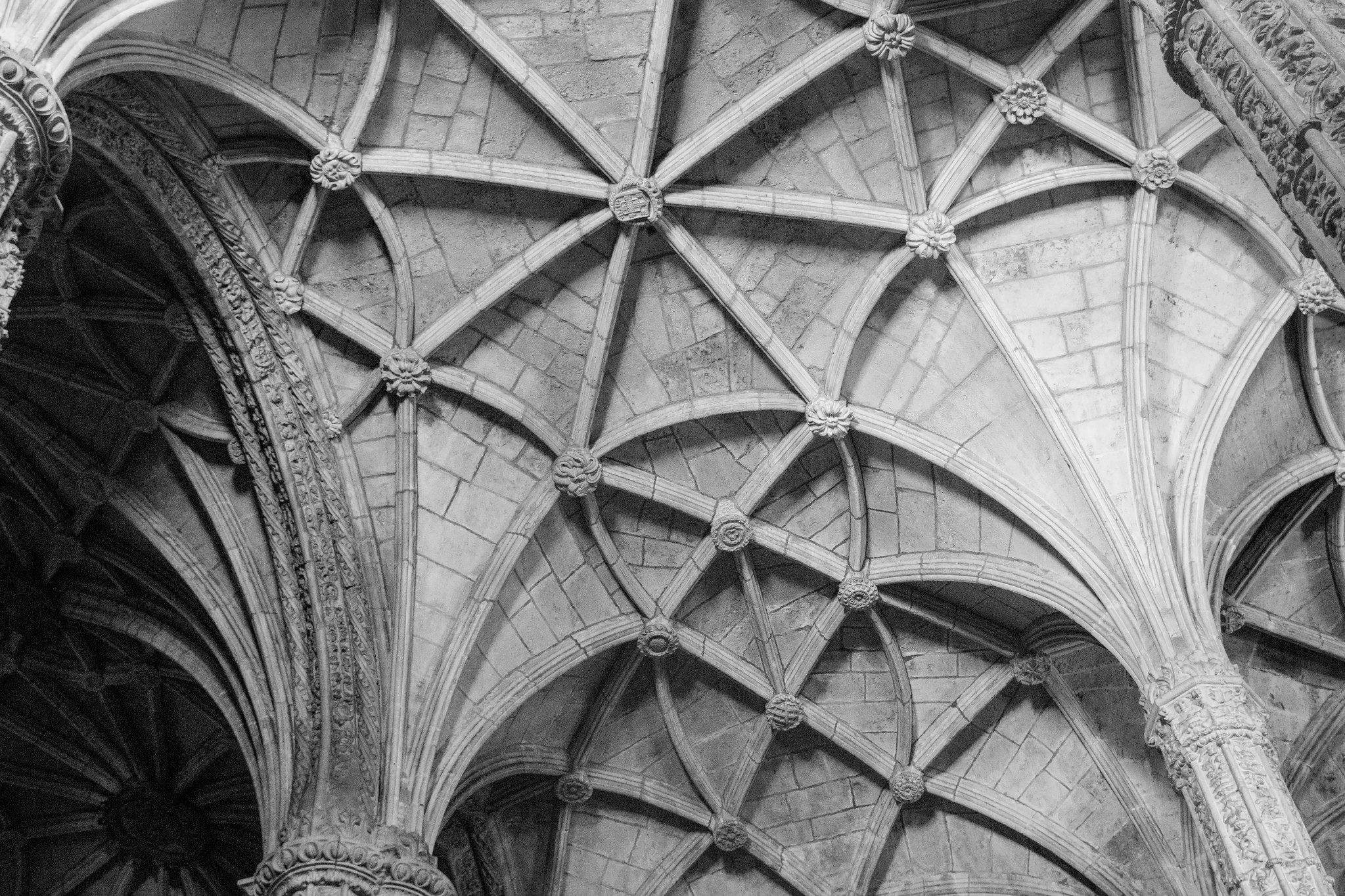 Jeronimos Roof