Critique Kayleigh .. A Portrait of a dancer.

R

RJ Bradbury

Guest
Good Evening Guys,

Since I have given some critique on images on here it's only fair that I post some of my own work for critique.

I have photographed Kayleigh a few times but wanted to get a still dancer portrait of her during our last session.

Any and all feedback welcome.

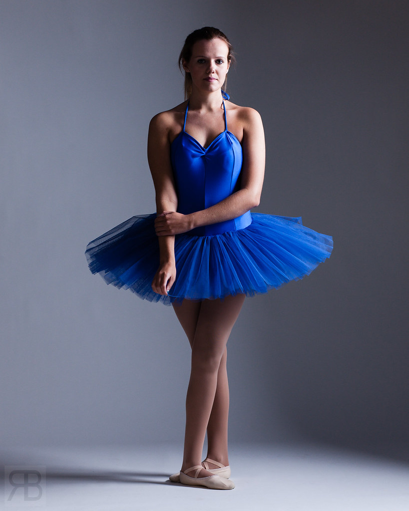
Kayleigh... by Richard Bradbury, on Flickr

Thank you

Rick
 
I like this.
I wonder if the image would have benefitted from a little fill light on Kayleigh's face to her right?
 
I like this.
I wonder if the image would have benefitted from a little fill light on Kayleigh's face to her right?

Thank you for the comment and feedback Peter.

I was not sure how much info to give about the image and my intention but in hindsight I rushed the post and gave too little.

Whilst I will use fill light for certain work, it's rare that I do if I am going for a more dramatic feel to the light to match the moment, expression and or pose of the subject. Plus I love shadows :)
 
Like this. Really like the split light on the background eg: light on dark and vice versa the other side. Love the colours too. I think the face being dark to the one side is exagerated a touch because the light side looks a tad to hot.

Gaz
 
Sorry to be negative but I'm not a huge fan tbh. The key light seems to hot and harsh on the side it's firing. I can see how Peter thought the shadows need lifted, I feel there's good detail in shadows, though a wee bit of light in her right eye would be nice, but the overall ratio is off because the light is a bit overpowering. I think dropping the power or feathering it off a bit would help and maybe a flag to drop the light hitting her arm and leg slightly. That said I agree with Gary I like the gradient on the background

The pose and expression looks like she's standing waiting to be directed in to the actual pose you want. The facial expression is just kinda blank but still staring at you and that arm gesture looks really defensive to me. I think it's partly because she's chin up and quite engaged at the camera but the body language isn't as alert, dunno just something doesn't tie it all. I almost feel like if you crop it from below her mouth so you don't get the face it's a stronger image. That said dancing isn't my thing, I know Simon has been shooting imo some amazing dance stuff lately so maybe @juggler will be able to offer his take.

One other thing for my taste and it's maybe just a me thing but I'm not a big fan of the arm hairs popping when you side light. If you set a layer above to darken and heal or paint over them with skin tone and then drop the opacity until they are there but you don't notice them it helps it imo.

I had a look at your site and you shoot some stunning stuff but this one just doesn't hit for me sorry.
 
I like the idea but it's not quite there for me, sorry.
The background shading is great, but the lighting on her face is just too harsh on her left side, looking almost burnt out (on my phone!).
Positioning of her legs and feet is good, but the arms just don't work for me as they are.
All imho of course.
 
Sorry to be negative but I'm not a huge fan tbh. The key light seems to hot and harsh on the side it's firing. I can see how Peter thought the shadows need lifted, I feel there's good detail in shadows, though a wee bit of light in her right eye would be nice, but the overall ratio is off because the light is a bit overpowering. I think dropping the power or feathering it off a bit would help and maybe a flag to drop the light hitting her arm and leg slightly. That said I agree with Gary I like the gradient on the background

The pose and expression looks like she's standing waiting to be directed in to the actual pose you want. The facial expression is just kinda blank but still staring at you and that arm gesture looks really defensive to me. I think it's partly because she's chin up and quite engaged at the camera but the body language isn't as alert, dunno just something doesn't tie it all. I almost feel like if you crop it from below her mouth so you don't get the face it's a stronger image. That said dancing isn't my thing, I know Simon has been shooting imo some amazing dance stuff lately so maybe @juggler will be able to offer his take.

One other thing for my taste and it's maybe just a me thing but I'm not a big fan of the arm hairs popping when you side light. If you set a layer above to darken and heal or paint over them with skin tone and then drop the opacity until they are there but you don't notice them it helps it imo.

I had a look at your site and you shoot some stunning stuff but this one just doesn't hit for me sorry.

Did someone mention me :) ?

It's difficult to offer much critique without understanding what the purpose of the shot is. As a portrait it's not all that engaging - partly because the lighting is too contrasty for the pose & expression. As a dance shot it lacks shape & dynamism and looks a bit like a test shot before she starts moving. But that's just my take. Maybe it does exactly what you had in mind?
 
Just a thought.. try dropping the exposure with a curves layer and converting to b&w.. so the right side of the face is in total shadow and the highlights are much dimmer. I reckon it'll burst into life, I'd post an edit if your settings allowed it.
 
Thanks for the feed back guys. It's good to find a forum that can provide feedback beyond the crap on Facebook such as nice DOF.

The exposure is IMO fine and the file can be pushed almost 2 stops before actually blowing out on her face/arm. It probably looks hotter on certain screens than it is.

The pose is not a pose nor directed. She fell in to it during a set and conversation at the time, I like to shoot these moments because they can often reveal something real. I agree they won't be a perfect pose though.

@CraigDHD No need to apologise at all you are not being negative, I appreciate the input and honest thoughts along with some feedback that has some meat to it. Thank you.

I can see I am going to really like this forum and the people on it. Great refreshing place. Thanks everyone.
 
Last edited by a moderator:
I like this.
I wonder if the image would have benefitted from a little fill light on Kayleigh's face to her right?
Whilst I really like the image, I have to agree with this. The first thing that struck me was the dark/light transition on her face.
 
I do have to agree with others, I'm not keen on the harshness of the shadow. It's not how I'd shoot a female face. And I also feel the highlights are a little hot for my taste. She also looks a little lost/bored.
But knowing you and how you shoot this is what you went for.

Not your strongest work mate.
 
Back
Top