
- Messages
- 5,275
- Name
- Ryan
- Edit My Images
- Yes

 Laura
Laura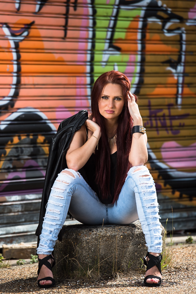 Laura
Laura
Last edited:

Nice shots but as a lighting novice No 2 confuses me. The shadow from her nose is on the right but the shadow from her legs is on the left.
As I said , I'm a lighting novice so I'm going to have to take some time to translate that into something I can understand... but thanks for the explanation and hopefully the OP will come along and give us the details.
And yes the lighting is really nice.
To me these shots are all artifice and quite without meaning. Think moulded plastic. No heart. Synthetic humanity.
No disrespect to the model or photographer is intended.
Nice shots.
Only comment is the feet in number one. Grass is distracting.

Thanks for the explanation, really helpful
I think the key could do with being a foot or two higher.At a guess, I'd say the hair/kick light from the back right was blocked from hitting her face by her hair. The key light may have been flagged, snooted or gridded to stop spill lower down... Or just a softer light source with more diffused shadows that are being filled in by the hair light (inverse square law dictates that a larger light source suffers more from fall off over distance) I'd be interested in hearing the answer myself. I like unravelling a mystery.
Lighting IS really nice on these though isn't it?
I think the key could do with being a foot or two higher.
Even with the nose shadow?I like the side lighting.
Even with the nose shadow?
Which is why I said that I'd soften it a bit.Yep.. doesn't bother me. Move it higher and it would be even more noticeable any way, as it would be heading down her face as well as across it. As it is, it kind of mirrors the shape of her hair.
What would make them less so? An explanation might be a little more constructive.To me these shots are all artifice and quite without meaning. Think moulded plastic. No heart. Synthetic humanity.
No disrespect to the model or photographer is intended.
Story and engagement.What would make them less so? An explanation might be a little more constructive.
Which is why I said that I'd soften it a bit.
I know you were. I was saying that raising it and softening it would negate the effect that you highlighted.I was referring to you saying raising it. I'd have no problem with softening it a bit... although I do like the dramatic shadows.
Still not an explanation.Story and engagement.
There doesn't have to be anything. It's perfectly fine to take photos of pretty women in urban environments just for that reason alone. When I look at photos like this though I think what could make it more than just a picture of a girl. The best photos - especially those attempting to be fashion - have drama, engagement (meaning the model draws you in and has life and emotion) and a story.Meaning what though? Why does there have to be a story and/or engagement?
I'm genuinely curious as to what exactly would be required.
My initial reaction was that they were good images, and I still think that.
Ok, so if you were taking these shots, how would you have achieved those things?There doesn't have to be anything. It's perfectly fine to take photos of pretty women in urban environments just for that reason alone. When I look at photos like this though I think what could make it more than just a picture of a girl. The best photos - especially those attempting to be fashion - have drama, engagement (meaning the model draws you in and has life and emotion) and a story.
I'm not an expert at fashion, and I acknowledge that this wasn't a pro model so accept the limitations, but I'd want to think of it from the same perspective a writer or director would. Why is she there? What's her story? You've got a pretty girl in a desolate wasteland. Why? What could you use to imply a reason for being there? Is she lost after a night out? Escaped from a kidnapper? I'd want to spice it up, but would only shoot it when I knew what I wanted.Ok, so if you were taking these shots, how would you have achieved those things?
Again, a genuine question.
Fair enough, but lots of questions, and no answers, so I'm none the wiser. What could be done to answer the questions? why is she there? What's her story? Is she lost? Escaped from a kidnapper? How could you answer these in the shot? What could be done to spice it up? Spice it up in what way? Less clothes? Ripped clothes?I'm not an expert at fashion, and I acknowledge that this wasn't a pro model so accept the limitations, but I'd want to think of it from the same perspective a writer or director would. Why is she there? What's her story? You've got a pretty girl in a desolate wasteland. Why? What could you use to imply a reason for being there? Is she lost after a night out? Escaped from a kidnapper? I'd want to spice it up, but would only shoot it when I knew what I wanted.
Don't get me wrong, there's nothing wrong with shooting whatever you like, but why not try for something great?
I'm sure that you've seen enough movies or TV shows to know what I mean. If I give you answers it's just another formula. The entire point is to come up with a vision for the shoot.Fair enough, but lots of questions, and no answers, so I'm none the wiser. What could be done to answer the questions? why is she there? What's her story? Is she lost? Escaped from a kidnapper? How could you answer these in the shot? What could be done to spice it up? Spice it up in what way? Less clothes? Ripped clothes?
OkI'm sure that you've seen enough movies or TV shows to know what I mean. If I give you answers it's just another formula. The entire point is to come up with a vision for the shoot.
I like them! Think they're fab, tres cool lighting. If I were to have any comment as a personal opinion only, I think she might sit a little low in the framing, and probably number three more than anything.
Awesome though as usual Ryan.