

You are using an out of date browser. It may not display this or other websites correctly.
You should upgrade or use an alternative browser.
You should upgrade or use an alternative browser.
LC2's Many Many (More) Fine Shoehorns in 2018 : Week 52 - Showcase [2018 Complete]
- Thread starter LC2
- Start date
OP
LC2
Negan
- Messages
- 10,447
- Name
- Tim
- Edit My Images
- Yes
It was never going to be for everyone, I just enjoyed the play on wordsGate ted is a ok shot, but not for me sorry.
")
Thanks Georgina. For some reason the fake shadow seems fainter on the forum than in LR or PS, but glad you spotted it.Brilliant, that made me laugh, had no idea where you were going with that one. I can see the difference between the 2, its very subtle but I think its just enough to stop him floating
I suspect it'll be the only image in this vein for gate(d).
OP
LC2
Negan
- Messages
- 10,447
- Name
- Tim
- Edit My Images
- Yes
Cheers Alison. I must remember to do this edit when I do this type of shot in the future.Groan- I do see the difference it does seem to ground it
Shoe-horn Moi?Terrible shoehorn, totally off-topic. Wish I'd have thought of it
I have to admit, it probably took less than an hour from seeing the theme to deciding that this was going to be my post.
- Messages
- 9,095
- Name
- Mandy
- Edit My Images
- Yes
Gated - Well I wasn't expecting that, a very good shoehorn of the theme, nice interiptation.
OP
LC2
Negan
- Messages
- 10,447
- Name
- Tim
- Edit My Images
- Yes
Yes, it is useful if people post how they achieved certain effects / looks. You'll find that many of the repeat 52ers will do this whenever it's something out of the ordinary.The word play/shoe horn is impressive.
Also thanks for the explanations of your pp processes, they are useful ideas for playing with later on.
Cheers Mandy. I do like to be differentGated - Well I wasn't expecting that, a very good shoehorn of the theme, nice interiptation.
Job done thenGreat interpretation of the theme and made me chuckle.
I'm going to have to work out why the fake shadow I put on the picture doesn't show up nearly as much on the forum as it does in PS.Excellent interpretation of the theme, it doesn't really feel floaty to me, I guess because the that the teddy is low in the frame, nicely processed.
Cheers brrndWell, that's a hell of a shoehorn. Clever idea, nicely processed.
- Messages
- 4,562
- Name
- Mark Gameson
- Edit My Images
- Yes
Very clever TIm made me smile a nice colourful image
- Messages
- 4,637
- Name
- Pete
- Edit My Images
- Yes
Is there a train coming into your 1st photo, its very hard to see.
2nd photo went straight over my head and to be honest not a fan. I understand a lot of pp went into it.
Pete
2nd photo went straight over my head and to be honest not a fan. I understand a lot of pp went into it.
Pete
OP
LC2
Negan
- Messages
- 10,447
- Name
- Tim
- Edit My Images
- Yes
Cheers Mark. It was fun to play with a bit of simple pp for a change.Very clever TIm made me smile a nice colourful image
I can't claim credit for the blending of the colours, I stole the flag image I used as the coloured layer from t'interweb. I guess I can claim credit for using the right blend modeOMG a gay ted, whatever next! Well, I like how the colours blend.
Hi Pete.Is there a train coming into your 1st photo, its very hard to see.
2nd photo went straight over my head and to be honest not a fan. I understand a lot of pp went into it.
Pete
Week 0 - There are actually 2 trains, but them being hard to see is actually the point
Week 1 - Actually, the pp wasn't a lot of work, just thought I'd explain it for anyone wanting to know how I did it.
It was never going to float everyone's boat, it would be a boring world if everyone thought or did the same thing.
Thanks for looking and commenting
- Messages
- 5,432
- Name
- Andrea
- Edit My Images
- Yes
Oh Tim, that deserves a massive GROAN! I had no idea what your link was leading to, and as someone else has said it should win a prize for the biggest shoehorn, but such a clever idea and excellent processing to achieve the result you had in mind. The second version is a slight improvement but I hadn't really noticed the 'floating' until it was pointed out. I was too busy laughing/groaning 
I had no idea what your link was leading to, and as someone else has said it should win a prize for the biggest shoehorn, but such a clever idea and excellent processing to achieve the result you had in mind. The second version is a slight improvement but I hadn't really noticed the 'floating' until it was pointed out. I was too busy laughing/groaning
OP
LC2
Negan
- Messages
- 10,447
- Name
- Tim
- Edit My Images
- Yes
Gate
It took me longer to work out than it probably should have, but when I got it, it made me chuckle.
That was the idea.Me, shoe-horn? Surely not. It's not often that when you get a theme you know exactly what you're going to do (even if not 100% on the details), but for this theme, this idea was pretty immediate and I knew just how I was going to achieve the end result.Oh Tim, that deserves a massive GROAN!
Thanks Liz. You know what, it was actually quite easy to do tooMade me laugh and very clever

OP
LC2
Negan
- Messages
- 10,447
- Name
- Tim
- Edit My Images
- Yes
Thanks David. I had to get my main subject matter in for week0, and it's even not really a shoe-horn.Week 0 - Well I never would have guessed
Week 1 - Nice PP - second with grounding reflection works even better - View attachment 118331
I had fun with week1, and was pleased I remembered the trick for grounding objects with that sort of approach.
OP
LC2
Negan
- Messages
- 10,447
- Name
- Tim
- Edit My Images
- Yes
Week 2 - People
Out and about in the cold sunshine today in the vicinity of the Tate Modern and the Wobbly bridge.
Some shots were up close and personal, some at a distance, no one batted an eyelid, most were wrapped up in a world of their own. I did drop some coin into the street artist's collection (she was the only person who actually noticed I wsa taking photos and smiled).
On to the presentation... I see this as a peek into the lives of some of the People of Southwark, perhaps through a keyhole.
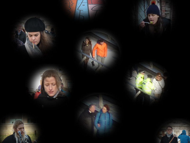
TP 52 for 2018 - Week 2 : People by Tim White, on Flickr
Oh, and still in the right week... (Just).
Out and about in the cold sunshine today in the vicinity of the Tate Modern and the Wobbly bridge.
Some shots were up close and personal, some at a distance, no one batted an eyelid, most were wrapped up in a world of their own. I did drop some coin into the street artist's collection (she was the only person who actually noticed I wsa taking photos and smiled).
On to the presentation... I see this as a peek into the lives of some of the People of Southwark, perhaps through a keyhole.
TP 52 for 2018 - Week 2 : People by Tim White, on Flickr
Oh, and still in the right week... (Just).
Last edited:
OP
LC2
Negan
- Messages
- 10,447
- Name
- Tim
- Edit My Images
- Yes
Cheers. That's what I was aiming for.A very nice snapshot of life. It works really well as a montage of different experiences
Well, I couldn't quickly do a keyhole shapeNot a keyhole as it`s round
Quite a lot of shots were taken for those. I was torn between this kind of presentation or just a simple person shot. I thought this to be more alternative.- Messages
- 4,562
- Name
- Mark Gameson
- Edit My Images
- Yes
Really like that Tim something a bit different. It looks like you put quite a bit of work in to laying it out.
- Messages
- 7,548
- Name
- susie
- Edit My Images
- Yes
Hi Tim, well done to you for trying something a bit different, a difficult theme I think to make interesting ....I haven’t done mine yet
I’m tending to agree will Allan a bit, there’s maybe just a bit too much black, but I really like the little windows into peoples lives, excellent idea for the theme.
I’m tending to agree will Allan a bit, there’s maybe just a bit too much black, but I really like the little windows into peoples lives, excellent idea for the theme.
- Messages
- 13,760
- Edit My Images
- Yes
Certainly a good variety of people there Tim, I like that you got them all for the theme too, a real interesting presentation of the head-shots too which I like
OP
LC2
Negan
- Messages
- 10,447
- Name
- Tim
- Edit My Images
- Yes
There were 19 layers in that shot before I flattened it. It wasn't actually that difficult to do. The bit that took longest was deciding how much to feather the holes that you see the people through.Really like that Tim something a bit different. It looks like you put quite a bit of work in to laying it out.
The clipped circles were meant to convey that this is a small part of the greater canvas of the people of the earth. Maybe I was being too crypticI kind of like the idea behind it but not so sure on the execution the clipped circles don’t work and they could all be a bit tighter together maybe
And there was me worrying that I had too many viewpoints. I did struggle deciding where to put all the 'holes'.Hi Tim, well done to you for trying something a bit different, a difficult theme I think to make interesting ....I haven’t done mine yet
I’m tending to agree will Allan a bit, there’s maybe just a bit too much black, but I really like the little windows into peoples lives, excellent idea for the theme.
A couple of the original images could have stood alone for the theme, but after taking the shots and reviewing them, this felt better. It also hides some of the deficiencies of my 8 yr old 'work bag camera', TZ8, which is okay close up in good light, but rapidly loses detail when you increase the ISO or use it's zoom.Certainly a good variety of people there Tim, I like that you got them all for the theme too, a real interesting presentation of the head-shots too which I like
OP
LC2
Negan
- Messages
- 10,447
- Name
- Tim
- Edit My Images
- Yes
It was never going to be everyone's cup of Rosie. But worth the experiment and fun with the pp I feel.I kind of see what you were aiming for here Tim, but Im unsure if it really works ?
- Messages
- 2,625
- Name
- Bernd
- Edit My Images
- Yes
Clever idea with the post processing, but I'm with Mark. As for the individual people photos, I find them a bit hit and miss, with the ones you've taken close up and personal hit, the other ones rather miss. But kudos for trying something different!
OP
LC2
Negan
- Messages
- 10,447
- Name
- Tim
- Edit My Images
- Yes
I agree, the distance shots aren't as good, but it was just the TZ8 (which isn't great zoomed) that I had with me at the time, and I was working with what I had taken.Clever idea with the post processing, but I'm with Mark. As for the individual people photos, I find them a bit hit and miss, with the ones you've taken close up and personal hit, the other ones rather miss. But kudos for trying something different!
They certainly were, I'm pleased you feel it came across.An interesting take on the theme there Tim, very different in pp too. It certainly comes across that they were in a world of there own.
Vignettes, hmm well I suppose they are. Though I'd not really considered that, more that I wanted to not have harsh edges to the various viewpoints onto the people in the shot.I like the presentation, makes the most of a series of vignettes
Thanks David. It's a less busy version of something I tried back in 2015 for Jimmy Cauty's Model Village (which wasn't part of a 52, so you probably won't have seen it).Very clever collagey type effect.
- Messages
- 9,095
- Name
- Mandy
- Edit My Images
- Yes
People - I like this a different take on the theme and nicely thought out and put together, I feel the only thing that lets the image down is the shots at distance.
OP
LC2
Negan
- Messages
- 10,447
- Name
- Tim
- Edit My Images
- Yes
I tottaly agree, the distance shots are nowhere near as strong. I did want some distance shots, but they are evidently not the TZ8's strong pointPeople - I like this a different take on the theme and nicely thought out and put together, I feel the only thing that lets the image down is the shots at distance.
So I worked with what I had. Maybe week 4 will bring a nicer theme.