LC2's Many Many (More) Fine Shoehorns in 2018 : Week 52 - Showcase [2018 Complete]

I think a little more space around it the "hole" and the "live wires" sign little to tight maybe

Enjoy the new kit and hope it does you well. Age is a clear shot and nicely on theme Tim, agree maybe more space for the hole.

... some nice colour and texture there. No doubt cropped tight for a reason.

Lovely details in Age Tim I agree with Allan it would have been nice to see a bit more space next to the hole. The brass plaque looks very well cared for.

Yes, it is a little tight, but @d00d has the nub of it. The web that the plate is fixed to isn't very large, infact the top lhs of the image is faked (content aware fill). There wasn't much space to drop the image down either, but I do agree, it is a tad closely cropped. I could have cropped in tighter, but that would have lost some of the context.
Ah well...

That's old. Nice and clean composition!

Well I never realised that Armstrongs merged with Whitworth, interesting piece of history, lovely details.

Age
A good simple (in a nice way) shot. Works well for the theme.

Cheers @brrnd, @sirch, @Nostromo. Pleased you liked it.

I’m using a rota to make sure I spread my comments round. Will be doing about 1 in 7 each week, so this week you got lucky :)

Week 4 - Over - Excellent feel of an old photo and props suit it so well, though who left their khaki brassiere on top of the cases? :whistle:
Week 5 - Age - Those name plates always help show the pride manufacturers had in their product. I just missed visiting the Scotswood Works in production when I was studying in Newcastle but saw it silent when we went in as training for doing building surveys for asbestos in 1981.

Chuckle at the khaki bra ;) I'm sure it isn't (but you never know).
It's such a shame that our heavy engineering base has been decimated, isn't it.
 
Sharp I like that something a bit different nice use of DoF and composition.

I'm off to on a day shooting (in a good way:eek:) Steam Punks at the end of April I'm really looking forward to it.
 
What's a Steampunk?:confused::)

OK I Googled it. Not sure I'm that much wiser but they look impressive:)
 
Last edited:
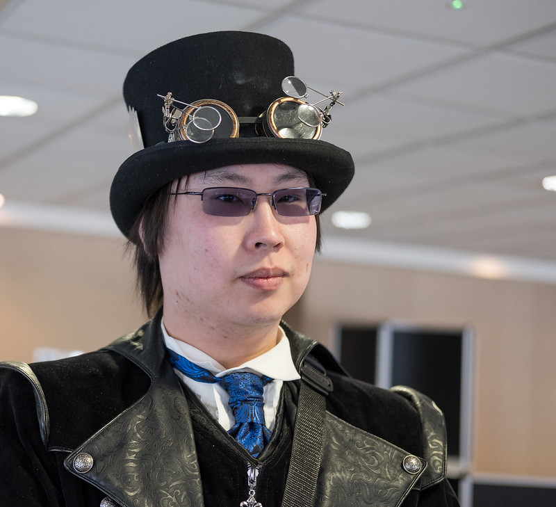
Impressive outfit! That is sharply dressed indeed!
 
Steampunk ..... weirdos ... but liking the optics on his hat. :)

EDIT to add ... particularly that hinged bit and the way it stands out against the ceiling BG. Nice camera, I think. (y)
 
Last edited:
Sharp - interesting take on the theme, good light on the subject, you caught the optics well.
 
Age(ing) - fits the theme, but I too would like a bit more space around the hole and the live wire sign.

Sharp - Ok I need to go and Google what a Steampunk is :thinking:, as for the image I can't fault it at all. Nicely composed, well lit and great detail good work.
 
Sharp ly dressed is nicely on theme Tim good colours in the shot and the BG thrown off well. Thought you might like the X-T2 and XF 35mm f2 (y)
Cheers Dave - I am enjoying the new beast.

Sharp I like that something a bit different nice use of DoF and composition.

I'm off to on a day shooting (in a good way:eek:) Steam Punks at the end of April I'm really looking forward to it.
His Steam Punk is far better than mine :)

What's a Steampunk?:confused::)

OK I Googled it. Not sure I'm that much wiser but they look impressive:)
I suspect that my post for week 7 will confuse even more ;)

Impressive outfit! That is sharply dressed indeed!
:)

On theme there Tim, shame about the bg, but that can't be helped at a convention.

Enjoying the xt2?
I thought that background was pretty clear for a convention... Yes, I'm really taking tot he XT2 and 35m f/2

Great take on the theme. That is some interesting eyewear he has on his hat.
I like to do something a bit different.

I really like the variety in this shot, the brass plaque, the white sign, the round hole - all add interest,

Steampunk ..... weirdos ... but liking the optics on his hat. :)

EDIT to add ... particularly that hinged bit and the way it stands out against the ceiling BG. Nice camera, I think. (y)
You've not seen my SteamPunk gear yet... Actually, it's not a patch on this.

Sharp - interesting take on the theme, good light on the subject, you caught the optics well.
Ta Chris

Age(ing) - fits the theme, but I too would like a bit more space around the hole and the live wire sign.

Sharp - Ok I need to go and Google what a Steampunk is :thinking:, as for the image I can't fault it at all. Nicely composed, well lit and great detail good work.
A bit more space would have been nice, but that would have involved faking it even more than I did.

Sharp

Nice idea, a good sharp photo and a sharply dressed man.
Ta.

Nice sharp Image there Tim
Shame about the background

Pete
As backgrounds go (at conventions), this one isn't so bad. Have a look at the convention shots I've just posted and you'll see what I mean.
 
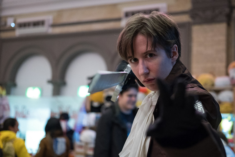
Captain Levi Ackerman of the 'Survey Corps Special Operations Squad' guards the 3 Walls (Maria, Rose and Sina) which protect humanity from the Titans (Shingeki no Kyojin)
No it isn't :whistle:

Can't really comment constructively on this I can't stand dress up, to much going on in the BG it would be better if the captain was isolated a bit more
 
No it isn't :whistle:

Can't really comment constructively on this I can't stand dress up, to much going on in the BG it would be better if the captain was isolated a bit more
I'm not going to disagree on the isolation / background comments, but it was taken in the right week and as today is about the first time I've felt vaguely human since last weekend, PABD.
 
Sorry to hear you've not been feeling so good, took me a little while to see it all, with the black gloved hand in the foreground and view down the sword blade but does the job for the theme
 
I like the pose and the shot in general although the hand not holding the sword looks more like an amorphous blob. A little more definition of the hand would have improved it for me but then that would have meant moving back or increasing the DoF which would have made the background a little intrusive so I don't think you could win here. I really do like the photo though.
 
Sorry to hear you've not been feeling so good, took me a little while to see it all, with the black gloved hand in the foreground and view down the sword blade but does the job for the theme
Yes, there is more to the image than a quick glance exposes :)
This one I kind of like Tim, like the eye contact and the position of the sword and hands and a good expression on the face.
At these events almost everyone wants their photo taken, but not everyone knows what poses they should do. This chap did :)
I like the pose and the shot in general although the hand not holding the sword looks more like an amorphous blob. A little more definition of the hand would have improved it for me but then that would have meant moving back or increasing the DoF which would have made the background a little intrusive so I don't think you could win here. I really do like the photo though.
I do see what you mean about the left hand, but as you've guessed, getting it would have been close to impossible given the nature of the venue and the number of people. You end up giving up waiting for the background to clear enough, even at f/2, positioning him further from the wall, and being further from him myself, well, it doesn't bear thinking about ;)
 
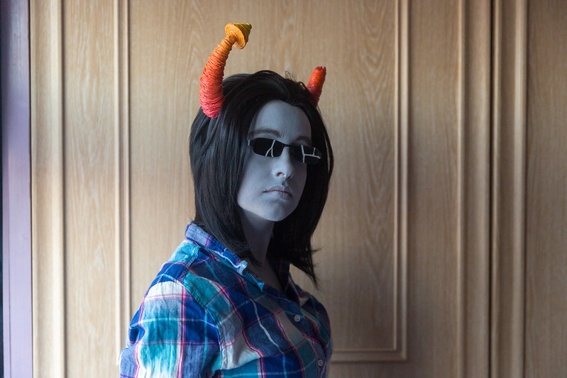
Week 8 - Thick (Makeup)

No, it's not a white balance issue, Sam's face really is grey.
A thick application of grey makeup, the wig, horns and glasses bring to life the first testing iteration of her next Cosplay, Equius Zahhak from Homestuck.
Homestuck is a Web Comic produced by MS Paint Adventures. To paraphrase Marty McFly...
You guys aren't ready for this yet... But your kids are gonna love it.


TP 52 for 2018 - Week 8 : Thick (Makeup). Equius Zahhak - Homestuck
by Tim White, on Flickr
 
Last edited:
Thick make is very nicely on theme Tim, a good shot but I think a slight crop on the LHS to get rid of the white bit.
White bit? I think your monitor is on the blink, it's lilac. :)
I did contemplate that, and indeed tried it, but it unbalanced the photo, so decided to leave it in.
I suppose I could have done a bit of colour matching to change it to the same as the doors, but I doubt it would have carried the grain across.
 
I would definitely get rid of the lilac bit and straighten the uprights other than that "I am not ready for it" indeed :)
 
Tim

Guard - Nice image, maybe a bit more dof so the sword and hand are more in focus.

Thick - Interesting, why the carrot on the right hand side? Kids are weird these days.

Pete
 
Not sure about your latest selfie Tim tbh..... ;)

I to would crop the lilac out, square it up and maybe lift the shadows a touch......but what do I know....
 
Thick - a clever take on the theme :)
 
Good to see something different, like the sun glasses, I'd probably crop it into portrait.
 
Hi Tim ... I envy you having young models to assist with your themes. :)

Guard ... good stance & expression making a great portrait. Shame about the one OOF finger obscuring his pretty boy face. The shallow DOF brings him out from the BG quite nicely but doesn't do his left hand any favours.

Thick .... more wackiness. I think what might work here is to take a chunk off LHS making it near square (?)
 
I would definitely get rid of the lilac bit and straighten the uprights other than that "I am not ready for it" indeed :)
Yes, I think I got lazy with the uprights, and just let LR do it (but not very well). I still don't like the results of doing a small edit to the photo width. A better option would be to re-shoot and move Sam a bit to the right.
Imaginative take on the theme.
Thanks Lee.
Tim

Guard - Nice image, maybe a bit more dof so the sword and hand are more in focus.

Thick - Interesting, why the carrot on the right hand side? Kids are weird these days.

Pete
It's not a carrot, it's a broken horn. Don't ask me why though, I've not read very much of Homestuck.
Not sure about your latest selfie Tim tbh..... ;)

I to would crop the lilac out, square it up and maybe lift the shadows a touch......but what do I know....
Shadows, yes perhaps. I did think afterwards that I should have gotten my reflector out to reduce the shadows, but the light was very quickly fading.

Thick - a clever take on the theme :)
Ta :)
Good to see something different, like the sun glasses, I'd probably crop it into portrait.
Portrait... Hmm maybe an option.
Hi Tim ... I envy you having young models to assist with your themes. :)

Guard ... good stance & expression making a great portrait. Shame about the one OOF finger obscuring his pretty boy face. The shallow DOF brings him out from the BG quite nicely but doesn't do his left hand any favours.

Thick .... more wackiness. I think what might work here is to take a chunk off LHS making it near square (?)
Conventions are good fun, even when I'm not in costume. And my Sam loves having her photo taken when she's in her cosplay gear (not so much normally).

I have now had a play with a square crop. yes, that does work if I go all Peter Hurley and crop right in (losing the near horn somewhat).
 
Thick

That's certainly thick make up, I tend to agree with getting rid of the left hand side bit.
 
As others have said, Interesting take on the theme. I think maybe a tighter crop ala headshot style would have suited it slightly better.
I did try a head shot, but you lose the horns :/
A different a clever take on the theme Tim I like it.
Cheers Mark. As you know, I do try to be a bit different at least some of the time.
Thick; I have no idea what you're on about these Homestuck, webcomic and Marty McFly. Is he not that guy in Back to the Future? :)

Anyway, I quite like the image, the makeup and her expression too. Agree with Dave about the purple strip on the left.
Yes, Marty Mcfly is from Back to the Future, I was paraphrasing from the School Dance / Johnny B Goode scene.
Thick

That's certainly thick make up, I tend to agree with getting rid of the left hand side bit.
I was playing with this image and doing hair selections yesterday. Maybe I should have composited it onto a white background.
Something for another day perhaps.
 
Guard is a great photo, excellent posing and light.

Thick is missing some light in your model's face I think...
 
Hi Tim, Catching up again!

Over - Good idea well done. Processing really does give it a war time theme
Age - Not too sure about this, nice clear image but I think I would have either just had the plaque or gone for a wider shot with more context
Sharp & Guard are both nice portraits but are spoilt slightly by the bg but not a lot you can do about it when you are at this type of event
Thick - Think everything has been said about this one really. Not sure why but I think I would like to see her facing the other way :confused: Maybe its because the light seems to be coming from that direction. I think it would work if you cropped it just inside the 1st set of mouldings

:D
 
Back
Top