- Messages
- 5,432
- Name
- Andrea
- Edit My Images
- Yes
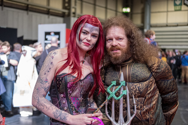
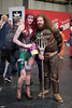
Hi Tim, I got flattened by a nasty cold too and it's taking time to catch up with everyone's threads again. You've posted three striking images since my last visit; the Steampunk guy is an original take on the Sharp theme and he really is sharply dressed and I like his confident pose. You can see a lot of thought has gone into his costume, especially the accessories on his hat. Guard is another really original take, and although I would have preferred a bit more definition in his hand, which is quite blurry in the foreground, once you realise what it is and notice the sword too, you can see he's striking a great pose for you. It must be fun to have such willing models ")
Finally, Thick is a good take on the theme. I can see from scanning through the comments above that everyone has their own ideas about how to frame and light this one, and I would possibly have tried to get some more light in her face but I don't know what restrictions were around you and the half-shadow is probably what you were aiming for anyway. I think a square crop would work well with this one to remove the outer door frame and bring the focus right to her face.
I'm glad you're enjoying your new Fuji; I've found mine has brought some fun and freshness back into my photography.