

You are using an out of date browser. It may not display this or other websites correctly.
You should upgrade or use an alternative browser.
You should upgrade or use an alternative browser.
LC2's Many Many (More) Fine Shoehorns in 2018 : Week 52 - Showcase [2018 Complete]
- Thread starter LC2
- Start date
OP
LC2
Negan
- Messages
- 10,447
- Name
- Tim
- Edit My Images
- Yes
Even though you say it did not work, it is a good effort and it is dark.
Tim
Good on you trying a different route for Dark, even if it does not work, for me it's all about learning and you need to fail to learn lessions.I'm not that good with processing, but I expect you need to use a mask and darken the background.
Overall the Image is another excellant shot, composition is good but a bit more space at top and bottom may help but it's difficult to tell with the dark processing you have applied.
Pete.
I tend to agree that it hasn't worked out, I don't think the blue sky and clouds top left help either but it's worth trying these things and the 52 is a good place to do that.
Think I agree with Pete you need to create a mask, as it is a very well composed shot, and works for me except for the sky. I think the 52 is the place to try out different ideas, good on you Tim for giving it a go.
It doesn;t work but still - if we don't try we don't learn. Well done for not going for the easy shot and having a crack at something different!
Thanks for all the thoughts...
It was worth trying to see what I could achieve. A mask in pp might have worked, but in reality when taking a 'dark' subject, I should have:
Started with something dark and added light, not started with something bright and attempted to remove the light.
You live and learn
")
OP
LC2
Negan
- Messages
- 10,447
- Name
- Tim
- Edit My Images
- Yes
Not sure if anyone has pointed it out to you but “Dark” doesn’t workLol No, really? And there was me thinking it was a masterpiece.
Damn all those sugar coated comments
okay, okay, it was carp wasn't it. I'm not afraid to post rubbish when I fsck up.
(fsck = command to file system check on linux ext2 filesystems before anyone accuses me of sidestepping the swear filter).
- Messages
- 14,766
- Name
- Michael
- Edit My Images
- No
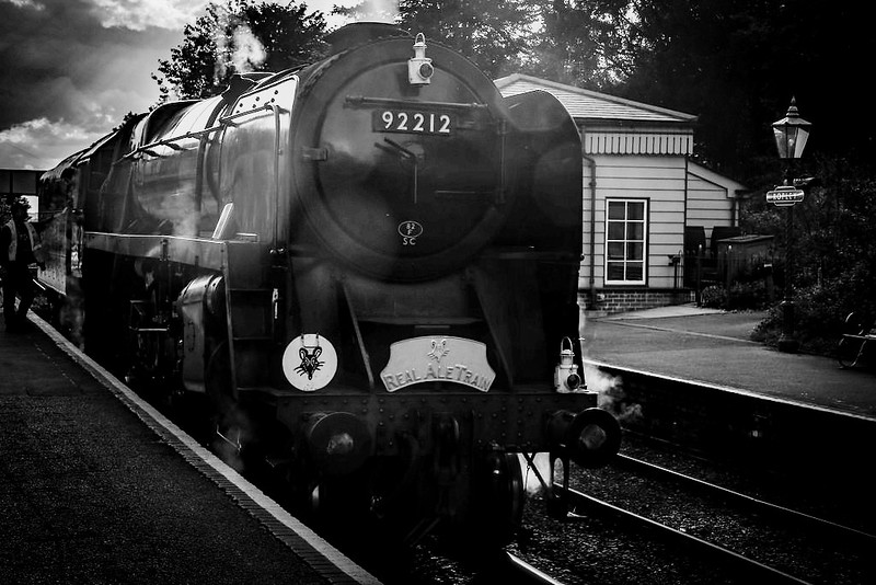
Hi Tim, not seen 92212 for a while, where was this? Worth a try. As you have yes on edit, I tried a b+w conversion in zoner, upped the exposure and contrast and a little de haze adjustment, hope that is ok.
 44225590322_11fefb00ba_b by Michael Johnson, on Flickr
44225590322_11fefb00ba_b by Michael Johnson, on Flickr
OP
LC2
Negan
- Messages
- 10,447
- Name
- Tim
- Edit My Images
- Yes
Hi Michael,Hi Tim, not seen 92212 for a while, where was this? Worth a try. As you have yes on edit, I tried a b+w conversion in zoner, upped the exposure and contrast and a little de haze adjustment, hope that is ok.
Yes, I think that does work better. I tried a B&W conversion but didn't do much with it. I think you've definitely made a significant improvement.
Pretty amazing what can be recovered from a deliberately underexposed image...
The mono also hide's Dave's Hi-Vis somewhat (he was chatting to the crew).
92212 was taken at Ropley. It was waiting for the Crompton to come in with the RAT ECS from Alresford, which was running a bit late (should have been in by 17:45, this was taken at 17:52).
I can't quite remember when it did turn up, but I know we were about 10-15 minutes later into Alton than we like to be, and the platform was heaving.
- Messages
- 14,766
- Name
- Michael
- Edit My Images
- No
Hi Michael,
Yes, I think that does work better. I tried a B&W conversion but didn't do much with it. I think you've definitely made a significant improvement.
Pretty amazing what can be recovered from a deliberately underexposed image...
The mono also hide's Dave's Hi-Vis somewhat (he was chatting to the crew).
92212 was taken at Ropley. It was waiting for the Crompton to come in with the RAT ECS from Alresford, which was running a bit late (should have been in by 17:45, this was taken at 17:52).
I can't quite remember when it did turn up, but I know we were about 10-15 minutes later into Alton than we like to be, and the platform was heaving.
Pleased you like it, I was surprised how well it edited.
OP
LC2
Negan
- Messages
- 10,447
- Name
- Tim
- Edit My Images
- Yes
Your edit is far better than my originalPleased you like it, I was surprised how well it edited.
Indeed, perhaps another attempt in the future, or perhaps noted down as "don't try that again!"Dark
It's a tricky one to comment on really, the composition is good, the idea was good. It just didn't work out this time.
nah, it really doesn'tGood effect, Tim. You put a lot of work into it and it works to an extent.
OP
LC2
Negan
- Messages
- 10,447
- Name
- Tim
- Edit My Images
- Yes
Week 35 - Splash
Up in town to see "The Cursed Child" at The Palace Theatre, so not able to take a 'professional' camera along (according to the T&Cs - and I wasn't about to risk not getting in with the Fuji), so these shots were taken with my (t)rusty TZ8.
The Fountains at Leicester Sq which you can run around in if you're not worried about getting wet.
Now TZ8's are great action cameras so I was having to judge the timings and guess the shutter lag...
This one is I think my favourite of the two, for the colours captured
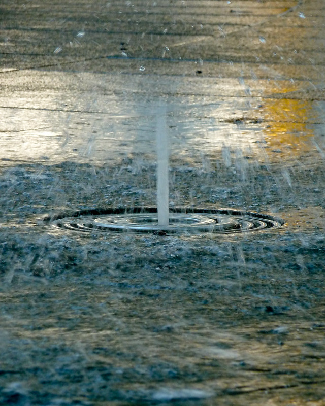
TP 52 for 2018 - Week 35 : Splash by Tim White, on Flickr
Though this second shot has merit in showing the action as the fountain spout collapses.
This one could perhaps have done with using flash to overpower the ambient light, enabling a sharp capture of the water itself.
The first though needs the ambient to provide the colours.
TP 52 for 2018 - Week 35 : Splash (2) by Tim White, on Flickr
Discuss!!!
ETA: I do like the face of the big cat in the second shot though!
Up in town to see "The Cursed Child" at The Palace Theatre, so not able to take a 'professional' camera along (according to the T&Cs - and I wasn't about to risk not getting in with the Fuji), so these shots were taken with my (t)rusty TZ8.
The Fountains at Leicester Sq which you can run around in if you're not worried about getting wet.
Now TZ8's are great action cameras
so I was having to judge the timings and guess the shutter lag...This one is I think my favourite of the two, for the colours captured
TP 52 for 2018 - Week 35 : Splash by Tim White, on Flickr
Though this second shot has merit in showing the action as the fountain spout collapses.
This one could perhaps have done with using flash to overpower the ambient light, enabling a sharp capture of the water itself.
The first though needs the ambient to provide the colours.
TP 52 for 2018 - Week 35 : Splash (2) by Tim White, on Flickr
Discuss!!!
ETA: I do like the face of the big cat in the second shot though!
Last edited:
OP
LC2
Negan
- Messages
- 10,447
- Name
- Tim
- Edit My Images
- Yes
Cheers Roger. A bit of a fortunate capture that. A fraction of a second either way, or a different angle and that wouldn't have appeared.I like the first one, definitely something different a great capture.
Second shot is my favourite to be honest, maybe because I like the cat face!
- Messages
- 4,637
- Name
- Pete
- Edit My Images
- Yes
Tim
Refuse - On Theme, like the glove being in focus and the eye well OOF, nice effect. Blue also adds boldness. Can't workout what has happened to the arm just below the glove, it looks a bit odd.
Splash - I prefer the first shot myself, must have been difficult with the shutter lag those types of cameras have. Second is a bigger splash but not a nice pattern (even with the cat face).
- Messages
- 104,465
- Name
- The other Chris
- Edit My Images
- Yes
They've both got merits, I wonder if the first would have been a bit stronger with a faster shutter speed but as you say the colours are good. I do like the second perhaps because of the intensity of the splash and the composition.
OP
LC2
Negan
- Messages
- 10,447
- Name
- Tim
- Edit My Images
- Yes
Cheers Allan, it was the yellow light that drew me to it.The splash of yellow in the first is a nice touch I would maybe have placed the grid at the bottom of the frame maybe a square crop, the second one fits the theme better in a way because it’s such a big splash
I kept the ratio like thatas I quite liked the waves of water flowing away from the outlet.
Yes, the old TZ is really not an action camera. I took quite a few goes to get something reasonable, guessing exaclty when the shutter would fire.Tim
Refuse - On Theme, like the glove being in focus and the eye well OOF, nice effect. Blue also adds boldness. Can't workout what has happened to the arm just below the glove, it looks a bit odd.
Splash - I prefer the first shot myself, must have been difficult with the shutter lag those types of cameras have. Second is a bigger splash but not a nice pattern (even with the cat face).
Perhaps, but less engaging for that.Plenty of water splash there. For me, I prefer #2 with fewer distractions.
A faster shut would probably have helped, but that old P&S doesn't like highish ISOs. Wrong canera for the job really, but the only one I was willing to take with me.They've both got merits, I wonder if the first would have been a bit stronger with a faster shutter speed but as you say the colours are good. I do like the second perhaps because of the intensity of the splash and the composition.
Other PoVs were possible (I was crouched for that shot) and attempted.The first one for me. A slightly lower pov may have been better, but not always possible.
That was the one that seemed to work best for me.
OP
LC2
Negan
- Messages
- 10,447
- Name
- Tim
- Edit My Images
- Yes
Week 22 - Creature
People never seem to look up...
How well do you know London?
Where in London is this, I'm looking for something fairly exact (the clue is in the statue itself).
Taken during the morning rush, with the best camera I had on me at the time (TZ8 again), but the light was right.
i.e. The statue was lit but the building behind was in shadow, allowing the statue to stand out from the wall as they are both made of the same material.
I contemplated going B&W, but actually preferred the colour version.
I will properly tag (and even geotag) the image after there have been guesses
It is visible on google maps for those unfortunate enough to not be based in 'town'.
Good luck
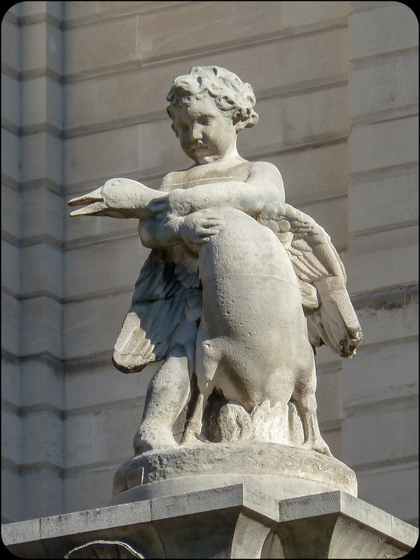
TP 52 for 2018 - Week 22 : Creature(s) by Tim White, on Flickr
People never seem to look up...
How well do you know London?
Where in London is this, I'm looking for something fairly exact (the clue is in the statue itself).
Taken during the morning rush, with the best camera I had on me at the time (TZ8 again), but the light was right.
i.e. The statue was lit but the building behind was in shadow, allowing the statue to stand out from the wall as they are both made of the same material.
I contemplated going B&W, but actually preferred the colour version.
I will properly tag (and even geotag) the image after there have been guesses
It is visible on google maps for those unfortunate enough to not be based in 'town'.
Good luck
TP 52 for 2018 - Week 22 : Creature(s) by Tim White, on Flickr
OP
LC2
Negan
- Messages
- 10,447
- Name
- Tim
- Edit My Images
- Yes
Without spoiling it, has it connections with Hong Kong and Singapore more now! On the corner of a poultry little road and I dare not mention where in case I get thrown out the labour party?
Beaten to it, it’s Boy with a goose midland bank HQ junction of Poultry with Old Jewry and it’s by Sir William Reid Dick R.A.
@Bearair he's really going to have to try harder than that isn’t he
Reckon so Allan, the power of google is mighty!
Very quick the pair of you
Yes, it's the (formerly) Midland bank at 27 Poultry, now a hotel.
IIRC from my early days working in banking, this was one of the 'city' banks where the clearings etc. were done by messengers 'walking' the cheques etc. between the banks, rather than the usual route of sending everything off in the 'Head Office bag', or by post.
OP
LC2
Negan
- Messages
- 10,447
- Name
- Tim
- Edit My Images
- Yes
Week 36 - Pull(ed)
Nary a shoehorn in sight...
Playing with the continuous focus mode on the X-T2, it did a pretty good job considering I was focused 1/2 way along the loco, which is predominately black!
I must try to remember to expose to the left and then recover the shadows more, as the X-T2 is rubbish at highlight recovery.
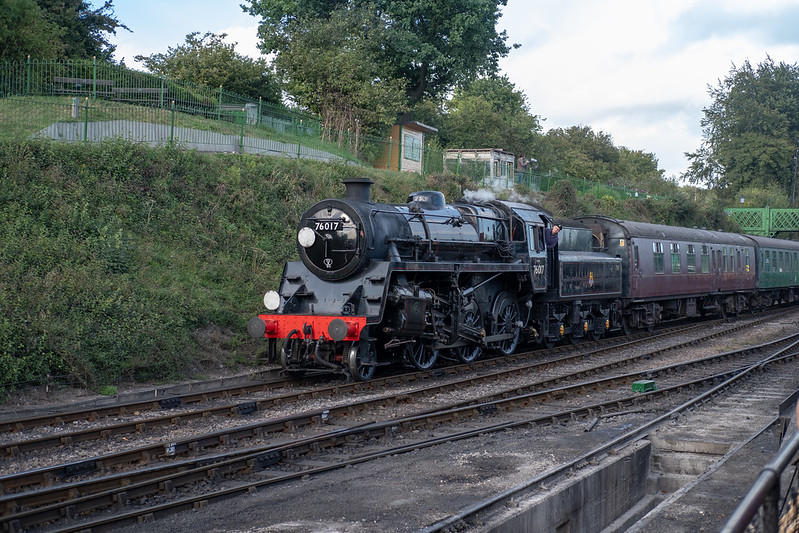
TP 52 for 2018 - Week 36 : Pull(ed) by Tim White, on Flickr
Nary a shoehorn in sight...
Playing with the continuous focus mode on the X-T2, it did a pretty good job considering I was focused 1/2 way along the loco, which is predominately black!
I must try to remember to expose to the left and then recover the shadows more, as the X-T2 is rubbish at highlight recovery.
TP 52 for 2018 - Week 36 : Pull(ed) by Tim White, on Flickr
OP
LC2
Negan
- Messages
- 10,447
- Name
- Tim
- Edit My Images
- Yes
Pretty much no change in them to the SOOC raw (maybe a bit lighter). I don't actually remember what they looked like in real life.Nice shot Tim, my only comment is that the greens look a bit flat, but that's probably just me.
That bridge is actually the one that spanned Kings Cross station, and has starred in such films as Harry Potter and The 39 Steps before they removed it from the station and replaced it with an 'accessible' one.Nice one, Tim. I think you have captured the essence of the theme for me and the cast iron bridge background complements the steam era.
The sky was about 1 stop over exposed (down to the fact I was shooting in the other direction and didn't hear the 4 coming until she was right on top of us, so didn't change any settings).Nice one - I like a Standard 4
Funny about the highlights - did you shoot RAW? My X-Pro2 does a fine job on highlight recovery. Essentially the ame camera different box.
I find that about the limit for highlight recovery on the X-T2, whereas I can underexpose and bring the images back from further in the minus if needs be.
- Messages
- 5,432
- Name
- Andrea
- Edit My Images
- Yes
Hi Tim, I've missed so much while I've been slacking with my own 52, so looking back over the ones of yours that I've missed I really like the simplicity of the Underground roundel for Round, with the red of the sign really popping off the screen. Refuse is a good take on the theme (and something I considered as that's usually the view I get if I point my camera at our lads!) and I like the details you have captured in the glove, which is prominent in the frame and makes the point very strongly.
I like both images for Splash and #1 is probably my favourite of the two. At first I thought the fountain centre was too central but in fact it balances nicely with the water drops flying in the top half and the motion blurred water and splashes in the bottom. I agree that the colour and reflection helps to lift the whole image
Yay - a train for Pulled! I never saw that coming This is a lovely engine and great choice for the theme, and much more impressive than the wee things we have here. Being picky I reckon you could lose a little bit off the bottom and left to bring the engine more to the fore, but it works well nonetheless as you can see the head of the train it's pulling behind it
I like both images for Splash and #1 is probably my favourite of the two. At first I thought the fountain centre was too central but in fact it balances nicely with the water drops flying in the top half and the motion blurred water and splashes in the bottom. I agree that the colour and reflection helps to lift the whole image
Yay - a train for Pulled! I never saw that coming
This is a lovely engine and great choice for the theme, and much more impressive than the wee things we have here. Being picky I reckon you could lose a little bit off the bottom and left to bring the engine more to the fore, but it works well nonetheless as you can see the head of the train it's pulling behind it - Messages
- 4,637
- Name
- Pete
- Edit My Images
- Yes
Tim
Creatures, well captured Image, Statue stands out well from the background. I think I would have cropped that highlighted bit at the bottom.
Pulled, another good Image, Explaination of being caught unexpected accepted.Allan has made some points that I can see.
Pete
Creatures, well captured Image, Statue stands out well from the background. I think I would have cropped that highlighted bit at the bottom.
Pulled, another good Image, Explaination of being caught unexpected accepted.Allan has made some points that I can see.
Pete
OP
LC2
Negan
- Messages
- 10,447
- Name
- Tim
- Edit My Images
- Yes
First thing I noticed is it needs a slight anti clockwise turn the verticals seem slightly off and a slightly closer crop, it doesn't dominate the frame as it should, but otherwise a good interpretation of the theme
I evidently hadn't looked for verticals, they certainly didn't jump out at me, but LR seems to agree with you. Not that I'm certain that all the verticals are actually vertical IRLTim
Creatures, well captured Image, Statue stands out well from the background. I think I would have cropped that highlighted bit at the bottom.
Pulled, another good Image, Explaination of being caught unexpected accepted.Allan has made some points that I can see.
Pete
I did play with crops, but felt that it was better with the space for the loco to move into. Albeit that there are one or two distractions in the shot as is.
OP
LC2
Negan
- Messages
- 10,447
- Name
- Tim
- Edit My Images
- Yes
Thanks AndreaHi Tim, I've missed so much while I've been slacking with my own 52, so looking back over the ones of yours that I've missed I really like the simplicity of the Underground roundel for Round, with the red of the sign really popping off the screen. Refuse is a good take on the theme (and something I considered as that's usually the view I get if I point my camera at our lads!) and I like the details you have captured in the glove, which is prominent in the frame and makes the point very strongly.
I like both images for Splash and #1 is probably my favourite of the two. At first I thought the fountain centre was too central but in fact it balances nicely with the water drops flying in the top half and the motion blurred water and splashes in the bottom. I agree that the colour and reflection helps to lift the whole image
Yay - a train for Pulled! I never saw that coming
The Std 4 in the Pull(ed) shot is actually one of the smaller locos on the line. She is quite smart looking, especially in BR lined black.
OP
LC2
Negan
- Messages
- 10,447
- Name
- Tim
- Edit My Images
- Yes
As per comment to Allan & Pete, I wanted space on the left for the loco to move into.I'm not train 'tog but it somehow feels a bit small in the frame and lacking in a bit of energy, not quite sure why.
It was moving quite slowly, maybe less than 10mph as it was approaching the station and I did have a reasonably fast shutter speed.
OP
LC2
Negan
- Messages
- 10,447
- Name
- Tim
- Edit My Images
- Yes
Week 30 - Cooking
Shopping at Camden Lock and looking for photo opportunities.
A shame about the lack of eye contact, but they were looking at what they were cooking...
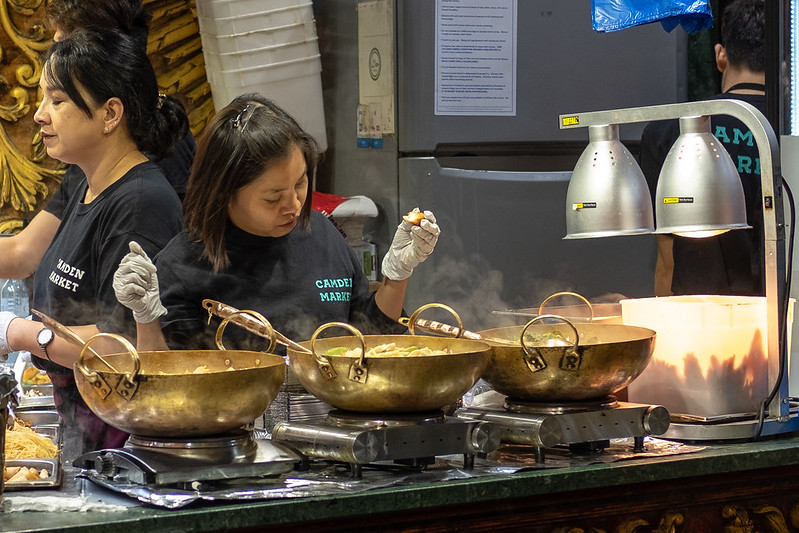
TP 52 for 2018 - Week 30 : Cooking by Tim White, on Flickr
Shopping at Camden Lock and looking for photo opportunities.
A shame about the lack of eye contact, but they were looking at what they were cooking...
TP 52 for 2018 - Week 30 : Cooking by Tim White, on Flickr