

You are using an out of date browser. It may not display this or other websites correctly.
You should upgrade or use an alternative browser.
You should upgrade or use an alternative browser.
weekly Lindsay56's 2019 TP-52 Wks 41/43/46 Partial catchup
- Thread starter lindsay
- Start date
OP
lindsay
Admin
- Messages
- 5,181
- Name
- Lindsay
- Edit My Images
- Yes
@GarethB @Allan.H @BobBCN Thanks chaps, the feedback is encouraging me to continue with this type of shooting - I've never had the nerve for Street really, but sitting in the bistro/cafe/bar place with the camera sitting on the table, screen flipped up and just fiddling with settings whilst watching what the lens saw in LiveView was easy, after a while, especially whilst casually sipping at a peppermint tea. I was able to set ISO to 400, to avoid too much noise although it could have gone higher, and playing with different combinations of aperture and speed thanks to the stability of the table as a base - it worked well.
OP
lindsay
Admin
- Messages
- 5,181
- Name
- Lindsay
- Edit My Images
- Yes
Interesting - I do plan to go back (it's a regular spot for us) with the EM10, but I'm not sure I've the nerve to shoot from a higher level. We'll have to see.No. 1 and 3 for me - I can't decide which as both are very good and perfect for the theme. I think I would err towards no.1 but I would like to see the shot from a higher viewpoint if that makes sense.
D
Deleted member 59779
Guest
Three good images there. First has the edge though. Really like the lighting in the first two images.
- Messages
- 996
- Name
- peter
- Edit My Images
- Yes
Waiting I am between 1 and 3 I think just edging to 1 but they are all good ")
OP
lindsay
Admin
- Messages
- 5,181
- Name
- Lindsay
- Edit My Images
- Yes
Catching up as the last couple of weeks have been a nightmare at work.
Week 7: Rough
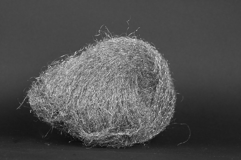 20190224-D300-DSC_1015-Rough_SteelWool2 by Lindsay Pennell, on Flickr
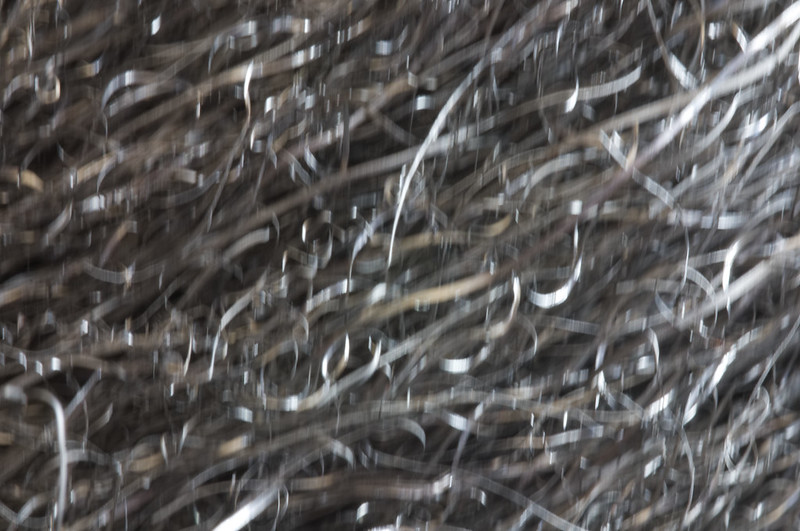 20190224-D300-DSC_1016-Rough_SteelWool_Abstract by Lindsay Pennell, on Flickr
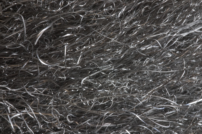 20190224-D300-DSC_1018-Rough_SteelWool by Lindsay Pennell, on Flickr
The second one above was a long exposure and I deliberately tapped the bench to get a bit of ICM, as an experiment. Probably choosing no 1 for my main image for "Rough" though.
Week 7: Rough
20190224-D300-DSC_1015-Rough_SteelWool2 by Lindsay Pennell, on Flickr20190224-D300-DSC_1016-Rough_SteelWool_Abstract by Lindsay Pennell, on Flickr20190224-D300-DSC_1018-Rough_SteelWool by Lindsay Pennell, on FlickrThe second one above was a long exposure and I deliberately tapped the bench to get a bit of ICM, as an experiment. Probably choosing no 1 for my main image for "Rough" though.
OP
lindsay
Admin
- Messages
- 5,181
- Name
- Lindsay
- Edit My Images
- Yes
and this week, for Object - my trusty pipe:
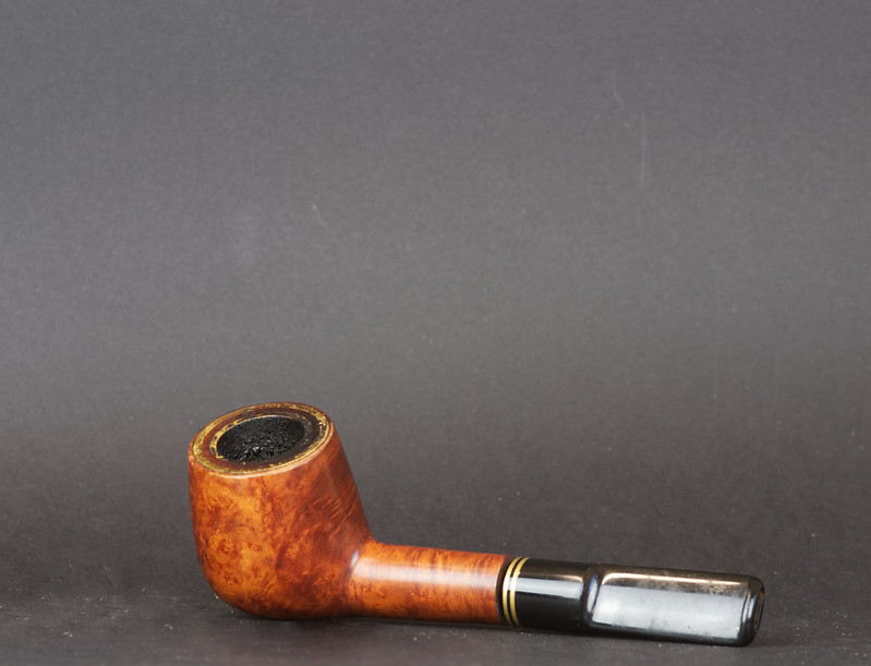 20190224-D300-DSC_1013-Object_Pipe1 by Lindsay Pennell, on Flickr
20190224-D300-DSC_1013-Object_Pipe1 by Lindsay Pennell, on FlickrLC2
Negan
- Messages
- 10,451
- Name
- Tim
- Edit My Images
- Yes
Rough - I do the ICM version of this shot, it's great to play with new techniques and i think it adds a bit of interest/fun over the sharp crop.
Object - Yup, the negative space works well with this one. You can almost imagine the smoke curling upwards to fill it.
Object - Yup, the negative space works well with this one. You can almost imagine the smoke curling upwards to fill it.
-Oy-
Worzel Gummidge
- Messages
- 9,064
- Name
- Dave
- Edit My Images
- No
Object - Yup, the negative space works well with this one. You can almost imagine the smoke curling upwards to fill it.
For me the smoke would have made the image. Still nice as is though.
GarethB
Likes to peek
- Messages
- 2,291
- Name
- I don't even know anymore!
- Edit My Images
- Yes
Fab work Lindsay!
Rough: All are very nice, I think I prefer the third image....just love the crisp detail. The first one however is superbly lit and the ICM of #2 is jolly good too.
Object: A nice, simple shot that works very well. The bright reflections pick out the shape nicely and the composition, while slightly unconventional, works very well.
OP
lindsay
Admin
- Messages
- 5,181
- Name
- Lindsay
- Edit My Images
- Yes
Thanks @rpn @Dave70D @LC2 @-Oy- @GarethB @michael23 @gremlin16
I appreciate the time taken to look and consider the images. On the Rough ones, the two close ups weren't cropped at all; the ICM came out nicely - I've been really sceptical about this as a technique but sometimes it produces some really interesting images. On Object, the pipe, I agree that if it was smoking a little it would have added to the image - might do something on that idea - maybe a Pipes project! My card background needs replacing as it's a bit marked now (thanks to the steel wool!), but I like the compositional effect of lots of empty space, I know it takes some getting used to but I think it works.
Cheers
- Messages
- 5,432
- Name
- Andrea
- Edit My Images
- Yes
They both fit the themes very well, Lindsay. I prefer the straight first shot for Rough as it's very clear what your subject is and we know how they feel, and B&W is a good choice for it. The second one just looks a bit OOF to me, sorry, although I agree it's always good to try new techniques.
For Object, that's a good subject with lovely warm colours in the wood, and the background complements it well. The placement is unusual but does work well, and the only improvement would be the suggestions above to include some smoke curling up into the negative space. Well done for keeping up when you're under pressure at work, too.
For Object, that's a good subject with lovely warm colours in the wood, and the background complements it well. The placement is unusual but does work well, and the only improvement would be the suggestions above to include some smoke curling up into the negative space. Well done for keeping up when you're under pressure at work, too.
OP
lindsay
Admin
- Messages
- 5,181
- Name
- Lindsay
- Edit My Images
- Yes
Thanks @BobBCN @Carl Hall
@Manxmaid that's exactly how I've often viewed ICM shots, so was tentative about offering it up. I kind of like it though. Thanks for your comments and views.
@Manxmaid that's exactly how I've often viewed ICM shots, so was tentative about offering it up. I kind of like it though. Thanks for your comments and views.
- Messages
- 1,075
- Name
- Georgina
- Edit My Images
- Yes
Hi Lindsay, Having a big catch up today in the hope I might then stay a bit more up to date!
Open - Love it. Great idea and well executed.
Distant - I think you picked the right one to go with. I like the bridge with the struts at the end framing to factory/warehouse in the distance
Cold - The blue certainly adds to the cold feel and I like the light shining through. I just slightly prefer the second one
Waiting - I like all the people waiting to cross. Not a good sky but then there's not a lot you can do about that, except maybe a letterbox crop would work, you could lose most of it then
Rough - Nice tones in the first image but I prefer the last one with it being a bit abstract
Object - Nice bg and lovely pipe. I do think it's missing a bit of smoke. You could always cheat and add some in photoshop
OP
lindsay
Admin
- Messages
- 5,181
- Name
- Lindsay
- Edit My Images
- Yes
- Messages
- 9,095
- Name
- Mandy
- Edit My Images
- Yes
Distant - nice set of images i like the first image, though i think i would prefer a colour version.
Cold - before i read the description i had wondered what it was, both images work.
Waiting - first image for me, nicely framed.
Rough - the last image in the trio shows the detail nicely of the wire wool.
Object - fits the theme, crop works, I also think it would be a stronger image with a bit of smoke added in PP.
OP
lindsay
Admin
- Messages
- 5,181
- Name
- Lindsay
- Edit My Images
- Yes
After a long absence from the 52 due to working away from home, I'm now trying to get back on board from Week 37: Old:
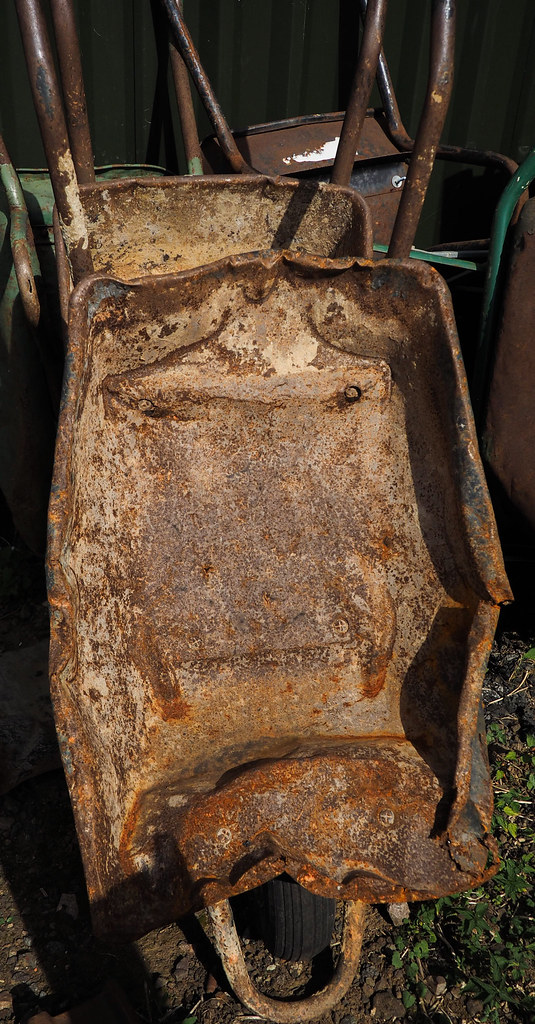 20190915-OMDEM1_1-P9150024-Old Wheelbarrow by Lindsay Pennell, on Flickr
20190915-OMDEM1_1-P9150024-Old Wheelbarrow by Lindsay Pennell, on Flickr