Lucy

Messages
172
Name
Chris
Edit My Images
No
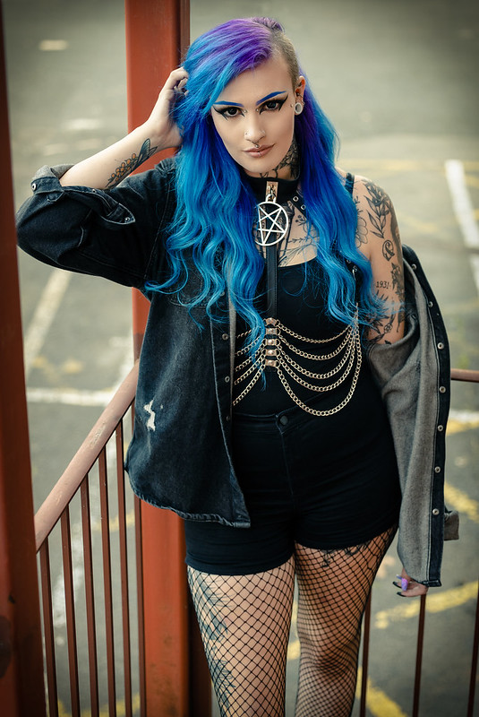
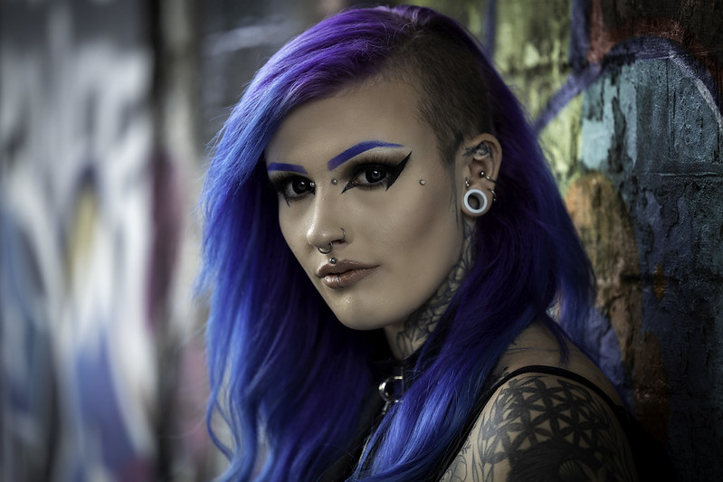
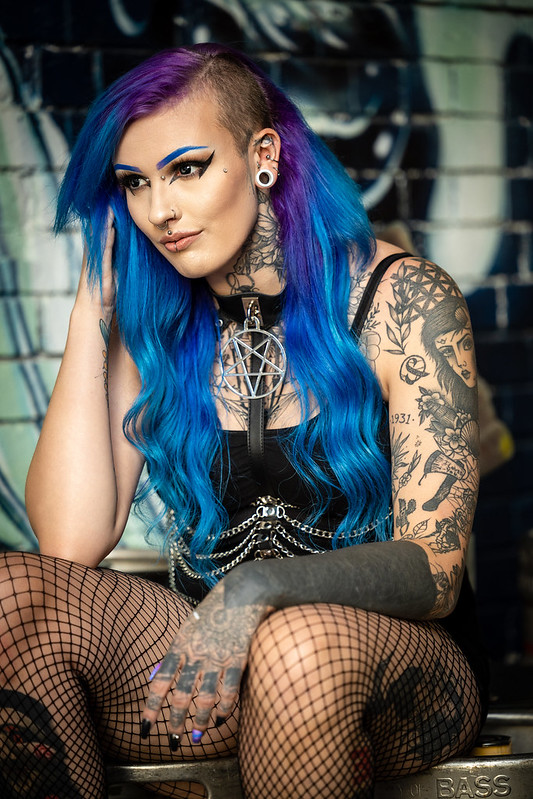
Portraits aren't usually my thing but I am trying to improve my skillset, so here is what is my second attempt of dedicated portrait shots.


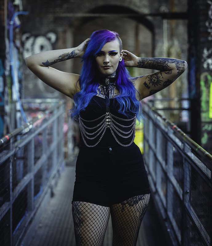
I really liked this one but I am so angry at myself for getting the composition wrong and cutting her knee off :crying:

 
Last edited:
I agree with the above, a little fill in flash in the second would lift it nicely I'd suggest :)
 
I think they’re great - only critique would be the vignette is a little unsubtle in a couple of them I.e. 1 and 3.
 
Nice set. If I was to offer any crit it would be that number 2 looks a little under and there’s very few people who that pose flatters. If you’d angles her slightly sideways it would have flattered her more.

number 4 looks a little warm compared to number 3 but I’m not on a calibrated monitor at present. Because of the way her legs come towards you and your angle to her they catch your attention and look very large. Personally I wouldn’t havekept this as I think it’s the weakest of the set

the set is great. I like it
 
No4 is the one I like - the others not so much

Les :)
 
I'd say number 2 was a little under exposed and I'd agree with the pose isn't overly flattering. But the rest are very solid. My favourite is no4. I personally think that's better than the final image (even if the knee was fully in shot [emoji13]) I prefer the eye contact but that just my personal opinion. Good work my friend.
If this is something you don't usually do, I'd say you have a great foundation to build upon. These are way better than some others I've seen, who've been doing it longer.
 
Also no3 is a very close second... Actually it's my joint favourite with no4. She's starring right into me with that look. Love it
 
Back
Top