

OP
- Messages
- 4,562
- Name
- Mark Gameson
- Edit My Images
- Yes
Age - I quite like the processing in #1. it has a bit of a stencil feel to it perhaps?
But #4 is the killer image for me. Less is more and you can't see that the wheels aren't minilites or steels.
Sharp - Blimey Mark, 5 offerings! #4 for me, it's Tack Sharp (groan). I like the way it pops from the background, which has some really great colours in it.
Thanks for taking the tim to comment on all 3 weeks TIm
I used Silver Fx to do the first image for Age and cannot remember which one! I agree No 4 is a better image I actually have that as my profile picture on facebook
Aged - I think an image of just the original mini would have been better, used to have a few myself but my right foot and their engine size don't seem to work well together ... :laugh
Sharp - The pencil theme is spot on for me.
Thank you I did consider just the classic but thought the 2 showed how far the Minis have come even in the last 18 years.
 R2-06629-014A
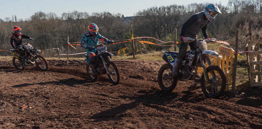
 WEEK 7 GUARDED (6 of 6)
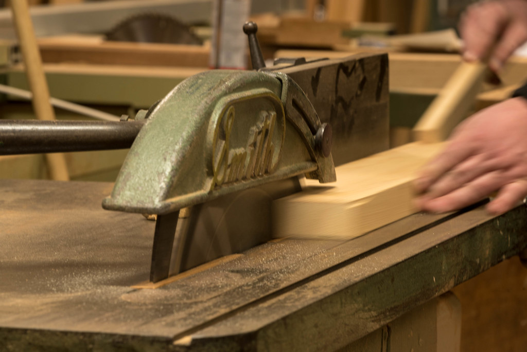 WEEK 7 GUARDED (5 of 6)
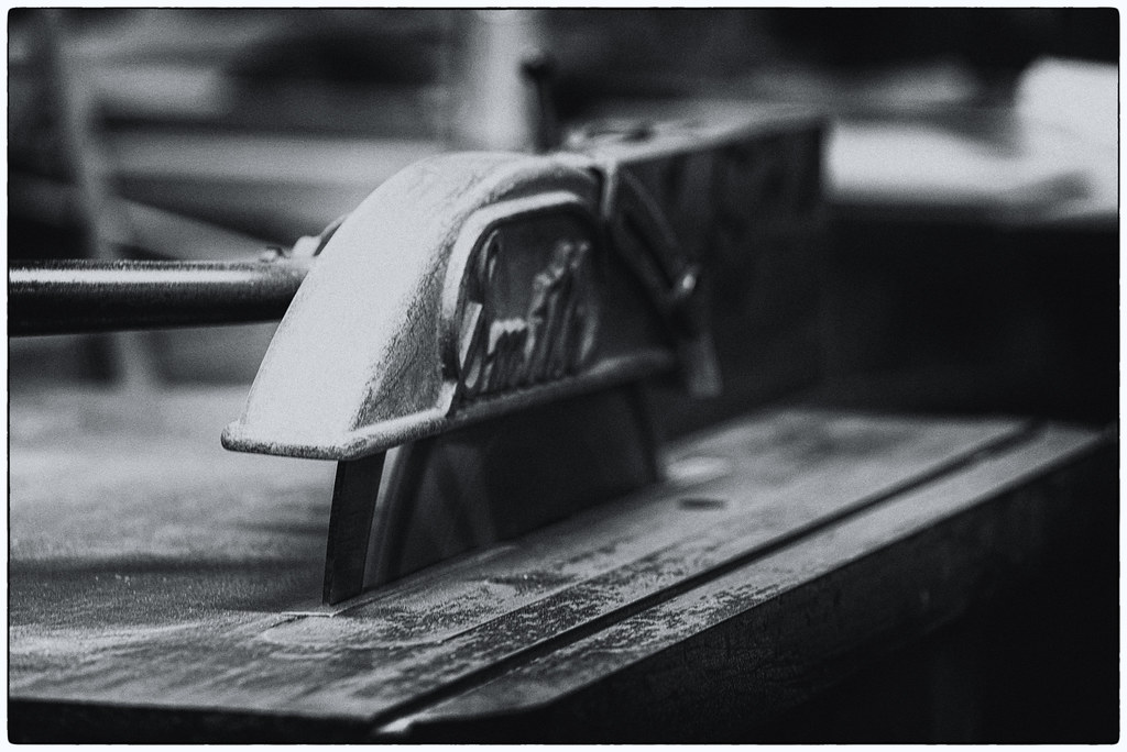 WEEK 7 GUARDED (4 of 6)
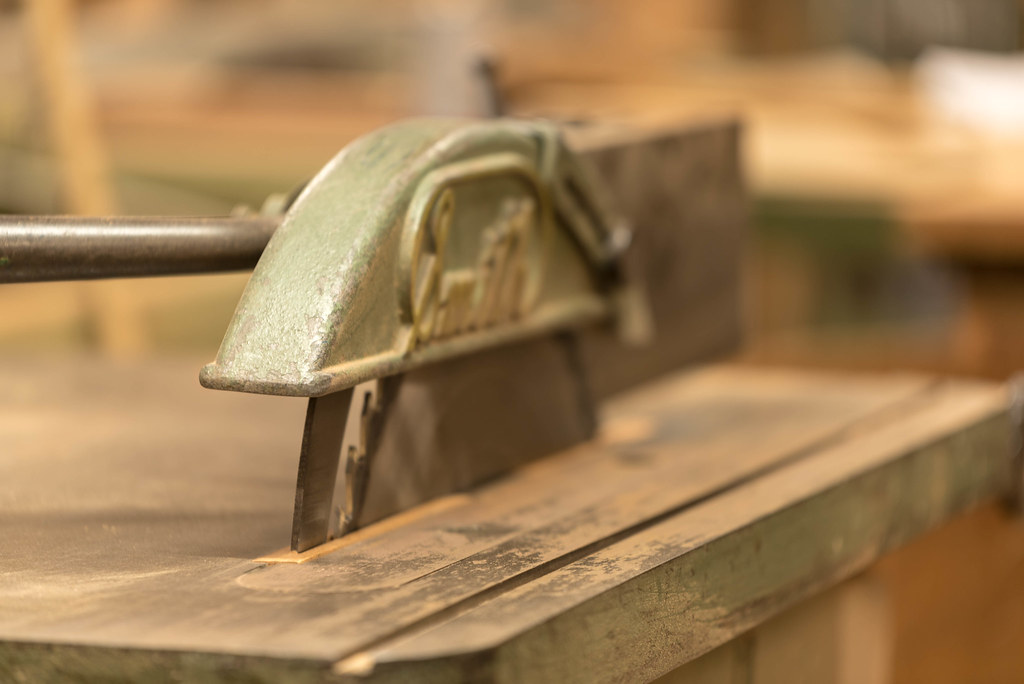 WEEK 7 GUARDED (3 of 6)
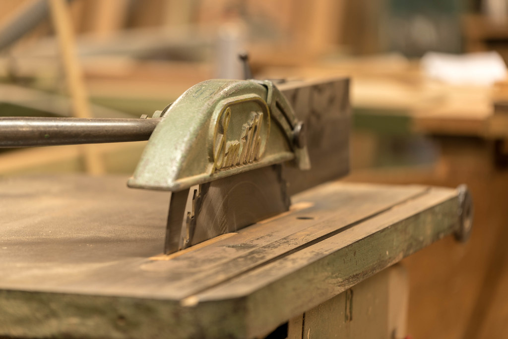 WEEK 7 GUARDED (2 of 6)

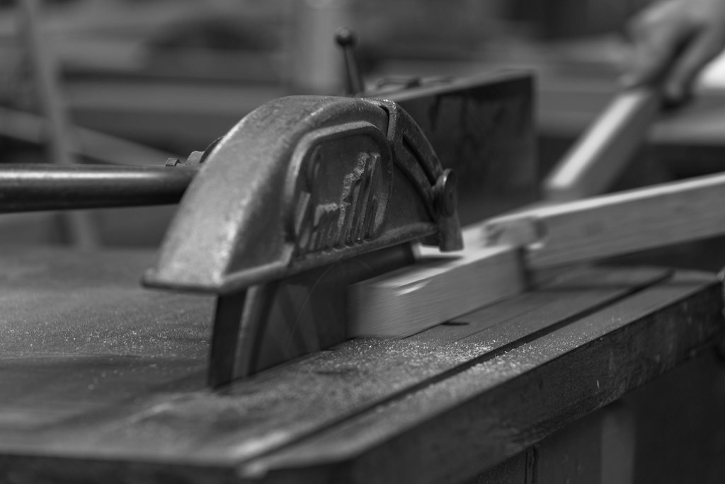
 WEEK 8 IN THE THICK OF IT (1 of 6)
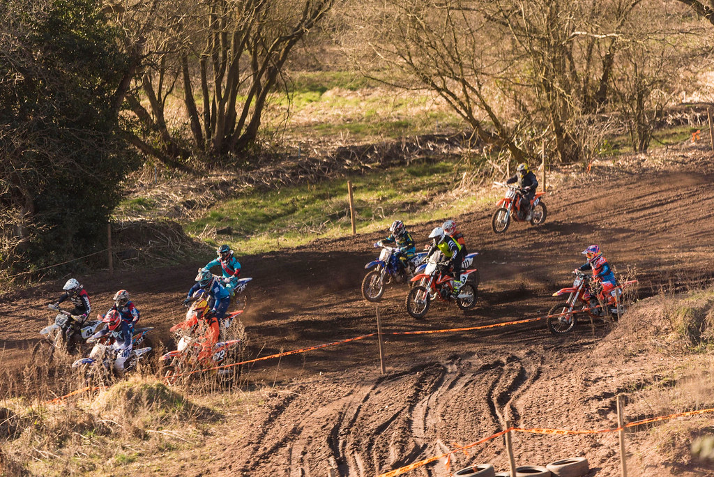 WEEK 8 IN THE THICK OF IT (2 of 6)
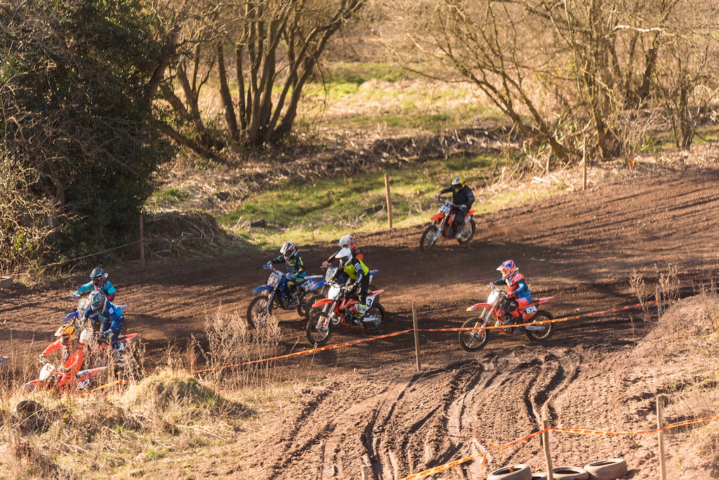 WEEK 8 IN THE THICK OF IT (3 of 6)
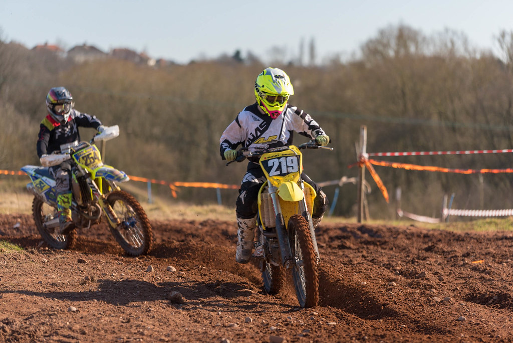 WEEK 8 IN THE THICK OF IT (4 of 6)
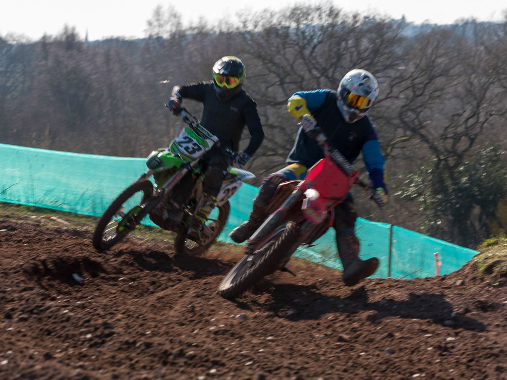 WEEK 8 IN THE THICK OF IT (5 of 6)