

You are using an out of date browser. It may not display this or other websites correctly.
You should upgrade or use an alternative browser.
You should upgrade or use an alternative browser.
More Shoehorns, Cosplay and Steam from LC2 for 2020 : Week 52 - Decorate(d)
OP
LC2
Negan
- Messages
- 10,451
- Name
- Tim
- Edit My Images
- Yes
White whites and bang on theme - tools stand out nicely. Like it.
ThanksWell it looks all white to me. Good job making those whites white.
") You should have seen the first couple of efforts. Decidedly grey.
You should have seen the first couple of efforts. Decidedly grey.- Messages
- 4,562
- Name
- Mark Gameson
- Edit My Images
- Yes
Works for the theme Tim those whites are lovely and white nicely handled.
- Messages
- 115,214
- Name
- The real Chris
- Edit My Images
- No
Mental note avoid any themes possibly remotely connected to ComiconConvention season starts 8/2 so a couple of weeks yet.
OP
LC2
Negan
- Messages
- 10,451
- Name
- Tim
- Edit My Images
- Yes
Better than real lifegood work on the whites
I was kinda expecting a lot more camera shots, but yes, I did want to avoid the obvious if possible.Theme done. So many have submitted 'shed-type' tools, so well done for providing something different.
De-sat a bit , play with the WB and boost the exposureWorks for the theme Tim those whites are lovely and white nicely handled.
Well, if you know your Harley or Deadpool...pleasure - I don't quite know what's going on there, but it looks rude. Great background too!
tool - could you come over and paint our wardrobes if you have any white left?
The photo lies. IRL they aren't as good (it's only the primer though).
Like you avoid Jazz ones eh?Mental note avoid any themes possibly remotely connected to Comicon
- Messages
- 115,214
- Name
- The real Chris
- Edit My Images
- No
Yeah pretty muchLike you avoid Jazz ones eh?
OP
LC2
Negan
- Messages
- 10,451
- Name
- Tim
- Edit My Images
- Yes
I certainly enjoyed doing the pleasure shot far more than the paintingHi Tim,
Loving the shot for pleasure. Really creative and spot on the theme
I don't think your shot for tool is a PABD at all. It works for my and kinda has a high key / minimalist feel to it. I like it
Non-Binary me, so I'm allowed to multitaskSurely this is multi-tasking
I totally agree. But while I'm working from home, @minx has got me doing some DIY.Decorating! {shudder}
Nicely shot!
- Messages
- 2,833
- Name
- Pete
- Edit My Images
- No
Nice white whites Tim. I think I may have cropped a little tighter (but that's what I do!).
OP
LC2
Negan
- Messages
- 10,451
- Name
- Tim
- Edit My Images
- Yes
Crop into the brush handle in the same way I cropped into the paint pot? Hmm maybe ...Nice white whites Tim. I think I may have cropped a little tighter (but that's what I do!).
- Messages
- 5,432
- Name
- Andrea
- Edit My Images
- Yes
HI Tim, I'm scrambling to stay up to date with commenting as well as images so it feels very late to be getting back to your thread but I've made it PABD or not, it's definitely on topic and you've kept the whites white, which isn't a given in photography, so well done for making extra use of your DIY time! It's a different type of tool too (although not quite as different as Cobra's!) so well done for that.
Oops, I thought I had missed Pleasure but there it was, hiding behind a Spoiler! A cheeky idea but why not, and the background is a good idea too.
PABD or not, it's definitely on topic and you've kept the whites white, which isn't a given in photography, so well done for making extra use of your DIY time! It's a different type of tool too (although not quite as different as Cobra's!) so well done for that.Oops, I thought I had missed Pleasure but there it was, hiding behind a Spoiler!
A cheeky idea but why not, and the background is a good idea too.
OP
LC2
Negan
- Messages
- 10,451
- Name
- Tim
- Edit My Images
- Yes
Thanks Andrea. I would have needed a spoiler for Tool as well as Pleasure if I'd followed @Cobra's leadHI Tim, I'm scrambling to stay up to date with commenting as well as images so it feels very late to be getting back to your thread but I've made it
Oops, I thought I had missed Pleasure but there it was, hiding behind a Spoiler!
Tool was *interesting* to process, Pleasure was more fun to create.
OP
LC2
Negan
- Messages
- 10,451
- Name
- Tim
- Edit My Images
- Yes
Week 4 - Discarded
In common with thousands of other steam locomotives, SR N15 Sir Lamiel and BR Std 8F 48624 were discarded by British Railways as part of the "Modernisation Plan", some after only a few years in service.
Some were fortunate enough to be 'scrapped' at Barry in South Wales, which was busy on other work and they survived long enough for the preservation movement to start buying them up for restoration.
Sir Lamiel and 48624 are pictured here in the GCR works at Loughborough.
Hand held at ISO 3200 and given a processing effect suited to the 1950s
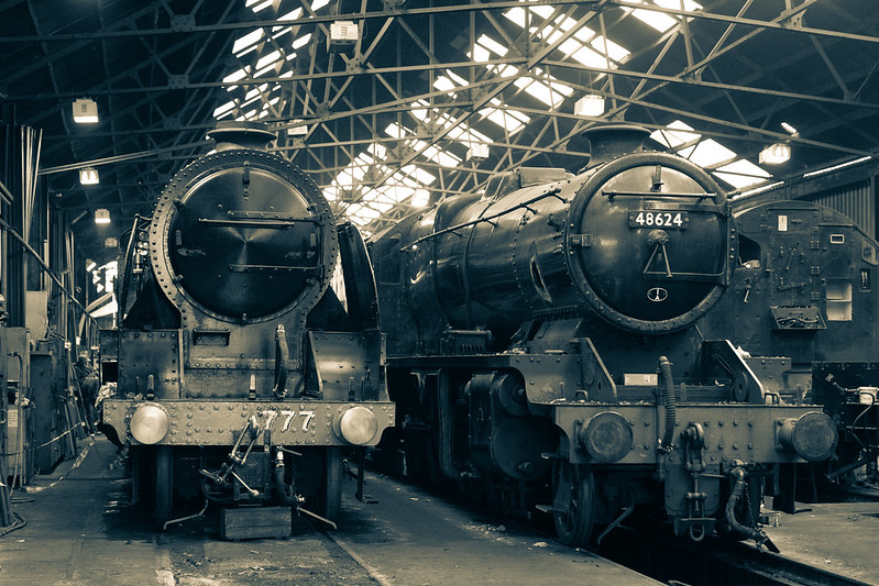
Southern Railway N15 - 777 - Sir Lamiel / British Railways 8F - 48624 by Tim White, on Flickr
In common with thousands of other steam locomotives, SR N15 Sir Lamiel and BR Std 8F 48624 were discarded by British Railways as part of the "Modernisation Plan", some after only a few years in service.
Some were fortunate enough to be 'scrapped' at Barry in South Wales, which was busy on other work and they survived long enough for the preservation movement to start buying them up for restoration.
Sir Lamiel and 48624 are pictured here in the GCR works at Loughborough.
Hand held at ISO 3200 and given a processing effect suited to the 1950s
Southern Railway N15 - 777 - Sir Lamiel / British Railways 8F - 48624 by Tim White, on Flickr
- Messages
- 115,214
- Name
- The real Chris
- Edit My Images
- No
Tis a shame about all the discarded Locos.
I used to watch them go by at the bottom of the playing fields but that was a few years ago, and that line, along with so many fell to the Beeching Axe.
Nice shoehorn I mean nice processing, it does indeed suit the image.
I used to watch them go by at the bottom of the playing fields but that was a few years ago, and that line, along with so many fell to the Beeching Axe.
OP
LC2
Negan
- Messages
- 10,451
- Name
- Tim
- Edit My Images
- Yes
Such a shame they still don`t run as normal, loving the effect you gave it in 50s style.
I think it needed that look. A sharp, vibrant colour version would have bene too out of keeping imo.Tis a shame about all the discarded Locos.
I used to watch them go by at the bottom of the playing fields but that was a few years ago, and that line, along with so many fell to the Beeching Axe.
NiceshoehornI mean nice processing, it does indeed suit the image.
OP
LC2
Negan
- Messages
- 10,451
- Name
- Tim
- Edit My Images
- Yes
You can still do that in a few placesA great atmospheric shot, and a beautiful subject, I still remember standing on a bridge with my mum waiting to be blasted with steam..andb I loved the smell.
I honestly thought you'd beat me to a kettle shot for this!Ooooh I do like an 8F
Never considered an old steamer for "Discarded" - Hmmm... maybe I should - not sure I can get to one before Thursday though.
Thanks, I envisaged this look when I took it.Lovely processing on this and it really suits the theme.
IndeedThank goodness for the preservation movement, nice fit for the theme
Thanks Helen, it's what I was aiming for.Impressive beasts.. so much more character than the sleek modern versions. The processing is well suited to the era.
It's 3200ISO alreadyNice Discarded image, the composition is really nicely balanced. I wonder if it might 'benefit' from some added grain/noise, to really complement the antique look in the pp (?). We weren't bad at proper engineering back then.
I think there is enough grain, especially once you zoom in. Feel free to have a play and post a version though Cheers Stan. I liked it. Had to wait around a fair bit to get the shot without people in it (who would have looked out of place on their phones etc.)I like that a lot, Tim. Nice view angle and composition. The exposure is spot-on too, the slight grainy high ISO and mono process with a hind of sepia tint just suit that mid-1900 feel.
Cheers BrrndNice trains! Very sharp, nice details and great processing!
- Messages
- 5,184
- Name
- Fi
- Edit My Images
- Yes
Interesting take on the theme and I like the processing on this - feels quite 'cold' which sets the tone well for the theme.
OP
LC2
Negan
- Messages
- 10,451
- Name
- Tim
- Edit My Images
- Yes
I always like an interesting take on a theme (as you'll probably find out if you follow my 52 through the yearInteresting take on the theme and I like the processing on this - feels quite 'cold' which sets the tone well for the theme.
)- Messages
- 4,562
- Name
- Mark Gameson
- Edit My Images
- Yes
Really like that Tim the processing is absolutely perfect for it, it feels as though it was taken in the 50's.
- Messages
- 2,833
- Name
- Pete
- Edit My Images
- No
Those are fine pieces of engineering and I like that the processing gives the pic even more "atmosphere".
OP
LC2
Negan
- Messages
- 10,451
- Name
- Tim
- Edit My Images
- Yes
Spot on processing here Tim!
It really does have the feel and look of an image taken in the fifties, which perfectly suits the subject.
Impressive!
Really like that Tim the processing is absolutely perfect for it, it feels as though it was taken in the 50's.
Cheers all. I was quite happy with the effect I got and it seems that most others are tooThose are fine pieces of engineering and I like that the processing gives the pic even more "atmosphere".
- Messages
- 508
- Name
- Heather
- Edit My Images
- Yes
Playing catch up with comments tonight.
Last weeks theme of tools was totally out of the ordinary, whilst the rest of us were photographing the obvious you were seeing the obvious whilst being press ganged into doing some DIY. The crispness of the White really made the paint tray stand out.
I love the aged feel to this weeks discarded shot, the engines stand discarded in their shed and all because locomotive design and performance meant they were discarded for the new shiny engines that emerged. I think the aged feel makes this photo, had they been in colour it wouldn’t have done them justice and wouldn’t have been interpreted in the same way.
Thumbs up from me
OP
LC2
Negan
- Messages
- 10,451
- Name
- Tim
- Edit My Images
- Yes
Thanks HeatherPlaying catch up with comments tonight.
Last weeks theme of tools was totally out of the ordinary, whilst the rest of us were photographing the obvious you were seeing the obvious whilst being press ganged into doing some DIY. The crispness of the White really made the paint tray stand out.
I love the aged feel to this weeks discarded shot, the engines stand discarded in their shed and all because locomotive design and performance meant they were discarded for the new shiny engines that emerged. I think the aged feel makes this photo, had they been in colour it wouldn’t have done them justice and wouldn’t have been interpreted in the same way.
Thumbs up from me
I'm quite pleased with discarded. Tools was more of a PABD, but I did pay attention to the black & white points.
- Messages
- 5,921
- Name
- Dominic
- Edit My Images
- Yes
I'm glad there are still people/enthusiasts around who are willing to give up their time to restore and run these great trains of our heritage. I was going to say, our industrial heritage, but like you said a lot of these engines aren't or weren't very old when they were put out of service.