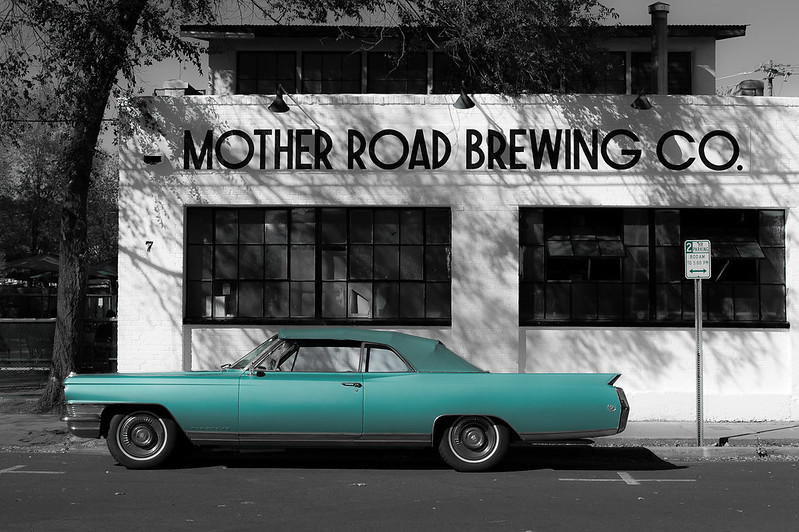
I like it in principle, I have no hang-ups about selective colour as long as it is carefully done and truly 'selective', my thoughts on this image specifically:-
- It looks, to me, as if you have missed the colour (blue) on the road-sign to the right of the car ... the [2] and the <~>.
- For me, the car extending beyond the building to the left and crossing the trunk of the tree creates a visual imbalance that I find uncomfortable to the eye.
- The 'clutter' behind the tree detracts from the simplicity of the car and the building.
I appreciate that you probably didn't park the car and there was possibly no other way of capturing the image (even moving to the left?) but these are just my honest observations on a photo that is otherwise a good use of selective colouring
")


 _DF02404
 _DF02404