

You are using an out of date browser. It may not display this or other websites correctly.
You should upgrade or use an alternative browser.
You should upgrade or use an alternative browser.
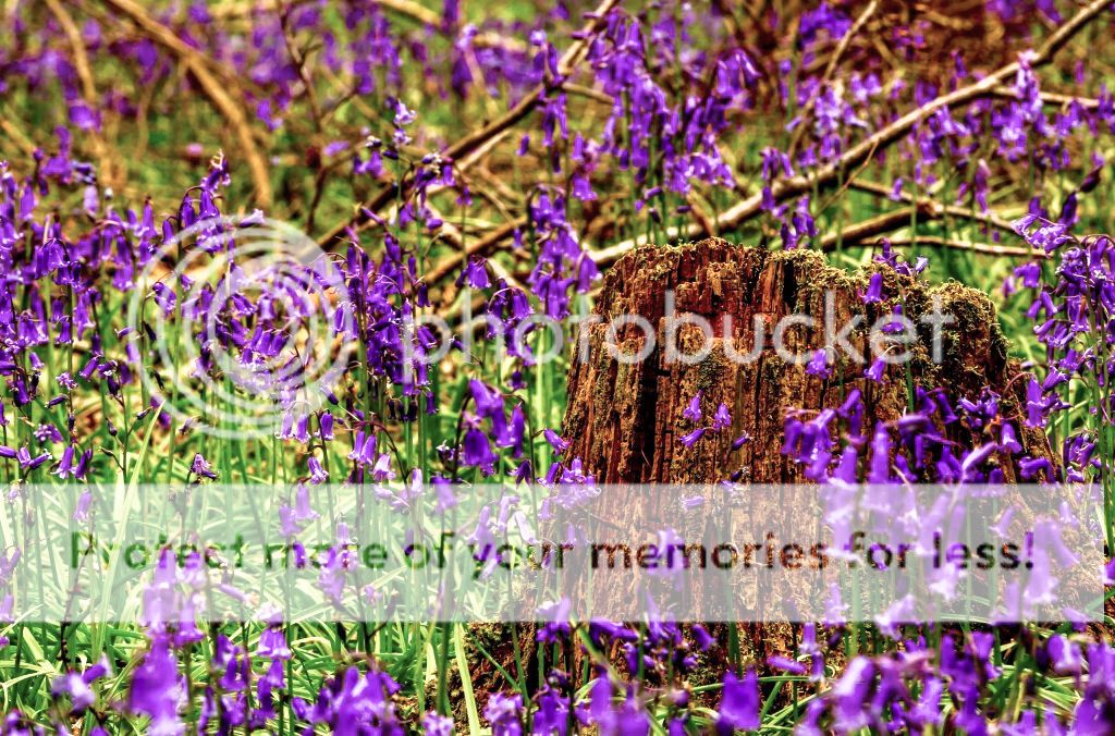
Beginner My bluebell effort.
- Thread starter Roy1212
- Start date

- Messages
- 2,214
- Name
- Craig
- Edit My Images
- Yes
Nice to see you trying to include various elements in the shot here rather than copying the standard bluebell shot.
I think either the WB is slightly warm, or you have over saturated the photo. I love contrast in my processing but perhaps it is a little strong in that respect too. This is not a criticism just an observation, with regard to the background I can't help but feel that you should either have used a wider lens, stepped further back from the foreground and/or stopped down for greater depth of field to include it, or really blurred it out with shallow depth of field and nice bokeh. As it is it is just a bit blurry looking.
I think either the WB is slightly warm, or you have over saturated the photo. I love contrast in my processing but perhaps it is a little strong in that respect too. This is not a criticism just an observation, with regard to the background I can't help but feel that you should either have used a wider lens, stepped further back from the foreground and/or stopped down for greater depth of field to include it, or really blurred it out with shallow depth of field and nice bokeh. As it is it is just a bit blurry looking.

- Messages
- 23,521
- Name
- Toni
- Edit My Images
- No
These are always tricky to get the colour balance right.
Out of interest does this look better to other viewers?
It must depend quite a bit on your screen calibration I suspect.
That also appears to have a slight colour cast, though much less, possibly having gone too far the other way.
just one further point of critique, if I may, the log is a very major visual element, and should either be sharp or more blurred - like this it looks like focus was missed because it dominates the image compared to the actual focus target of the bluebells in the foreground.
- Messages
- 2,480
- Name
- Steve
- Edit My Images
- Yes
I quite like the shot but agree with @ancient_mariner . I think there is a bit a clash here can't decide if it's a slight cast from PP or WB. It looks like as Craig says it's a little warm which has tinted the bluebell a little. Tricky ... would be a good time to have a grey card around") .
.
I don't think your choice of aperture has done you any favours here Roy as its not as sharp as it should be, probably due to diffraction at f20.
I like the composition would be nice sharper, I like the low perspective as this gives more density to the bluebells in the distance, sometimes from I higher perspective bluebells can look patchy and not as nice and dense as your shot.
.I don't think your choice of aperture has done you any favours here Roy as its not as sharp as it should be, probably due to diffraction at f20.
I like the composition would be nice sharper, I like the low perspective as this gives more density to the bluebells in the distance, sometimes from I higher perspective bluebells can look patchy and not as nice and dense as your shot.

- Messages
- 23,521
- Name
- Toni
- Edit My Images
- No
This image looks like it's had some kind of (hideous instagram) filter applied to give nuclear-fallout greens and ultra-violent violet colours. Since you have given permission to edit images I took it into lightroom to try to unpick the filter settings:
It was quite difficult to make it look natural. Initially I gave it about 0.5stops extra exposure and then tried to colour balance in the normal way, which proved impossible, though I did settle with -5 on temperature and +9 on tint (more time would possibly improve these settings). I also set black & white points to crisp it up a little more and reduced vibrance -15 and saturation -12. Next I went to the HSL sliders, altering the hues that appeared to have been skewed by the filter: orange +5, yellow -10, green -21, blue +55 and purple -17.
It's not 'right' yet, but it looks more pleasing to my eyes than otherwise - what's your thoughts Roy?