My first attempts at portraits

Firstly, congrats on doing a training shoot and I hope it gives you some confidence, given that the comments on Flickr suggest that the model was nervous!

What sort of lighting did you use?

My comments would be as follows:-

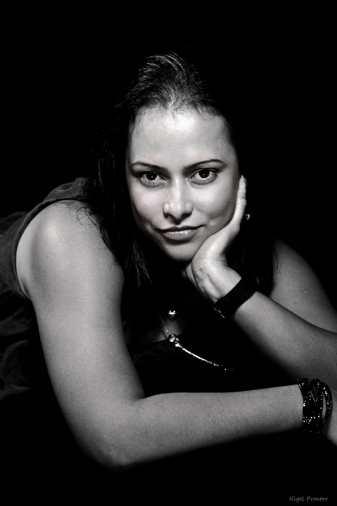
1. The pose is a little awkward. The shoulder dominates. Hand is cut off.
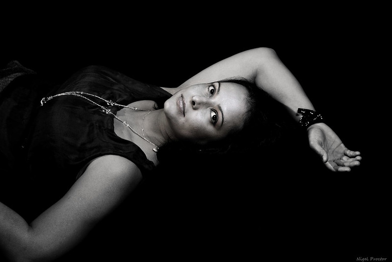
2. Better, but the cut off arm is again a no no in my book. Also some separation of the hair from the background might be beneficial, unless this was the idea.
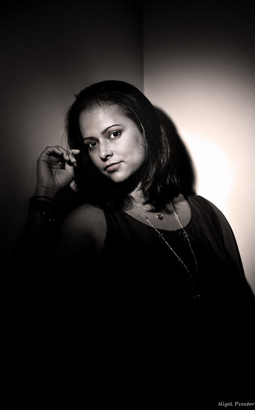
3. The model seems more at ease in this one. Again the shadow and background detract from the overall image, I would have placed the model away from the wall if a harsh shadow was likely to ensue. Also cropping this one at the base would not detract as there is little detail in the lower section of the photo. The bright spot on the wall draws attention away from the model.

Hope you don't mind but here is the crop, deliberately taking a little off the top of the head though...this is a Marmite sort of thing, but look how often it is done on commercial shoots.

2gt3q8m.jpg


It also concentrates attention on the most important thing...the eyes.

However, these are meant as helpful comments , to encourage you next time around, rather than to be critical; Its a learning curve for us all!

Keep on shooting.
 
Last edited:
The 2 most important things for you at the moment are :
1- Practice
2-Practice some more

As a first attempt these aren't too bad, although I agree with the comments from Shreds above.
You will find that when shooting different models you will get inspiration from them too.
Don't try to run before you can walk, and you, and your style will develop naturally.
As said, keep shooting, and you'll keep improving.
Keep posting your results on here, and take on board the helpful critiques which you can learn from.
I look forward to seeing more of your work.
Well done.
 
They're good, especially for a first go, but one thing stands out.. They're very dramatic mono conversions of what look to be quite soft & feminine poses. I _think_ the conversions have made the lighting look a bit patchy & uneven but it's hard to tell. I'd like to see something less severe.

(What it actually looks like is that you've used Silver Efex Pro and ramped up the structure or soft contrast sliders too far, or perhaps the clarity in Lightroom).
 
There's still some colour in there and it's distracting as hell. Makes her look like she's been dug up.

Nice shots for your first go though mate. Good effort.
 
As above, the shots are good for a first attempt, but the processing is more of a 'let's see if I can follow this tutorial' rather than, 'what does this shot need to improve it'.


I've said it before, I won't be happy till every 'eye popping' tutorial on the Internet has been removed. :)
 
  • Like
Reactions: GHP
Back
Top