Beginner My first print

Messages
8
Edit My Images
Yes
Hi guys, need some help here!

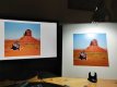
Few days ago I ordered from theprintspace.co.uk my first proper print - meaning a fairly large one to hang and where I did care what the print looked like, rather then the usual small format ones to put in an album.

Of course the print doesn't look like its digital version on screen. First of all some useful pieces of information for you:
  • my monitor is IPS and calibrated with Spyder4Pro to gamma 2.2, 6500K and 80 cd/m2
  • I edited the photo using Capture One 20 Pro and I selected as output profile Fuji Matt which is the one theprintspace.co.uk provides for the type of paper I chose
When I got the print it looked darker than expected but more importantly more saturated and redder than what I had on the screen. Assuming there is nothing wrong the printing process - and theprintspace.co.uk customer service has been super nice in answering my questions and they confirmed everything looked in order on their side - do you think I'm missing some essential step here? Something that can clearly make the print look different?

Or rather is it just that I've got wrong expectations and the problem is the way I'm (re)viewing the print?
 
Several things come to mind.

Did your exported image match their colour space and format requirements?

Is the viewing light daylight, artificial (source?).

Did you apply a downloadable print correction (forgot the right term for this) from them?
 
I edited and exported using the ICC profile they provided for the chosen paper, not sure if that's what you mean.

To be honest since this is basically my first experience at getting a "calibrated" photo printed I never spent much time thinking about how it should be viewed. So I bought a 550 lumens 6500K bulb for my desk lamp to make sure I'm viewing the printed photo in a - slightly - more sensible way. I've attached a quick snap grabbed with the phone to compare monitor and printed versions where the printed version is being lit by the aforementioned bulb.

I must say that in this viewing conditions the overall exposure looks fine to me. What left me puzzled is colors hues and luminosity - and maybe white balance - seem off. Look at the bottom right part of the picture in particular, the sand in the digital version is way more bright and vibrant and it's definitely darker and subdued in the printed version.

Not sure what to make of it since as said I'm inexperienced. Can this be a monitor calibration issue? Or is this what I should expect depending on printer and paper?
 

Attachments

  • comparison_exp.jpg
    comparison_exp.jpg
    104.2 KB · Views: 61
Last edited:
Interesting...

The shadows on the LH side of the rock look better defined in the print and yet as you say, the mid-tones appear darker...

What paper did you get he print done on? This can make a huge difference in perceived tones. Matt paper for example, will give a much lighter feel to a print vs the contrast of a gloss print. Then there are all the "definitions" in between, with silk, lustre, and other words used to describe varying amounts of gloss.

Based on your image, I'd say that's a pretty good representation. My initial impression is that the screenshot is overall darker than the print and if you hadn't called out the bottom right corner, I'd be puzzled.

"White" is very different on different papers and whilst ICC can correct it to a degree, it isn't perfect if you have exacting standards...

Especially if the paper itself isn't white... Here are some sample shots of different papers I've tested to show how "white" isn't always white... Your screen will likely be perfectly white so if the paper is off-white, even a calibrated print isn't going to be perfect (to a critical eye - would a non-photographer really notice any issue?)

IMG_0421.jpg
IMG_0417.jpg
 
Last edited:
The paper is Fuji Matt - at least that's the name on theprintspace.co.uk - and its finish is defined as "Slight Sheen / Satin".

I can totally see your point about different whites and how they can change the colour perception. What your conclusion - or opinion - though? Given what's on the screen does the print look acceptable?

When I pointed out how brighter the bottom part of the image is on screen rather than on paper the guys at theprintspace said that I should probably recheck my monitor calibration but I've already done that more than once and everything seems in order.

What I'm saying is do the two images look different just because of different media or are they so different - despite the monitor calibration - that it may indicate some issue on my side - for instance wrong calibration, wrong ICC profile, etc.?

Thank you for putting up with me. :p
 
do the two images look different just because of different media or are they so different - despite the monitor calibration - that it may indicate some issue on my side - for instance wrong calibration, wrong ICC profile, etc.?

I'd say that we don't really have enough info to tell. Looking at your screenshot I'd say that's acceptable. The only way I got results I was completely happy with was when I printed my own.

The media can often be responsible for tonal differences. ICC profiles (someone correct me here) relate to colour balance (that's the "C" in ICC). However a paper with a red sheen to it will "warm up" the overall image no matter how you play it. Do you have Lightroom? Did you soft proof? (If not - look up some tutorials on it)

My view is that the colour balance looks fine. The tonal ranges are slightly off, but there's nothing there that indicates it's anything other than media. However I'm making that judgement based on a screenie and don't have the physical print to hand or the hi rez original digital file. I very much doubt someone who didn't take the image would notice.
 
I was going to suggest soft proofing, but Ian beat me to it.
You could try calibrating with your device, but try different software from Displaycal
https://displaycal.net
I find it gives a better result than with Spyder and using their software

So hard to get a good result from printers, had a Photobook done at a well known company
It was awful, overall look was pale and the colours were poor too.
Only prints I'm happy with now are from my printer, maybe something to consider?
 
Do you have Lightroom? Did you soft proof? (If not - look up some tutorials on it)

The monitor in the snapshot is showing the soft proof version of the photo - that's Capture One but I also checked Photoshop and they look identical.

My view is that the colour balance looks fine. The tonal ranges are slightly off, but there's nothing there that indicates it's anything other than media. However I'm making that judgement based on a screenie and don't have the physical print to hand or the hi rez original digital file. I very much doubt someone who didn't take the image would notice.

Fair enough. At this point I'm thinking that too. Media must be the main culprit here. And as you say while they look different it's not a difference that make the paper version bad.

You could try calibrating with your device, but try different software from Displaycal
https://displaycal.net
I find it gives a better result than with Spyder and using their software

That software is amazing! :D I'll definitely switch to it rather than what Spyder provides. I've run a full calibration though and the result looks basically identical to what I had before. Again this seems to prove that the calibration here is not a factor.

The only way I got results I was completely happy with was when I printed my own.
Only prints I'm happy with now are from my printer, maybe something to consider?

Everybody seems to get to this conclusion. I'll seriously think about it. (y)
 
Everybody seems to get to this conclusion.

Good luck :)

My lightbulb moment with printing was when I was talking to someone about DSCL and asked "why would you print your own?" Their response was simply "I don't do it because it's cost effective". They do it for the absolute control you get over the final product. And photography for me is all about that. I was kicking myself for not figuring it out sooner.

it's not a difference that make the paper version bad

This is really important to remember. Media will give a very different impression depending on your choice and the great thing about printing your own is that you can try different media to get the best result (for you).

All the best!
 
Back
Top