My first shoot with Ella (Setup shot added)

Messages
1,564
Name
Graham
Edit My Images
No
I've been building up to a shoot this evening and learning a lot about beauty lighting and dishes and side lighting and all manner of things that I hadn't used before. I had a clear picture in my head regarding what I wanted to achieve and although I've only edited one or two images so far, I am very pleased with the results.

I'll add to this thread as I edit images and post a few that I like. I'm using this session to work on my Photoshop retouching too, so I expect my editing will get better as I go along. I'm not taking any shortcuts with retouching (this time) so it's going to be a steep learning curve to begin with I reckon! I'll also add the pull back image as soon as I get it off the phone.

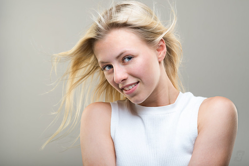
So to start, here's the 1st image I edited.It's actually a test shot from the last of the sessions this evening. I have converted to mono because I love the texture of the top and this particular image looks better in mono than colour.


EllaScott-262-Edit
by Graham Mayers, on Flickr

Here is the pullback shot - it's only from an iPhone and doesn't quite convey the true scale, but it should be good enough to illustrate the setup.


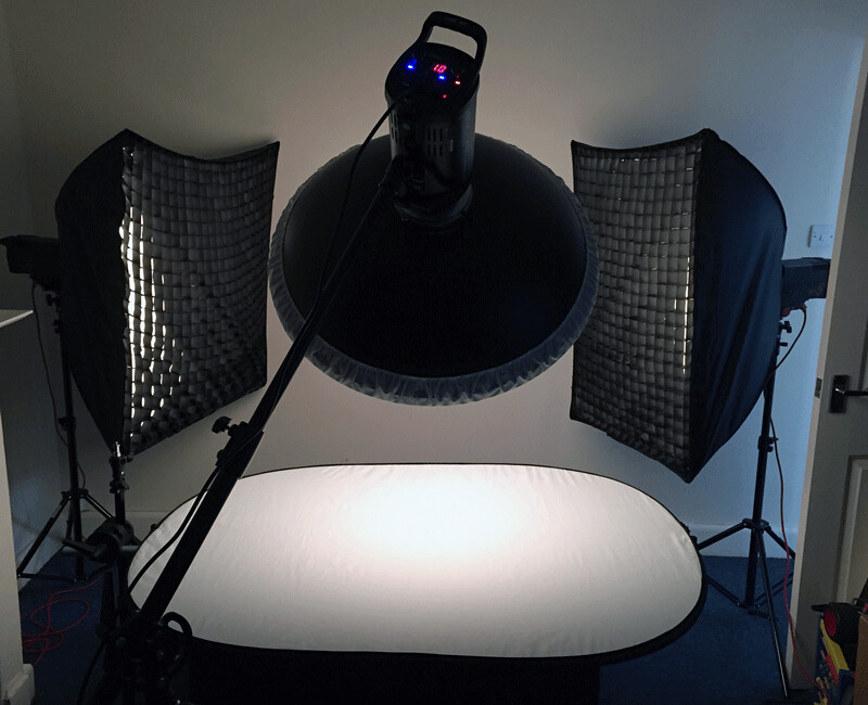
Ella Scott Light Setup by Graham Mayers, on Flickr
 
Last edited:
Graham,

Love her natural, cheeky look.

The uneven lip line bothers me though. Other niggles include the rucked top under her left arm, and what appears to be a thin, pale vertical shadow to the left of the model on the background, but that is easily dealt with in pp. Anyway just my thru'pence worth.

Enjoying following your journey in portraiture :)

Thanks Ian, I've sorted the annoying line on the wall. I think it's a wallpaper join which I had tried to sort using the clone tool but hadn't picked up the change in value :banghead:

I've left the crop to include the 'rucked top' as I think it's the lesser evil. Cropping tighter makes the arm/shoulder look big...
 
Last edited:
Thanks Ian, I've sorted the annoying line on the wall. I think it's a wallpaper join which I had tried to sort using the clone tool but hadn't picked up the change in value :banghead:

I've left the crop to include the 'rucked top' as I think it's the lesser evil. Cropping tighter makes the arm/shoulder look big...

Don't get me wrong, I don't think cropping it out would help at all at this stage. Just something to bear in mind in future.
 
Graham, took the opportunity to look at your flickr page, i think this image is superb... D41_3895-Edit-Edit-2. If you can recreate this feel in your work then you have something a bit special. The featured photos of Ella are very competant, I cant add anything as I tend to take snapshots rather than studio work although saying that 267 could maybe be improved in post by working on the background to even the tones ( as you say), try selecting the model, inverting the selection and playing with the tone curves....could be a disastrous fail but maybe worth a go. Regards Gary
 
Last edited:
What a lovely open face. Well captured. I could fotograph her till the Wife found out!
 
Is the brightness to either side the result of the lights being too close to the background? Moving them further away might soften the effect. Also need to slightly reduce the hot spot on her leading shoulder?
 
Is the brightness to either side the result of the lights being too close to the background? Moving them further away might soften the effect. Also need to slightly reduce the hot spot on her leading shoulder?

No, the difference in brightness is due to me being cack-handed with trying to even the background after fixing a wallpaper join, trying to match left and right tones and then going too far down the retouch process before noticing and then not wanting to redo it all last night at silly o'clock! I wanted to share something so decided to post it anyway as this is as much about my learning journey as it is about showing some polished, final images.

I really like this image so will be giving it another go. Will also reduce the hot spot on the shoulder.

Thanks for contributing Ian (y)
 
Graham, took the opportunity to look at your flickr page, i think this image is superb... D41_3895-Edit-Edit-2. If you can recreate this feel in your work then you have something a bit special. The featured photos of Ella are very competant, I cant add anything as I tend to take snapshots rather than studio work although saying that 267 could maybe be improved in post by working on the background to even the tones ( as you say), try selecting the model, inverting the selection and playing with the tone curves....could be a disastrous fail but maybe worth a go. Regards Gary

Thanks Gary. I have a lot of images to process so I think I will have one or two that are similar in mood/feeling to the one of Tammy. I'll continue to post new images as I process them.
 
Congrats! The preparation has paid off. I've seen far worse portfolio shots from photographers who claim to do produce them professionally.

Love the mono conversion of the first. I'd be tempted to do a little more work on her neck.
267: Either start again, leave it (I quite like it too), or.. try this, only takes 2 or 3 minutes after the first time; I have most of it set up as an action for backdrop cleanup.
  • Stamp, or duplicate layer, or smart object or whatever
  • Crudely select all the background (magic wand?) and invert selection to be just model & hair. It doesn't matter if you miss bits of background - but don't include any hair.
  • (optional, depending on accuracy of selection) Expand and feather the selection by a few pixels.
  • Cut model (Ctrl X) leaving a blank spot.
  • (optional) Magic wand to select blank spot and content aware fill
  • Lasso select & content aware fill the bright patches you dislike
  • Gaussian blur with large radius
  • Add noise to match what was there originally
  • Paste model back as new layer
  • (optional, depending on accuracy of selection) Group backdrop and model layers, add black layer mask to group. Paint in white on group mask to reveal areas which need backdrop cleanup.
If your selection is more precise early on then you don't need to add a mask to the group and paint in. I tend to use a mask now so I can leave some imperfections (!)
 
Last edited:
Thanks Simon - I'm pretty pleased that I went through the build up process, learning that side lights were too hot, figuring out better height/angle for dish, etc. It made the real session a lot less worrying and allowed me to concentrate on the photography rather than faffing with lights. There were definitely a few tweaks needed at the start and as we went through things, but the angst of getting the right balance wasn't there.

You guys helped a lot in your comments on the Tammy threads (y)

I will have a look later on this evening and give your background suggestion a go..
 
Here is my effort from tonight... This 'no short cuts' thing with retouching is a bit of a pain... but I think I'm getting better at it. It's slowing me down a lot, but I don't think I can ever go back to the 'plugin' type retouching programs - although I still have loads to learn.


EllaScott-175-Edit by Graham Mayers, on Flickr
 
Last edited:
These look great to me but as most will know on here I can seldom see the finer details that the pro's can spot :-(
These are most inspiring to me.
Well done I reckon she be chuffed with these !

Gaz
 
I really like these lovely set of images, nice lighting and thanks for including the set-up shot .

Mickey
 
Back
Top