New Zealand Trip

Messages
235
Name
Ben
Edit My Images
Yes
Here is selection of my favourite images I took on our trip to New Zealand over the last three weeks. Still have quite a few photos to review and edit. Some amazing scenery and beautiful roads to drive. So quiet compared to the UK. They also take great pride in the environment from the government to the public. This country could learn a few things.

Beach near Punakaiki, South Island

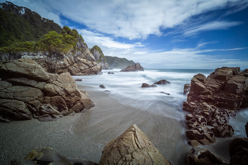
Punakaiki Beach, New Zealand by Ben Hanson, on Flickr

Road to Milford Sound...simply amazing to drive

Highway 96 to Milford Sound, NZ by Ben Hanson, on Flickr

Moeraki Boulders, South Island, a photographers dream...if you get there before the crowds.

Moeraki Boulers, NZ by Ben Hanson, on Flickr

Secluded forest stream, Lake Gunn, South Island

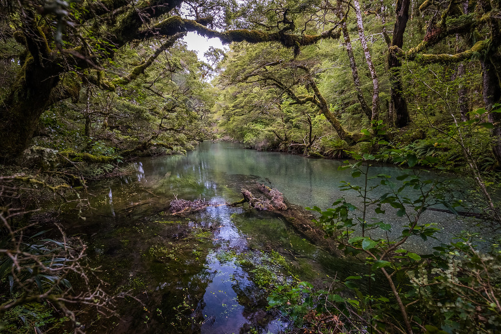
Tranquil by Ben Hanson, on Flickr

Lake Pukaiki with Mount Cook in the background, South Island.

Lake Pukaki, New Zealand by Ben Hanson, on FlickrA lonnngggg way to travel from the UK, but a beautiful place. I hope you enjoy these.

Ben
 
Last edited:
One and three would be pretty nice but there is some strange colour going on, probably related to the HDR processing. I think they need a bit more contrast as you've lost all the shadows which you'd expect to see, and number one is definitely wonky - check the sloping sea. Two is an ok travel-type shot but the other two aren't doing anything for me
 
Would love to go there and Australia but not learnt yet to walk upside down.:rolleyes::banghead:
 
That's good to know. I am colour blind so noticing removing colour casts from filters is a bit of an issue. The inside of the rocks really are that weird orange colour. Like alien eggs or something.

There certainly are noticeable casts in number 3 - green/cyan in the white points of the sky and water, and magenta in the upper right. It's a really nice shot though, and I do think 1 and 3 would work well in black and white too.
 
There certainly are noticeable casts in number 3 - green/cyan in the white points of the sky and water, and magenta in the upper right. It's a really nice shot though, and I do think 1 and 3 would work well in black and white too.

Cheers for this. Will mess around with the white balance using 50% grey in photoshop. Its the only way a color blind person can be reasonably confident of removing casts. These were vetted by the non-colour blind mrs. She obviously wasnt paying attention.
 
No 1 has the best composition and exposure, just far too blue (easy to correct).

3 looks interesting, but I'm afraid the highlights are totally lost and nothing will help unless you have another shorter exposure from the same spot and blend the two together.
 
My favourite is no. 2 - loved Milford Sound. Didn't get to spend long at the boulders and didn't even try with my SLR as it as driving rain and wind. We had fantastic weather for most of the trip apart from two days and that just happened to be one of them! is that a 'shelf cloud' (or whatever the real name is?) in the back of the boulders pic? We saw something similar but i did not manage to get a photo of it as it looked amazing and i was kicking myself for delaying getting out there with the camera.
 
No 1 has the best composition and exposure, just far too blue (easy to correct).

3 looks interesting, but I'm afraid the highlights are totally lost and nothing will help unless you have another shorter exposure from the same spot and blend the two together.

Burnt Highlight in the foam are pretty much inevitable, but it is fairly easy to clone detail into them from elsewhere and then match the colour. However @benhben is colour blind, so such blending must be extremely difficult for him.
 
To put a more postive light on things I like the compositions. Correcting the colours in levels/curves is easy enough but...I couldn't do it if I was colourblind.

Given you're colour blind your images are a credit to you - I think I would do IR or B&W images if I was colourblind and even look into buying a dedicated B&W camera.
 
Nice set the third is my fave
 
Back
Top