
- Messages
- 2,691
- Name
- Andrew
- Edit My Images
- Yes
Oh oh and the 105 1.4
nice lens, i was wondering whether to splash out a couple of hundred pounds on a 2 x converter as a stop gap, as I have the 18-35 and 105 f1.4.
Oh oh and the 105 1.4
nice lens, i was wondering whether to splash out a couple of hundred pounds on a 2 x converter as a stop gap, as I have the 18-35 and 105 f1.4.
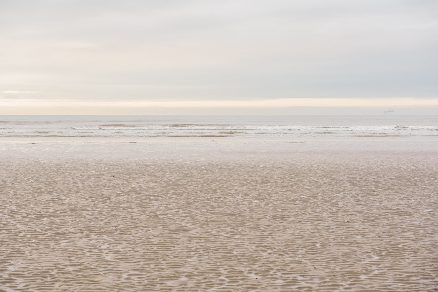
The days are getting longer. Still cold and misty, but longer.
Minimalistic gas rig.
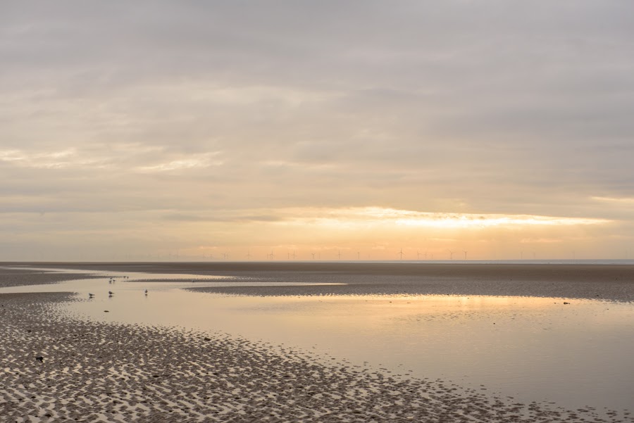
Sunset over the wind farm.
I've not scrutinised it and checked spelling etc but my initial thoughts are that it looks a nice clean professional looking site. The only thing is for me the golf pictures in the gallery look a bit out of place and maybe it would be better to have different galleries for conferences and sport events?Seen as though these were all shot on the D750 I thought I'd post this here as well...
So If anyone has a little spare time on their hands I'd really appreciate any feedback or general comments you'd care to offer on my new website.
It's not finished and there's things I want to refine, but after 10hrs straight at my computer building the site and doing as much SEO as physically possible, I need to step away
TIA
http://www.adambowery.com/

Cheers mate. Yeah that's a possibility. Until this morning it was a slideshow so it wasn't so obvious, but I agree I'll now it's in a wall it does stick out.I've not scrutinised it and checked spelling etc but my initial thoughts are that it looks a nice clean professional looking site. The only thing is for me the golf pictures in the gallery look a bit out of place and maybe it would be better to have different galleries for conferences and sport events?
What new toy?Work has gone stupid and im getting a new toy tomorrow not happy.
Seen as though these were all shot on the D750 I thought I'd post this here as well...
So If anyone has a little spare time on their hands I'd really appreciate any feedback or general comments you'd care to offer on my new website.
It's not finished and there's things I want to refine, but after 10hrs straight at my computer building the site and doing as much SEO as physically possible, I need to step away
TIA
http://www.adambowery.com/
d500
Had to be done, you know how it goesYou look really happy to be in front of it...
As others have said nice clean slick professional site that gets across what your about, have to agree that the logo is ineffective, it's not so much that it's small but looks faded and lacks impact.Seen as though these were all shot on the D750 I thought I'd post this here as well...
So If anyone has a little spare time on their hands I'd really appreciate any feedback or general comments you'd care to offer on my new website.
It's not finished and there's things I want to refine, but after 10hrs straight at my computer building the site and doing as much SEO as physically possible, I need to step away
TIA
http://www.adambowery.com/
It was a last minute decision. I still had reservations about sigma qc then i was pointed in the direction of this lens after the 1.4 nikon was well out the price range.
Oh well if its not good someone is in for it
Sure it'll be fine and probably weighs half the Sigma!
When you carry about a camera case with a sigma 150-600 and the 70-200 vr1 in it most times i go out, i dont think id worry about the weight difference in the 35mm haha
I'll pass on your suggestion [emoji6]The missus could always carry the heavy ones.
Having now looked on the computer rather than the iphone I don't actually think they look as out of place. I agree with the others about the logo now too.Cheers mate. Yeah that's a possibility. Until this morning it was a slideshow so it wasn't so obvious, but I agree I'll now it's in a wall it does stick out.
That and you'd get faster and better comments [emoji2]Seen as though these were all shot on the D750 I thought I'd post this here as well...
So If anyone has a little spare time on their hands I'd really appreciate any feedback or general comments you'd care to offer on my new website.
It's not finished and there's things I want to refine, but after 10hrs straight at my computer building the site and doing as much SEO as physically possible, I need to step away
TIA
http://www.adambowery.com/
That and you'd get faster and better comments [emoji2]
As said it's just the logo. Struggled to see it on my s7 phone. Need to pop and stand out but in keeping with the rest of the website.
Showed it to the oh. Her comments were " why can't you do something like that." So she just got the shaking of the head.
I found it easy to navigate, pleasing to the eye and it's not overload with info and pictures the balance seems spot on to me
Change the logo?Thanks @kingo15 (and Mrs Kingo!). Yeah the logo is driving me mad. Basically my website is a squarespace template and I can't for the life of me work out how to increase the size in the template I'm using. Actually, I can, and I do know how, but when I increase the size nothing bloody happens!
No can do on the template I'm using@UaeExile would it not be better in the middle too the logo that is?
I think I'm just going to bin the logo full stop and put my name inChange the logo?
You can always get a new logo at a later date. But a carefully chosen typeface can be all you need for a logo.I think I'm just going to bin the logo full stop and put my name in
Seen as though these were all shot on the D750 I thought I'd post this here as well...
So If anyone has a little spare time on their hands I'd really appreciate any feedback or general comments you'd care to offer on my new website.
It's not finished and there's things I want to refine, but after 10hrs straight at my computer building the site and doing as much SEO as physically possible, I need to step away
TIA
http://www.adambowery.com/
Looks better but I would put in the word Photographer/photography so as to leave no doubt what you are, as at first glance on opening page you could be PR/consultant/advertising etc.I think I'm just going to bin the logo full stop and put my name in
It's got a really clear marketing message, it's obvious what you're trying to sell.
I felt that I ought to have been able to click on the 4 images on the home page to be taken somewhere interesting, but they don't link anywhere.
I'd choose a different pic for exhibitions and conferences - it's a bit wide for the small size it's displayed at. It's also very similar to the shot of HRH.
fwiw I think the pic of Camilla is much more intimate & successful than the one of Charles in full flight.
I'd also choose a different pic for sports - it doesn't look like a classic sport pic so much as a staged group shot, and it too doesn't work at a small size. A golf shot would be better.
I'm not convinced that having your twitter feed so prominently on the front page is a great idea.
hth