

You are using an out of date browser. It may not display this or other websites correctly.
You should upgrade or use an alternative browser.
You should upgrade or use an alternative browser.
weekly Nostromo TP52 (2017) Wk 52: Weather
- Thread starter Nostromo
- Start date
- Messages
- 5,787
- Name
- Storm Trooper
- Edit My Images
- Yes
Above, the bridge provides a nice lead into the lower town. Nice try with the blurred cars.
Evolve, Nicely put together, good detail in the texture of your hands.
")
Evolve, Nicely put together, good detail in the texture of your hands.
LC2
Negan
- Messages
- 10,451
- Name
- Tim
- Edit My Images
- Yes
Hi Dominic,
Above - Bridgnorth, home to one end of the SVR. I do recall it being particularly hilly around there and your shot shows that off to a T. Mono works well for the shot
I like the idea for teh second shot, but you really would need something like a gorillapod to give you the ability to get the angle you want. Cool idea though.
Evolve - Opposable thumbs... Okay, I wouldn't have gotten that without the comments. Um, not my kind of shot I'm afraid, but good control of the lighting.
- Messages
- 5,432
- Name
- Andrea
- Edit My Images
- Yes
Hi Dominic, having caught up with my own thread this is my first visit since week 0 so I've looked through all of your images since then. My favourites so far are the colourful and well composed image for Comfort, the metal artichoke in Structure, which really suits the top-down view and B&W processing, the colours and perfect arrangement of notes for Attractive, the second image for Above with the motion blur and two bright colours, and I don't think it's affected by slight blur on the road itself, it still works very well Finally, Evolved is a great idea and you have captured and presented it very well. Well done for completing the first quarter of your first 52 with some really strong images 
Finally, Evolved is a great idea and you have captured and presented it very well. Well done for completing the first quarter of your first 52 with some really strong images
OP
- Messages
- 5,921
- Name
- Dominic
- Edit My Images
- Yes
Hold
For such a simple theme it's been quite hard to think of something to do. I used my hands in the last theme, so didn't really want to use them again, but without any inspiration this week i've had to resort to a boring photo. I hope to do better with smoke this week.
 untitled-43 by Dominic Rodgers, on Flickr
For such a simple theme it's been quite hard to think of something to do. I used my hands in the last theme, so didn't really want to use them again, but without any inspiration this week i've had to resort to a boring photo. I hope to do better with smoke this week.
untitled-43 by Dominic Rodgers, on Flickr
- Messages
- 3,250
- Name
- Emma
- Edit My Images
- Yes
Apart from bringing back unhappy memories of being dragged round a golf course as a kid there's nothing wrong with this at all Dominic. Good dof, spot on focus and strong colours - good choice of colour for the tee too! it might look good as a wider crop, 16:9 or something too?
there's nothing wrong with this at all Dominic. Good dof, spot on focus and strong colours - good choice of colour for the tee too! it might look good as a wider crop, 16:9 or something too? with the above comments, you are being a little harsh on yourself
- Messages
- 13,760
- Edit My Images
- Yes
Nothing boring with that Dominic, nice DoF, nice colours and a good composition too, real nice image
OP
- Messages
- 5,921
- Name
- Dominic
- Edit My Images
- Yes
Smoke
It took me a while to come up with an idea for this weeks theme, it sounded like a good theme, a chance to set thinks alight. In the end it was actually quite problematic.
Anyway this is what i came up with.
Sorry little Dandelion seed heads
 2-1 by Dominic Rodgers, on Flickr
It took me a while to come up with an idea for this weeks theme, it sounded like a good theme, a chance to set thinks alight. In the end it was actually quite problematic.
Anyway this is what i came up with.
Sorry little Dandelion seed heads
2-1 by Dominic Rodgers, on Flickr
OP
- Messages
- 5,921
- Name
- Dominic
- Edit My Images
- Yes
Thanks very much for the kind words. I'm just trying to improve my photography and this 52 thingy is really helping.Smoke, I love this shot and think it is a cracker too, the BG really helps show off the seed heads and the smoke is brill
- Messages
- 3,250
- Name
- Emma
- Edit My Images
- Yes
I absolutely love this one Dominic - the movement of the smoke and flame upwards has been captured brilliantly - it just says 'whoosh!' The colour of the glowing embers and flame are wonderful too without detracting from the smoke. A brillliant idea really well executed
- Messages
- 485
- Name
- Chris
- Edit My Images
- Yes
Smoke - cleverly done. Lovely colors and the dandlion subject adds a more interest to the shot (wish I'd thought of something like that myself now - ho hum, next time)
OP
- Messages
- 5,921
- Name
- Dominic
- Edit My Images
- Yes
Vivid
It took a little while to decide what to do, i had a few ideas and went with this Rhododendron in the end.
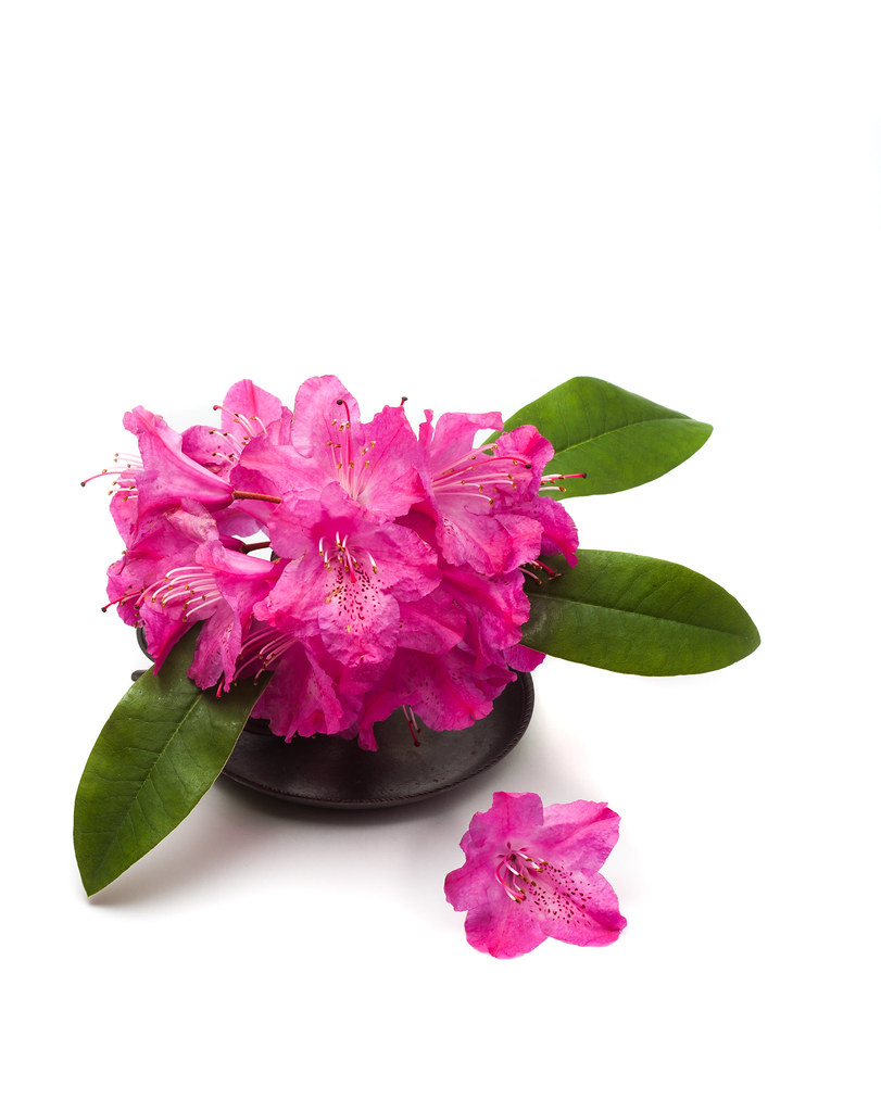 untitled-170 by Dominic Rodgers, on Flickr
It took a little while to decide what to do, i had a few ideas and went with this Rhododendron in the end.
untitled-170 by Dominic Rodgers, on Flickr- Messages
- 1,645
- Name
- Steve
- Edit My Images
- Yes
I think it needed the shadows or it would have looked like it was photoshopped onto a white bg. Also with only one Speedlight it was very hard if not impossible to not have them.
I agree with you, that shadow helps to ground it but isn't too dominant. Lovely colours in the shot.