weekly Nostromo TP52 (2017) Wk 52: Weather

That's a good idea for display, Dom, and well done for getting out there to take it. You are definitely not alone in your reluctance to point your camera at strangers, although - as you said - people rarely seem to notice in public places. That's a big display of fruit and veg and I like the interaction between the two men (y)
 
Display, well observed, the obvious interplay between the stall holders means they are not self conscious about your presence and that helps the shot.
 
Lots of detail there ... wondering if I would be tempted to crop the top ...canopy & light, but my eye is drawn to that so it must be good.

BTW ... I'd take the photo, then approach the guys, say ... nice display, caught you too hope that's OK, I can delete it if you want.
 
Really good display of Fruit & Veg they have. I like this in B&W but it would be interesting to see the colour version, just for a comparison. Well done on the bravery front, it appears we are all the same in our reluctance to photograph strangers :)
 
YOU nice idea but it needs a boost its very flat, just a brighten up of the image would help

ARCH the second one is better, no drainpipe, looks like a nice place to live

DISPLAY well done for getting the camera out in the situation, the conversion is a little to contrasty maybe
 
Bent
After a few weeks of having no time, enthusiasm, inspiration to pick up my camera, i made myself take it out at the weekend to do a bit of a catch up.
So i'll start off with Bent.
This is an old pipe i found kicking about in my woodshed.

untitled-662 by Dominic Rodgers, on Flickr
 
Wall

I'm not overly happy with this, it all seems a bit narrow, but there is a white door to the left and a window to the right as seen in the second photo and i'm just not sure that it works with them included. I did try putting a black boarder around it but that looked even worse.

untitled-689-2 by Dominic Rodgers, on Flickr


untitled-689 by Dominic Rodgers, on Flickr
 
All good for the themes I do like "wood" nice shadows and light as you say

The second "wall" is better with the door and window a better composition I feel
 
I'm liking both the wooden slats and the bent pipe, the colours, texture and detail on the pipe, which is a complete contrast of the other shot, but that works really well too, the shafts of light at the foot of the image make it for me !!! - A nice catch up Dominic (y)
 
The second for me, I like the context provided by the door and window. I wonder if you could push the contrast and/or curves a bit to give it a bit more impact?
 
All good for the themes I do like "wood" nice shadows and light as you say

The second "wall" is better with the door and window a better composition I feel
I'm liking both the wooden slats and the bent pipe, the colours, texture and detail on the pipe, which is a complete contrast of the other shot, but that works really well too, the shafts of light at the foot of the image make it for me !!! - A nice catch up Dominic (y)
The second for me, I like the context provided by the door and window. I wonder if you could push the contrast and/or curves a bit to give it a bit more impact?

Thanks all.
I just wasn't sure if including the window and door worked or not.
 
Hi Dominic,

Bent - Cool textures and colour matching going on there. Spot on for the theme.

Wood - Nicely captured light, shadow and texture.
What size screen do you use, as even on this 1920x1080, I can't see the whole image in one go and have to resort to looking on flickr.

Wall - I agree with Allan, the second shot has more balance and also has more easily viewed detail as it's larger.
 
Symmetrical

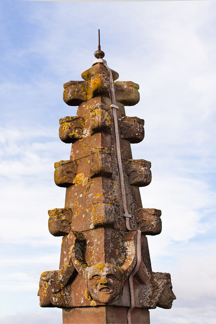
I had a little trip out with the camera club on Saturday, one of the places we visited was st Leonards church in Bridgnorth. Part of the visit included a hike up the bell tower onto the roof, where i found this stonework thingy.

untitled-97 by Dominic Rodgers, on Flickr

I also have this one, but i'm no so happy with it. I just don't think the quality is there.


untitled-143 by Dominic Rodgers, on Flickr
 
Worn

So following on from visiting the church, we then went to Seven Valley Railway. Here we had access to the workshops and the sidings (if that's what it's called, i'm sure someone will let me know).
Now i know this is a photo of the tracks and it's definitely not somewhere you should or would stand to take photos, but we had free access and were under constant supervision, also this part of the track is at the entrance to the work shop, so isn't in use, unless a train is coming in for maintenance.

untitled-253 by Dominic Rodgers, on Flickr
 
I do like the stonework thingy though the lightning conductor throws the symmetry off a little, inside of the church works well too I think you have handled the expose well churches are notoriously bad for light

Worn works really well for the theme I like the light too
 
Last edited:
Hi there Dominic .... no time, enthusiasm, inspiration to pick up your camera eh! I'd noticed you were quiet. And unfortunately I'm the same when it comes to comments at the moment.

Wood is the one here that stands out, the light through the slats works a treat.

And your Wall is a good too, #2, fab faces.
 
Hi Dominic

Symmetrical - I think both work, but my preference is #1 because of teh way it stands out from the background.
I do agree with Allan about the lightening conductor. I wonder how much of an effort it would be to remove it in PS.

Worn - An unusual view, as you say it's not somewhere that the general public would normally have access.
I like the way the tracks lead your eye to the Mk1 carriages in the background.
 
Symmetrical - I think both work, but my preference is #1 because of teh way it stands out from the background.
I do agree with Allan about the lightening conductor. I wonder how much of an effort
Way beyond my ps skills.
These were in each corner of the roof of the bell tower and each had conductors on them (how inconsiderate). So I couldn't get a shot without the conductor.
 
You did well with the inside of the church, the big window isn't blown but I think you made the right choice with the finial.

I really like the worn tracks, great light and details.
 
Nice shots for symmetrical and worn Dom, I like how the tracks lead the eye into the image
 
Like the worn tracks Dom and the OOF burnt out coaches add to the sense of an autumn afternoon. You've even got leaves on the line:) Like the stonework, very inconvenient to put a conductor on all of them:(
 
Your stonework thingy works well for Symmetrical, (I'm glad Andy straightened that top bit up) well spotted for the theme.
I do like the church too, it all leads in really nicely.
Those tracks certainly look as if they've had plenty of wear and look very timeworn, another perfect choice for the theme.
 
Colourful

Here it is, colourful. I had an idea that i wanted to try, which i could combine with this weeks theme. It hasn't worked out completely, but has still worked (hopefully) for this weeks theme.

Jane frame-2 by Dominic Rodgers, on Flickr
 
I like the idea and I like your photo but my inner pedant is thinking that the tree trunk inside the frame is a bit out of place, I do like it though, eye-catching photo.
 
It works she is very colourful and its an interesting idea I assume its a composite
 
Nice idea for the theme Dom and an interesting image
 
Colourful right down to her shoelaces. These things are normally a composite, but here I think not. Good work. (y)
 
I'm assuming it's not a composite too, but done using a mirror.
Very good. It certainly has you looking at the shot working out what you're seeing.
Interesting expression on Jane's face too.
 
Height

A couple from me this week. I took a walk around Wyre Forest (near me in Worcestershire), to take some photos of the autumn colours. Near by they have a place called Go Ape, Basically you climb through the woodland and zip wire between trees. This allowed me to get these couple of shots.
It was getting dark and it was pretty gloomy, so these aren't as sharp as they should be (there is a lots of noise reduction going on).
At the moment i'm also trying to practice panning (it's my new favorite thing).

untitled-725-2 by Dominic Rodgers, on Flickr


untitled-713 by Dominic Rodgers, on Flickr

Also took these, but i'm not that happy with the skies

untitled-787 by Dominic Rodgers, on Flickr

untitled-782 by Dominic Rodgers, on Flickr
 
Back
Top