

You are using an out of date browser. It may not display this or other websites correctly.
You should upgrade or use an alternative browser.
You should upgrade or use an alternative browser.
Nostromo TP52 (2018) Week 51/2 : Party/Showcase
- Thread starter Nostromo
- Start date
- Messages
- 662
- Name
- John
- Edit My Images
- Yes
Like the sense of depth in the first one Dominic. #2 looks a bit "battered" so less uniform. Both good though, well found")
- Messages
- 9,095
- Name
- Mandy
- Edit My Images
- Yes
Abundance - #1 for me as well
- Messages
- 1,075
- Name
- Georgina
- Edit My Images
- Yes
Thick - Three unusual shots there. My favourite is the first one, I like the delicate colours peeking through the snow
Abundance - has to be no1, just because I can't stand those nuts that look like brains They always put so many in a bag of mixed nuts too Filling the frame definitely adds to the feel of abundance
Abundance - has to be no1, just because I can't stand those nuts that look like brains
They always put so many in a bag of mixed nuts too Filling the frame definitely adds to the feel of abundance- Messages
- 4,562
- Name
- Mark Gameson
- Edit My Images
- Yes
Abundance No1 for me great textures
OP
- Messages
- 5,921
- Name
- Dominic
- Edit My Images
- Yes
WK 10- Heavy
A quickly taken (during my lunch break) shot for week 10. This might be one for the chemists or physicists out there.
I don't know why i tried to photo something so reflective in a rush.
 untitled-1108.jpg by Dominic Rodgers, on Flickr
A quickly taken (during my lunch break) shot for week 10. This might be one for the chemists or physicists out there.
I don't know why i tried to photo something so reflective in a rush
.untitled-1108.jpg by Dominic Rodgers, on Flickr
OP
- Messages
- 5,921
- Name
- Dominic
- Edit My Images
- Yes
Very impressive, I knew of heavy water (i remember it from an old world war 2 film) but had to look up it's chemical symbol.Ahh, Deuterium Oxide (and no I didn't need to Google it either). I work for a company called Deuterium and we export water treatment chemicals
Very clever themed image
- Messages
- 4,640
- Name
- Pete
- Edit My Images
- Yes
Heavy
Nice simple but effective shot. Glad I got mine in early.
Pete
Nice simple but effective shot. Glad I got mine in early.
Pete
OP
- Messages
- 5,921
- Name
- Dominic
- Edit My Images
- Yes
WK 11- Wet
Something simple, Spilt milk. It's wet isn't it?
 untitled-149.jpg by Dominic Rodgers, on Flickr
Something simple, Spilt milk. It's wet isn't it?
untitled-149.jpg by Dominic Rodgers, on Flickr- Messages
- 104,475
- Name
- The other Chris
- Edit My Images
- Yes
Hope you weren't crying over it
One really nit-picky comment is that I feel it could do with a little more shadow around the neck of the jug on top but I like the simplicity of it and you have got a really good reflection and a nice milk-spill
One really nit-picky comment is that I feel it could do with a little more shadow around the neck of the jug on top but I like the simplicity of it and you have got a really good reflection and a nice milk-spill
- Messages
- 4,562
- Name
- Mark Gameson
- Edit My Images
- Yes
Wet - I like that great idea love the reflection
- Messages
- 656
- Name
- Jon
- Edit My Images
- Yes
Catch up time again...
Sharp-That barbed wire shot is great, I really like it. Holly is not bad, but not in the same league imo
Guard-The mono one for me, works well
Thick- I like all of them, but the second one is the one I like the most. Really unusual, and love the soft colour
Abundance- I like the walnuts best, but then, I hate almonds with skin on..... Plus I like the shapes in the walnuts shot. Nicely done. Doesn't look like brains to me
Heavy- I like the idea, and I like the bubbles, but overall it doesn't grab me.
Wet- I really like it, the milk looks great on the black surface, and nice reflection, too.
OP
- Messages
- 5,921
- Name
- Dominic
- Edit My Images
- Yes
Yes it was.Like the D2O, the milk shot is not showing but I remember it I think and thought it very good.
Was the WW2 film the Heroes of Telmark?
I don't know why the milk shot isn't showing.
Baloo
Pleurodelinae and proud
- Messages
- 4,212
- Name
- Roger
- Edit My Images
- Yes
I had the same happen to me last year, I could never figure out why, ended up just editing the post.Yes it was.
I don't know why the milk shot isn't showing.
- Messages
- 1,139
- Name
- Richard
- Edit My Images
- Yes
Wk-08 Thick
Snow seems to be the theme this week, so not to feel left out, i've gone with a snowy shot myself.
So it may not be thick for humans, it is thick for these little flowers.
untitled-45 by Dominic Rodgers, on Flickr
untitled-31 by Dominic Rodgers, on Flickr
untitled-21 by Dominic Rodgers, on Flickr
Love the colours and the contrast of the snow and the delicateness of the flower. For me you cant really tell its thick snow though, but you have addressed that in your write up
.Wk 09 Abundance
It's all a bit brown this week.
untitled-127.jpg by Dominic Rodgers, on Flickr
I was going to go with this, but it looked too much like brains
untitled-112.jpg by Dominic Rodgers, on Flickr
Its like Christmas with the abundance of nuts. Love the textures and detail in these
WK 10- Heavy
A quickly taken (during my lunch break) shot for week 10. This might be one for the chemists or physicists out there.
I don't know why i tried to photo something so reflective in a rush
Don't understand it, but I was never very good at chemistry haha. Mesmerizing picture though
WK 11- Wet
Something simple, Spilt milk. It's wet isn't it?
Cant see it on here, but checked it out on Flickr. Works well for the theme, love the picture, great contrast as well
- Messages
- 4,640
- Name
- Pete
- Edit My Images
- Yes
Dominic
Wet, nice image (on Flickr), could have been used for this weeks theme (juxtaposition) with the Black and White.
Pete
Wet, nice image (on Flickr), could have been used for this weeks theme (juxtaposition) with the Black and White.
Pete
 Perfect for the theme, great contrast between the milk and the black surface, and just enough of a reflection beneath to give it depth and anchor it.
OP
- Messages
- 5,921
- Name
- Dominic
- Edit My Images
- Yes
Wk 12: Juxtaposition
It's taken me a while to find some feathers (you would think it could be so hard).
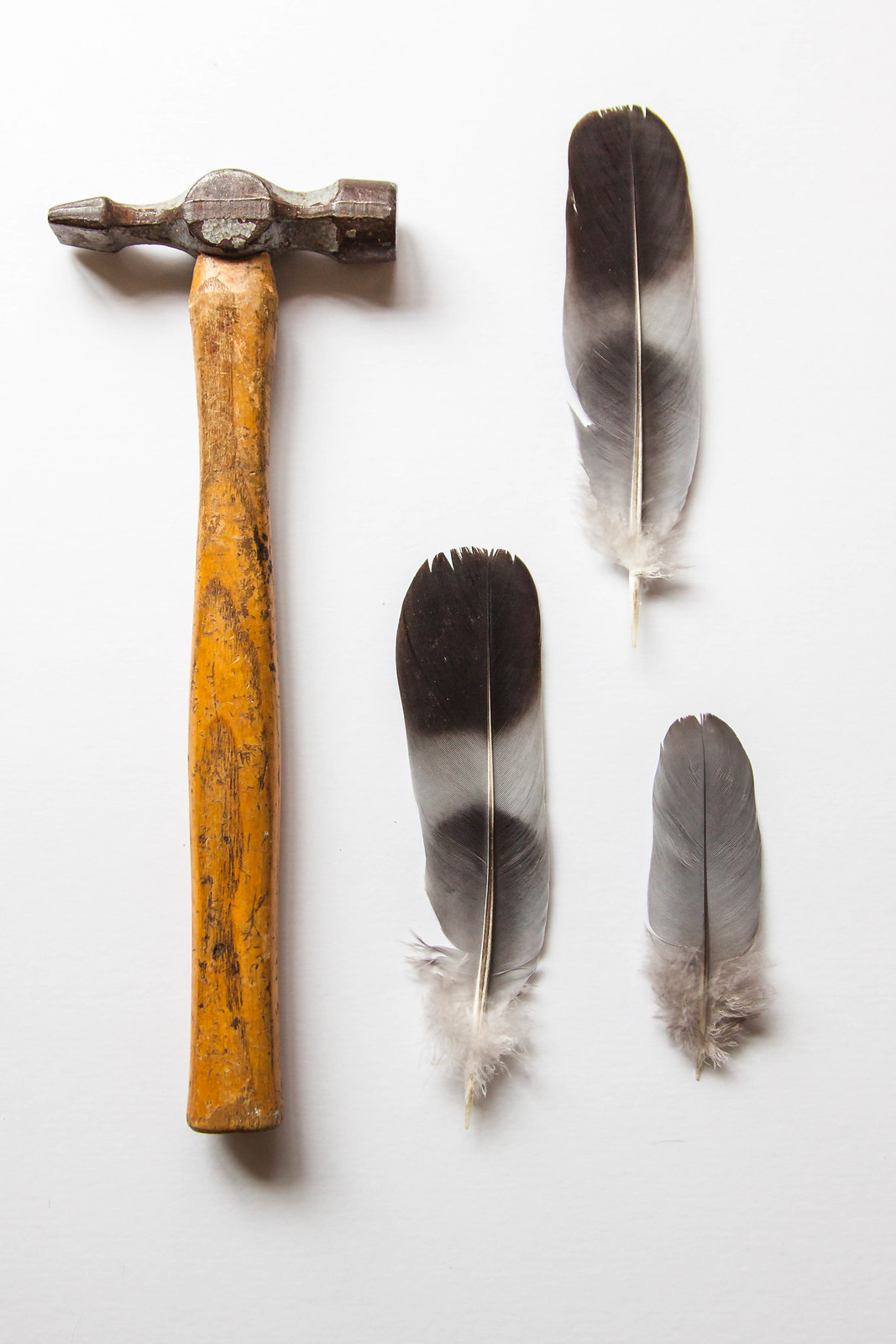 untitled-1115.jpg by Dominic Rodgers, on Flickr
It's taken me a while to find some feathers (you would think it could be so hard).
untitled-1115.jpg by Dominic Rodgers, on Flickr- Messages
- 5,432
- Name
- Andrea
- Edit My Images
- Yes
I can see what Allan means about the layout - although I'm not sure HOW you would effectively arrange a hammer and some feathers - but they are definitely "placed close together with contrasting effect" as per the definition I read so it's spot on in those terms and I like the way you've used three feathers rather than just one
- but they are definitely "placed close together with contrasting effect" as per the definition I read so it's spot on in those terms and I like the way you've used three feathers rather than just one