

You are using an out of date browser. It may not display this or other websites correctly.
You should upgrade or use an alternative browser.
You should upgrade or use an alternative browser.
Nostromo TP52 (2018) Week 51/2 : Party/Showcase
- Thread starter Nostromo
- Start date

- Messages
- 616
- Name
- Ross
- Edit My Images
- Yes
Grest low shot. Not envious of you getting under a horse but its a grest shot from an angle not many people see.
- Messages
- 1,075
- Name
- Georgina
- Edit My Images
- Yes
Hi Dominic,
Unattractive - Bit of a contradiction here, I wouldn't want that strange collection of rubbish on the street especially not on my door step but as a picture I find the colours quite attractive
Shadow - very inventive, well done. Ended up with a great image, I like the hint of colour in the shadow
Beautiful - Certainly beautiful colours, as others have said the dof is a little narrow. It's very tricky with flowers like bluebells to get all the flower in focus and still through the bg out.
Low - good fun shot, great detail in the hair. You were lucky to not get dunked on the head
- Messages
- 9,095
- Name
- Mandy
- Edit My Images
- Yes
Unattractive - image works for me, but i think it could do a different style of processing as all i can look at is the pretty bright colours of the graffiti.
Shadow - great idea and nicely executed, and good to see your set up shot as well.
Beautiful - i like the colours, bluebells really are pretty little flowers but i think from a photography point. I find them to be the most trickiest thing to get a good photo off, not anything i have been able to achieve yet. So well done for having a go at it.
Low - Its a horsey shot whats not to love about it, I feel a sensor clean is needed BG has got several specs in the image which is a little distracting.
OP
- Messages
- 5,921
- Name
- Dominic
- Edit My Images
- Yes
Wk 20 - Music
Well this is week 19 and 20, i haven't really been feeling it with these last two themes, but i guess that's the luck of the draw.
Anyway here are my entries.
Match
well you can't have one without the other (in my mind anyway.
 untitled-542.jpg by Dominic Rodgers, on Flickr
Music
I have no musical instruments, neither have i been anywhere lately that has any singers, bands etc so this is all i could come up with to get me back up to date.
 untitled-1158.jpg by Dominic Rodgers, on Flickr
Well this is week 19 and 20, i haven't really been feeling it with these last two themes, but i guess that's the luck of the draw.
Anyway here are my entries.
Match
well you can't have one without the other (in my mind anyway.
untitled-542.jpg by Dominic Rodgers, on FlickrMusic
I have no musical instruments, neither have i been anywhere lately that has any singers, bands etc so this is all i could come up with to get me back up to date.
untitled-1158.jpg by Dominic Rodgers, on Flickr- Messages
- 616
- Name
- Ross
- Edit My Images
- Yes
Match - certainly a match made in heaven. Nice colours in both the flower and the bee. Not too distracting background, oof focus enough to keep your eye on the flower.
Music - Certainly musical. And good choice of tune. Shame the edge of the headphones is cut off.
Music - Certainly musical. And good choice of tune. Shame the edge of the headphones is cut off.
- Messages
- 4,641
- Name
- Pete
- Edit My Images
- Yes
Dominic
Low, good shot, but not the best angle to make the horse look an attractive breast.
Match, I like this image, but there is a lot going on in the OOF bacground that distracts from the Bee, the flower is nice and sharp.
Music, very sharp Image, good colours and reflection.
Pete
Low, good shot, but not the best angle to make the horse look an attractive breast.
Match, I like this image, but there is a lot going on in the OOF bacground that distracts from the Bee, the flower is nice and sharp.
Music, very sharp Image, good colours and reflection.
Pete
- Messages
- 4,562
- Name
- Mark Gameson
- Edit My Images
- Yes
Music - I like that nice clean image nicely set up great reflection
OP
- Messages
- 5,921
- Name
- Dominic
- Edit My Images
- Yes
So i've been away from the 52 for a few weeks, so i'm playing catch up.
Hard
I found this theme really quite difficult (hard)
So this is a bit of a shoehorn (or horse shoe)
Horses hooves and shoes are hard, believe me i've had my feet stood on a few times.
 untitled-20 by Dominic Rodgers, on Flickr
Creature
I've got many photos to chose from for this theme, a lot of them are horse related (but i'll steer clear of those, or i'll end up like @LC2 and his trains)
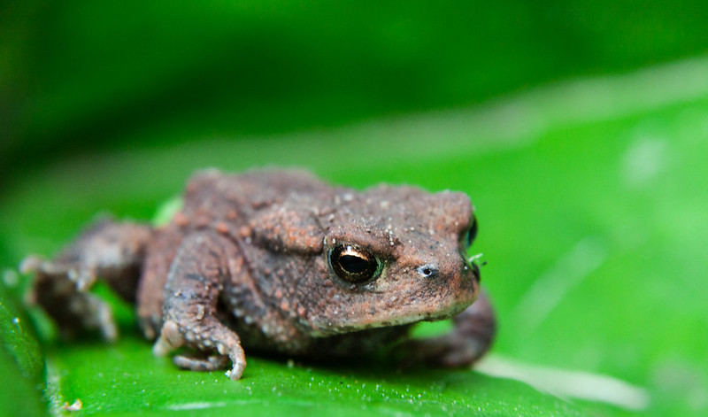 untitled-100.jpg by Dominic Rodgers, on Flickr
Hard
I found this theme really quite difficult (hard)
So this is a bit of a shoehorn (or horse shoe)
Horses hooves and shoes are hard, believe me i've had my feet stood on a few times.
untitled-20 by Dominic Rodgers, on FlickrCreature
I've got many photos to chose from for this theme, a lot of them are horse related (but i'll steer clear of those, or i'll end up like @LC2 and his trains
)untitled-100.jpg by Dominic Rodgers, on FlickrFuji Dave
I'm in Clover
- Messages
- 22,088
- Name
- Dave
- Edit My Images
- No
I don`t think that is a shoe horn at all, the horse shoes have to be hard and I know the pain of one standing on my foot too. It`s a good shot as like the crop but also the little bit of dust flying up from the ground. Creature is a good shot too, nice use of the dof but keeping the main focus sharp.
- Messages
- 11,087
- Name
- Allan
- Edit My Images
- No
I would have lost the riders foot in "Hard" but you have caught the horseshoes really well, they stand out its the first thing you notice
different creature than we have had, you could have done horses we don't see that many of them in here but nice Toad/Frog
Don't ever tag @LC2 and trains in the same sentence its a bit like saying Beetlejuice 3 times
different creature than we have had, you could have done horses we don't see that many of them in here but nice Toad/Frog
Don't ever tag @LC2 and trains in the same sentence its a bit like saying Beetlejuice 3 times
- Messages
- 9,075
- Name
- David
- Edit My Images
- Yes
Hard is an interesting one, love those two shoes. Is it a dressage horse perhaps with exaggerated movements?
Difficult to get the top cut off point right when emphasising groundlevel.
Yes ... don't see many toad/frogs around here, don't know what they're like at keeping still for the camera.
love those two shoes. Is it a dressage horse perhaps with exaggerated movements? Difficult to get the top cut off point right when emphasising groundlevel.
Yes ... don't see many toad/frogs around here, don't know what they're like at keeping still for the camera.
OP
- Messages
- 5,921
- Name
- Dominic
- Edit My Images
- Yes
Yup, it was a dressage test.Hard is an interesting one,
Difficult to get the top cut off point right when emphasising groundlevel.
Yes ... don't see many toad/frogs around here, don't know what they're like at keeping still for the camera.
This little toad was very small, he did sit quite nicely for after I had put him on the leaf.
LC2
Negan
- Messages
- 10,451
- Name
- Tim
- Edit My Images
- Yes
Hi Dominic,
Hard - Interesting. Absolutely get what you're going for, and the shoes are more or less the brightest part of the image (and the focus), but somehow I think there is a more focused crop (or shot) in there waiting to get out.
Creature - it's not a bug He stands out well from the background. I thought frogs/toads were supposed to camouflage with their environment!
There's nothing wrong with having a goto subject for most themes It stirs the old grey matter coming up with new and more wonderful shoehornery.
Hard - Interesting. Absolutely get what you're going for, and the shoes are more or less the brightest part of the image (and the focus), but somehow I think there is a more focused crop (or shot) in there waiting to get out.
Creature - it's not a bug
He stands out well from the background. I thought frogs/toads were supposed to camouflage with their environment!There's nothing wrong with having a goto subject for most themes
It stirs the old grey matter coming up with new and more wonderful shoehornery.
OP
- Messages
- 5,921
- Name
- Dominic
- Edit My Images
- Yes
So a bit of a catch up, but it will bring me up to date
So wk 23 is Synthetic, i had struggled to find anything of any interest for this and i'm only mildly happy with this one.
It's all about the balloons.
 untitled.jpg by Dominic Rodgers, on Flickr
Wk 24 Rural
I had one for this before i had found a shot for synthetic so couldn't post it (i don't like to be out of sequence) and since then, i have now found something else the fits the theme a little better.
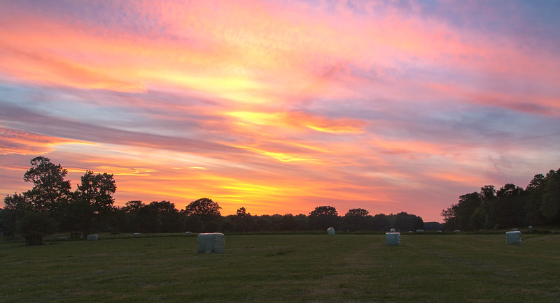 untitled-58-Edit.jpg by Dominic Rodgers, on Flickr
wk 25 Bright
This weekend was the local carnival (Bridgnorth), so i was hoping to get something Bright and i think i've achieved it with this shot.
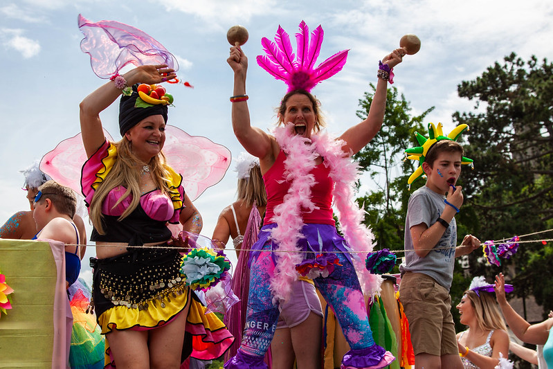 untitled-14.jpg by Dominic Rodgers, on Flickr
So wk 23 is Synthetic, i had struggled to find anything of any interest for this and i'm only mildly happy with this one.
It's all about the balloons.
untitled.jpg by Dominic Rodgers, on FlickrWk 24 Rural
I had one for this before i had found a shot for synthetic so couldn't post it (i don't like to be out of sequence) and since then, i have now found something else the fits the theme a little better.
untitled-58-Edit.jpg by Dominic Rodgers, on Flickrwk 25 Bright
This weekend was the local carnival (Bridgnorth), so i was hoping to get something Bright and i think i've achieved it with this shot.
untitled-14.jpg by Dominic Rodgers, on FlickrLC2
Negan
- Messages
- 10,451
- Name
- Tim
- Edit My Images
- Yes
Hi Dominic.
Synthetic - I think I'm with Allan on this. You could crop in and lose most everything else.#
Rural - Fantastic sunset. The sky is obviously the focus and looking like that, doesn't need anything else.
Bright - Brightly dressed up They are in shadow though. It would have been great if there was one of them in bright light for this theme (of course, that probably wasn't possible).
Synthetic - I think I'm with Allan on this. You could crop in and lose most everything else.#
Rural - Fantastic sunset. The sky is obviously the focus and looking like that, doesn't need anything else.
Bright - Brightly dressed up
They are in shadow though. It would have been great if there was one of them in bright light for this theme (of course, that probably wasn't possible).
OP
- Messages
- 5,921
- Name
- Dominic
- Edit My Images
- Yes
Wk 26 Elegant
This sort of set up came into my head when the theme was announced, but i'm not sure i've done it justice. I didn't really have the props i wanted. I wanted to use satin as a base, with pearls and a white Rose. Oh well this is what i managed to come up with.
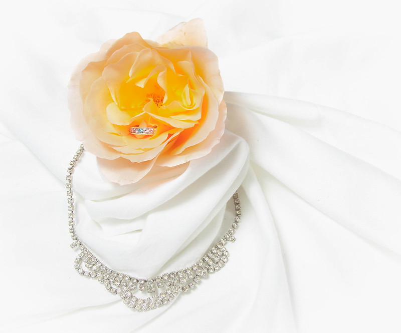 untitled-1191.jpg by Dominic Rodgers, on Flickr
This sort of set up came into my head when the theme was announced, but i'm not sure i've done it justice. I didn't really have the props i wanted. I wanted to use satin as a base, with pearls and a white Rose. Oh well this is what i managed to come up with.
untitled-1191.jpg by Dominic Rodgers, on Flickr-Oy-
Worzel Gummidge
- Messages
- 9,066
- Name
- Dave
- Edit My Images
- No
I agree composition isn't quite right, exposure colour spot on, if the comp could run on a diagonal top left to bottom right maybe that would work
Yeah diagonal is the way to go I think.
It's still a nice shot though
- Messages
- 616
- Name
- Ross
- Edit My Images
- Yes
For me the colour is a bit odd. I mean its still a much better shot than I would manage, (I'm rubbish at setting up shots like this), I just look at it and all I can focus on is the yellowy, orangey, pinky, salmony colours in the flower. I'd almost rather the rose was white and the whole photo was in B+W.
Last edited:
LC2
Negan
- Messages
- 10,451
- Name
- Tim
- Edit My Images
- Yes
I'm going to disagree with the comments about a diagonal composition, I don't think it would work/help. Just my opinion though.
I particularly like the small details, like the blue colour of the middle gem in the ring, which contrasts with the rose.
Your linky is knackered. You might want to fix it.
I particularly like the small details, like the blue colour of the middle gem in the ring, which contrasts with the rose.
Your linky is knackered. You might want to fix it.
OP
- Messages
- 5,921
- Name
- Dominic
- Edit My Images
- Yes
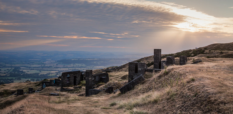
Wk 27 Derelict
I took a trip out to Titterstone Clee on Tuesday night, nearly everything there is derelict. It's an old coal and dhustone (dolerite) quarry, it's also the third highest hill in Shropshire at 533 m. It's one of the bleakest places i know, even on a summers evening, in the winter it's even worse, it's cold, windy, wet or covered in snow.
 untitled-91-Edit by Dominic Rodgers, on Flickr
 untitled-68 by Dominic Rodgers, on Flickr
 untitled-44 by Dominic Rodgers, on Flickr
I took a trip out to Titterstone Clee on Tuesday night, nearly everything there is derelict. It's an old coal and dhustone (dolerite) quarry, it's also the third highest hill in Shropshire at 533 m. It's one of the bleakest places i know, even on a summers evening, in the winter it's even worse, it's cold, windy, wet or covered in snow.
untitled-91-Edit by Dominic Rodgers, on Flickruntitled-68 by Dominic Rodgers, on Flickruntitled-44 by Dominic Rodgers, on Flickr
Last edited: