Hi Dominic
Catching up is hard to do.
Your Hard Image. Nice capture of the 2 horse shoes being very clear, near enough being on 3rds, bit of action in the dust. Background being a bit OOF helps. You have all the info in the picture you require.
Creature.
Personally I don't like this image, you have focused on the eye but the nose is a bit soft, a bit more DOF would help. On Theme so ok with it.
Synthetic
A bit messy this one, but difficult to clean up, crop out the little boy at the bottom and the woman walking her dog on the left. Also get rid of the bus stop sign would all help I feel.
Rural
Nice sunset, but the Rural part is enderexposed, maybe using a nd grad would have helped.
Bright
This is better, plenty of action going on. could have cropped the boob out on the right hand side and maybe the cardboard box looking thing on the bottom left.
Elegant
Nice Image, well controlled exposure. It did not need the ring in the petals as it attracts the attention from the rest of the subtile details.
Derelict
Out of the 3 I prefer the second one with the colour and it is better framed.(nice and close)
The other 2 the Derelict bits are a bit underexposed. on the 1st a ND grad could be used and on the 3rd take 2 exposures and blend as there is a lot of the building breaking the skyline.
Pete


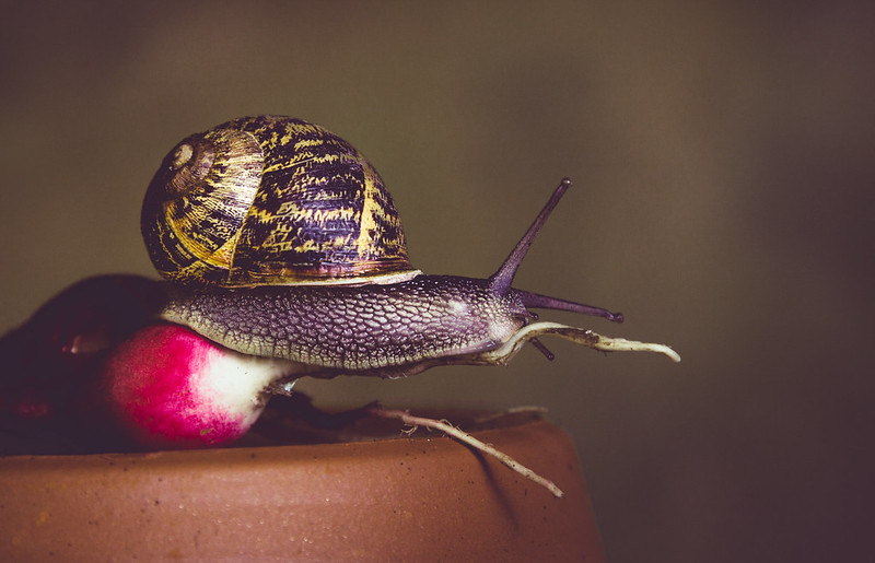 untitled-111
") Perhaps radishes are performance enhancing and lettuce soporific, Great colours and oof background.
Perhaps radishes are performance enhancing and lettuce soporific, Great colours and oof background.
 untitled-1209-3
 untitled-1232.jpg
 untitled-1292
 untitled-1311
 untitled-1317.jpg