

You are using an out of date browser. It may not display this or other websites correctly.
You should upgrade or use an alternative browser.
You should upgrade or use an alternative browser.
Nostromo, up for it, Wk: 52 Decorate 52-2020
- Thread starter Nostromo
- Start date
- Messages
- 3,145
- Name
- bill
- Edit My Images
- Yes
Great shots Dominic, I'm liking the concept for the second one, very good execution.
- Messages
- 2,833
- Name
- Pete
- Edit My Images
- No
Two lovely shots Dominic. Great lighting on both and I really like the idea for the mirror pic. ")
- Messages
- 4,635
- Name
- Pete
- Edit My Images
- Yes
Hi Dom
Topical has great lighting and very clever take on food with the mirror image.
Pete
Topical has great lighting and very clever take on food with the mirror image.
Pete
OP
- Messages
- 5,919
- Name
- Dominic
- Edit My Images
- Yes
Wk:43/44 Sharp/Digital
Sharp
This is a close up (well 1:1 macro) of some horse clipper blades. It's a stack of 8 images. I've left the bits of clipped hair on the blades, as it adds a little bit of context.
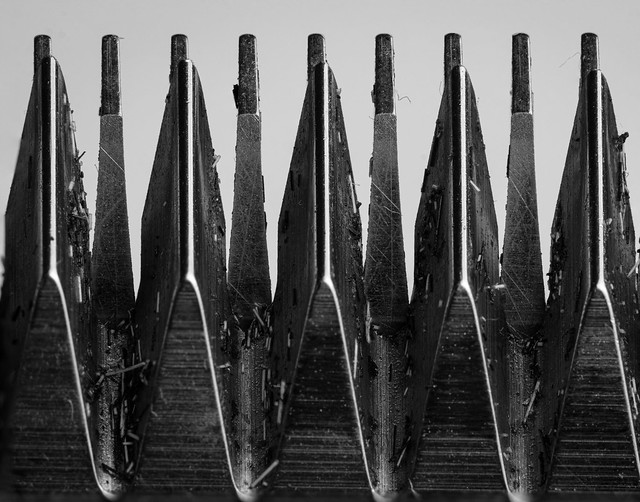 Sharp (2) by Dominic Rodgers, on Flickr
Another view, single shot
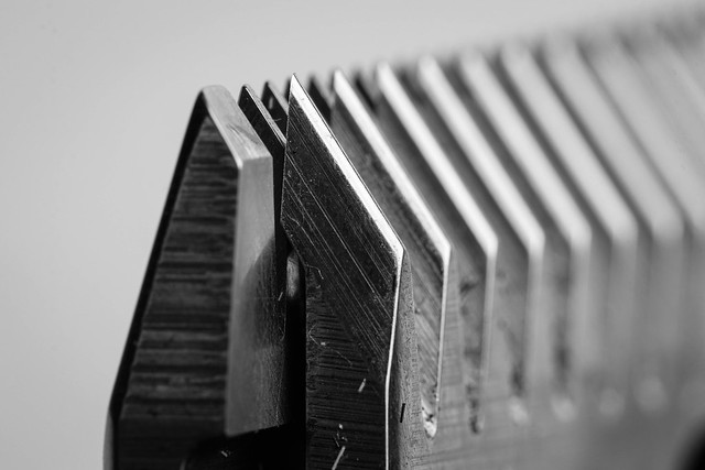 untitled-220.jpg by Dominic Rodgers, on Flickr
Digital
A collection of digital stuff
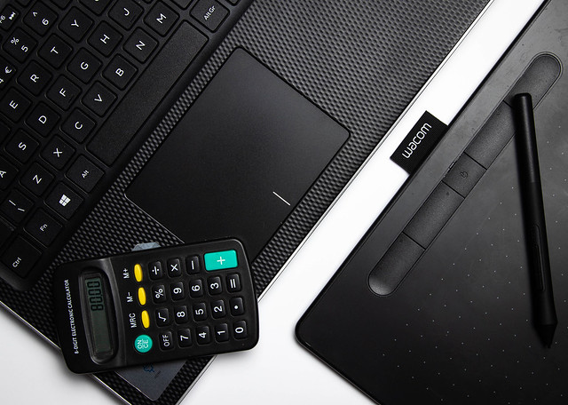 untitled-210.jpg by Dominic Rodgers, on Flickr
Sharp
This is a close up (well 1:1 macro) of some horse clipper blades. It's a stack of 8 images. I've left the bits of clipped hair on the blades, as it adds a little bit of context.
Sharp (2) by Dominic Rodgers, on FlickrAnother view, single shot
untitled-220.jpg by Dominic Rodgers, on FlickrDigital
A collection of digital stuff
untitled-210.jpg by Dominic Rodgers, on Flickr
LC2
Negan
- Messages
- 10,447
- Name
- Tim
- Edit My Images
- Yes
Hi Dominic
Activity - Nicely done. The front foot raised slightly give is motion
Artificial - Ah gotcha. Nicelt sharp eyes there.
Autumn - Perhaps a little dark? But again, nicely executed
Wet - I really like this. Absolutely beautiful. Nothing to add to add to that!
Topical - Nicely low key and directional light. Window lit?
Food - haha, clever. Was that two photos with the reflection one merged in, or just the core composited into the original?
Sharp - Looks a vicious as the ones @minx uses on my head ! B&W suits it, I think I prefer #2
Digital - Good use of dutch. You evidently gave it a good clean, my touchpad could never look that dust free...
- Messages
- 7,130
- Edit My Images
- No
Fascinating to see the clippers close up. I thought they were iron filings before I clicked on your thread
Digital age - good idea to being these things together, nicely composed and all black! The splash of colours on the buttons works well. It reminds me of some of the images you see in newspapers sometimes when they want an illustration for finance or something.
Digital age - good idea to being these things together, nicely composed and all black! The splash of colours on the buttons works well. It reminds me of some of the images you see in newspapers sometimes when they want an illustration for finance or something.
- Messages
- 9,699
- Name
- Stan
- Edit My Images
- Yes
I wouldn't able to tell what the sharp image is from the main photo post without your explanation. Actually I prefer the second shot.
Yes, we all have plenty of those digital devices. I don't quite get on with the Wacom tablet and don't use it a lot for photo processing workflow.
Yes, we all have plenty of those digital devices. I don't quite get on with the Wacom tablet and don't use it a lot for photo processing workflow.
OP
- Messages
- 5,919
- Name
- Dominic
- Edit My Images
- Yes
Wk: 45,6,7 Snappers choice, Narrow, Paper
Snappers choice
Morning dew on Euphorbia's
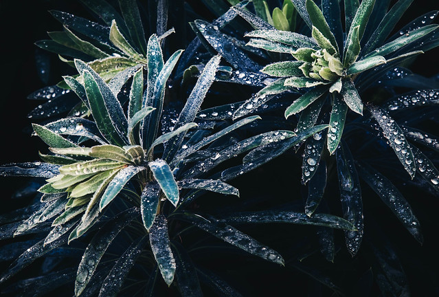 untitled-226-Edit.jpg by Dominic Rodgers, on Flickr
Narrow
It's a bit boring, but i felt a little uninspired about this theme, i suppose it's swings and roundabouts.
It's a narrow bench i made a couple of years ago out of a couple Oak sleepers.
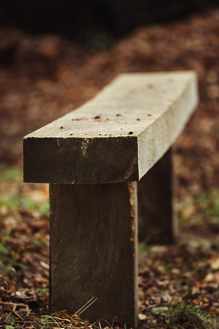 untitled-233.jpg by Dominic Rodgers, on Flickr
Paper
Acer griseum or more commonly known paperbark maple. Is it a shoehorn? i'll let you decide.
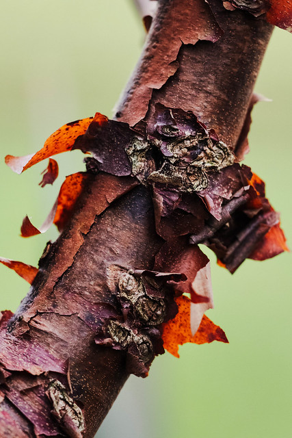 untitled-230.jpg by Dominic Rodgers, on Flickr
Snappers choice
Morning dew on Euphorbia's
untitled-226-Edit.jpg by Dominic Rodgers, on FlickrNarrow
It's a bit boring, but i felt a little uninspired about this theme, i suppose it's swings and roundabouts.
It's a narrow bench i made a couple of years ago out of a couple Oak sleepers.
untitled-233.jpg by Dominic Rodgers, on FlickrPaper
Acer griseum or more commonly known paperbark maple. Is it a shoehorn? i'll let you decide.
untitled-230.jpg by Dominic Rodgers, on Flickr- Messages
- 11,087
- Name
- Allan
- Edit My Images
- No
A good catch up Dominic they are all nicely processed particularly nice tones in the euphorbia
I don't think the paper bark maple is a shoehorn there is quite an old example in the grounds of the Cathedral were I work its quite an impressive tree.
I don't think the paper bark maple is a shoehorn there is quite an old example in the grounds of the Cathedral were I work its quite an impressive tree.
- Messages
- 2,833
- Name
- Pete
- Edit My Images
- No
Nice catch-up Dominic. I like the light and water drops on the Euphorbia.
Paper bark Maple is bang on theme for me.
Paper bark Maple is bang on theme for me.
- Messages
- 115,214
- Name
- The real Chris
- Edit My Images
- No
I'm liking the Euphorbia's rather a lot Dom
Of course its not, you must try harderAcer griseum or more commonly known paperbark maple. Is it a shoehorn? i'll let you decide.
OP
- Messages
- 5,919
- Name
- Dominic
- Edit My Images
- Yes
Wk:48 Camera
I don't know much about old film cameras, so can't give any info about this little baby.
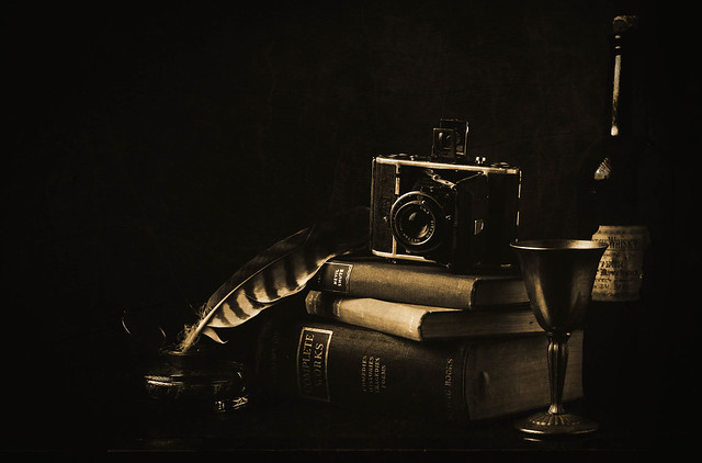 untitled-5-Edit-2.jpg by Dominic Rodgers, on Flickr
I don't know much about old film cameras, so can't give any info about this little baby.
untitled-5-Edit-2.jpg by Dominic Rodgers, on Flickr- Messages
- 11,087
- Name
- Allan
- Edit My Images
- No
First of all I don't like sepia, I understand what you were trying to do composition wise but the objects are things that don't really connect, for me anyway.
It's a lot better and brighter on flickr, I never understand why people on here can make any reasonable comment on a picture posted on this site.
As a photograph its well thought out composition wise and the lightings great when you click through (if people can be bothered I find they usually can't be)
as I say its just the selection of objects which I don't get.
I don't mean to be harsh as I do like what you've achieved
- Messages
- 1,927
- Edit My Images
- Yes
I'm with Allan - much better and brighter on Flickr (I've had the same problem with some of my darker images - bizarre problem!)
I like the overall effect, but the camera appears out of place as, despite being old, it's placed in a scene with significantly older objects.
The unbalanced composition works nicely though with a nice triangle, and like I said the overall effect is nice (I like the sepia btw!) but it doesn't quite work for me because of the subject.
OP
- Messages
- 5,919
- Name
- Dominic
- Edit My Images
- Yes
Wk: 49 Leaves
Is it too early for a bit of festive cheer?
 untitled-236-Edit.jpg by Dominic Rodgers, on Flickr
Is it too early for a bit of festive cheer?
untitled-236-Edit.jpg by Dominic Rodgers, on Flickr- Messages
- 4,635
- Name
- Pete
- Edit My Images
- Yes
Hi Dom
Nice colourful and festive shot.
Pete
Nice colourful and festive shot.
Pete
- Messages
- 2,833
- Name
- Pete
- Edit My Images
- No
Lovely arrangement and lighting Dominic.
OP
- Messages
- 5,919
- Name
- Dominic
- Edit My Images
- Yes
Wk: 50 Abstract
So i went out last night with a couple of members from the camera club, to photograph the Christmas lights in town. This gave me the opportunity do a little bit of ICM.
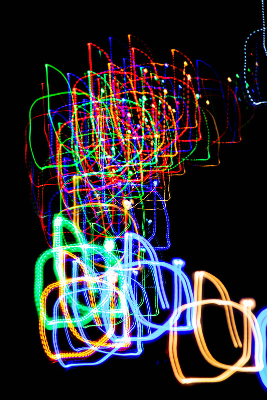 untitled-4.jpg by Dominic Rodgers, on Flickr
And a bit of reflections on the wet paving.
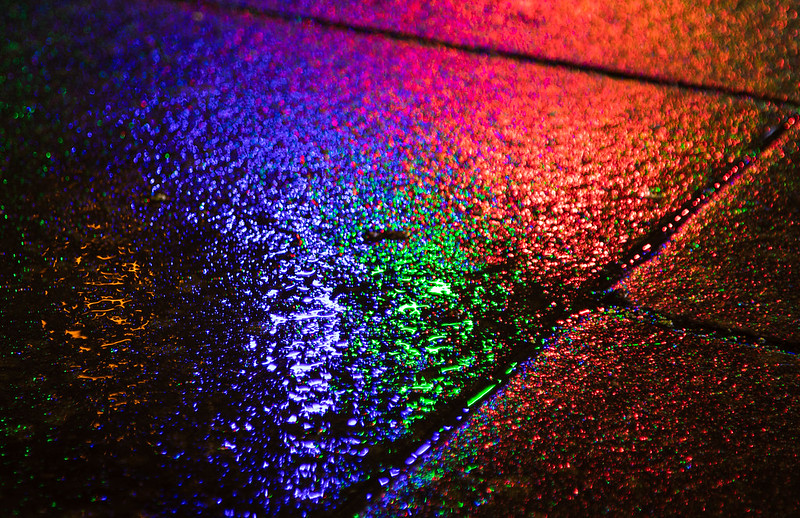 untitled-10.jpg by Dominic Rodgers, on Flickr
So i went out last night with a couple of members from the camera club, to photograph the Christmas lights in town. This gave me the opportunity do a little bit of ICM.
untitled-4.jpg by Dominic Rodgers, on FlickrAnd a bit of reflections on the wet paving.
untitled-10.jpg by Dominic Rodgers, on Flickr