OCF grab shot of my daughter

Messages
1,028
Name
Dan
Edit My Images
Yes
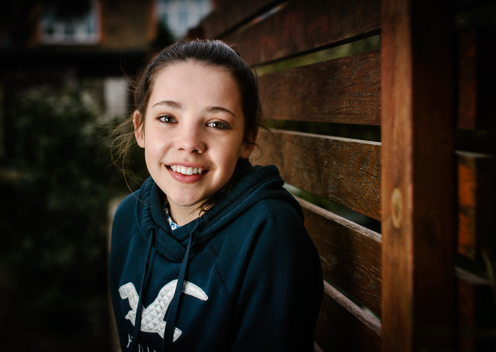
Busted out the ocf gear the other day as its been a while and its an area i really need to brush up on.

Took this in my small back garden with a speedlight in a softbox. Didn't really have much time to play around with settings or poses due to the weather and my daughter getting bored. Literally took about 8 shots and then had to go inside.

I've looked at this for so long now im really not quite sure about it and just wondered what others thought?

I won't say the things that bother me as id like to see if they bother anyone else........ so any C&C most welcome

DSC_8334-Edit
 
First off , Her expression is awesome , so that's 99% job done.

Nitpicking :The light looks a little low regarding catch lights, and the ambient looks a little dark for me.

but all in all :clap:
 
Lovely image. Enjoy it while you can, when she's a bit older, she'll not let you have a camera near her........... I speak from experience :eek::D

The bright area, around her right shoulder annoys me, but that was only when I went looking for something to annoy me :)
 
First off , Her expression is awesome , so that's 99% job done.

Nitpicking :The light looks a little low regarding catch lights, and the ambient looks a little dark for me.

but all in all :clap:

Wasn't sure where to start with the placement of light and didn't get the chance to play around with positions as i would have liked. I will plan it better next time so everythings not so rushed.

I want to avoid the clutter in my garden being in the shot so I underexposed the ambient by 2 stops and used a shallow dof, but i think its the vignette added in post thats enhancing the darkness. Ive been editing this on 27" Dell IPS but when i saw this on my phone the first thing i thought was that it looked a bit dark, when viewed on a larger screen its less noticeable.

Thanks for your comments.


Lovely image. Enjoy it while you can, when she's a bit older, she'll not let you have a camera near her........... I speak from experience :eek::D

The bright area, around her right shoulder annoys me, but that was only when I went looking for something to annoy me :)

Thanks Johnny. Shes 13 now and is pretty good when i get the camera out, but gets bored so quickly. I'm talking minutes here ..... although you are right, i can see a time coming soon where its going to be nigh on impossible to get her in front of one.
The bright area annoys me too, because i shot close up and at 2.8 the wall behind has blurred and looks like some weird halo. I think may have to do some masking and cloning etc in ps to fix this.

Thanks for your comments.
 
Last edited:
Well done great picture, a little more light in the shadows on the left would be nice but in fairness leave it. You have a beautiful picture to be proud of for years to come.
 
Thanks everyone. I think i will will dial the ambient down a touch and clone out the white wall that looks like a halo to me as that whats bothering me the most.

Dan
 
It is a lovely image and your daughter has a wonderful smile. The light could have been higher up perhaps (and maybe a bit closer). I like the balance of light too.
 
First off , Her expression is awesome , so that's 99% job done.

Nitpicking :The light looks a little low regarding catch lights, and the ambient looks a little dark for me.

but all in all :clap:
I agree. I also think the light is a bit hard, but that would be mitigated somewhat by a little higher ambient. I would crop out the vertical post on the rt side... it is effectively the rt side "frame" cutting off the image and it's a bit of a distraction.
 
Thanks everyone. I think i will will dial the ambient down a touch and clone out the white wall that looks like a halo to me as that whats bothering me the most.

Dan

I thought about the 'halo' but it doesn't look like a proper halo so it does look like background. I'd be concerned that you may lose the definition of her shoulder if you remove it. That's why I didn't suggest it. Nothing wrong with having a look at it I suppose :)
 
I quite like this shot Dan. Love the lighting but agree the catchlight for me is low but horses for courses and all.
The only thing that sticks out is the post on the right hand side of the frame is too bright and drags my eyes towards it.
Personally I'd either darken it in post or adjust the light (if noticed at the time) to fall just short of it.
That is me being nit-picky though.
 
Back
Top