

- Messages
- 831
- Name
- Michael
- Edit My Images
- Yes
A little selection of OCF shots from recent weddings.
Any advice, CC or comments welcome")
1. Autumn by Michael Carver, on Flickr
2. Doorway by Michael Carver, on Flickr
3, sunset by Michael Carver, on Flickr
4. Piper by Michael Carver, on Flickr
5. Achnrgairn by Michael Carver, on Flickr
6.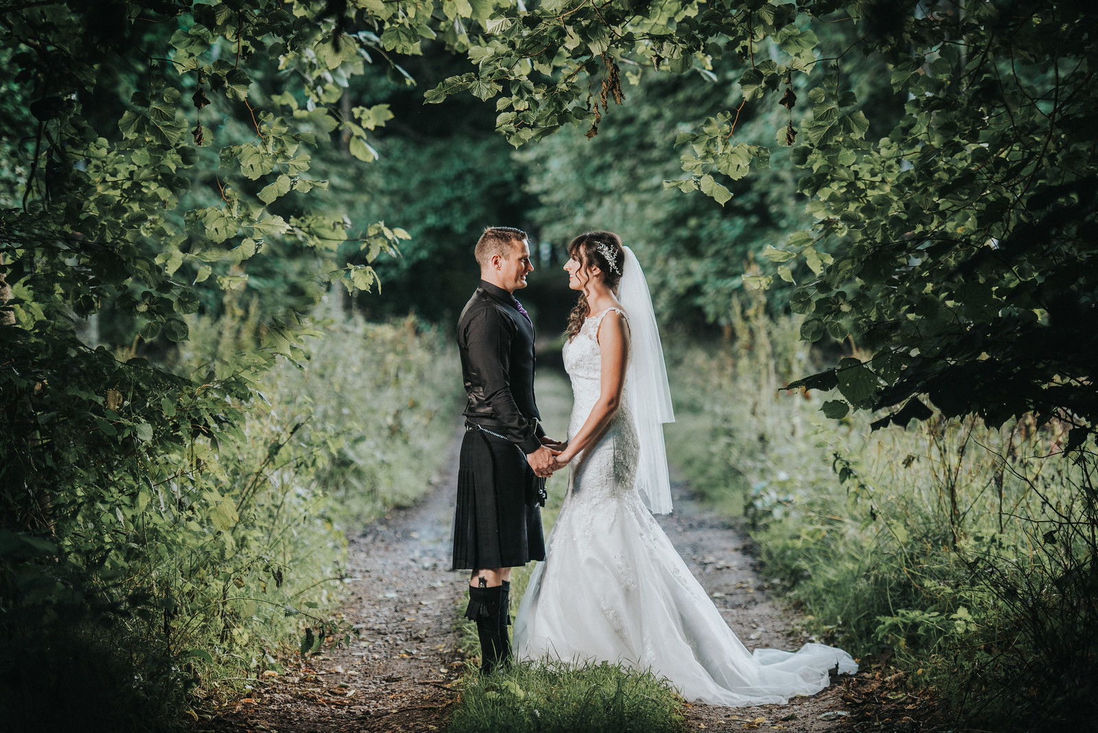 Lane by Michael Carver, on Flickr
Any advice, CC or comments welcome
1.
Autumn by Michael Carver, on Flickr2.
Doorway by Michael Carver, on Flickr3,
sunset by Michael Carver, on Flickr4.
Piper by Michael Carver, on Flickr5.
Achnrgairn by Michael Carver, on Flickr6.
Lane by Michael Carver, on Flickr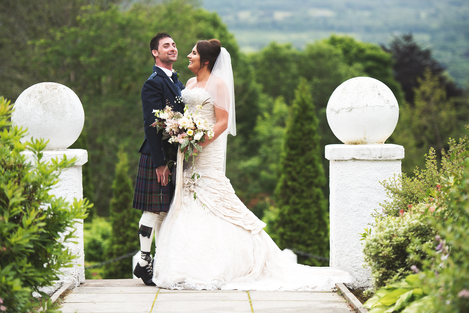 _DSC8355