

You are using an out of date browser. It may not display this or other websites correctly.
You should upgrade or use an alternative browser.
You should upgrade or use an alternative browser.
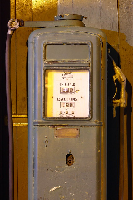
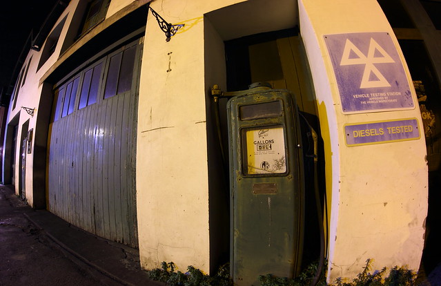
Old fuel pump
- Thread starter Chr1stof
- Start date
- Messages
- 987
- Name
- Alex
- Edit My Images
- Yes
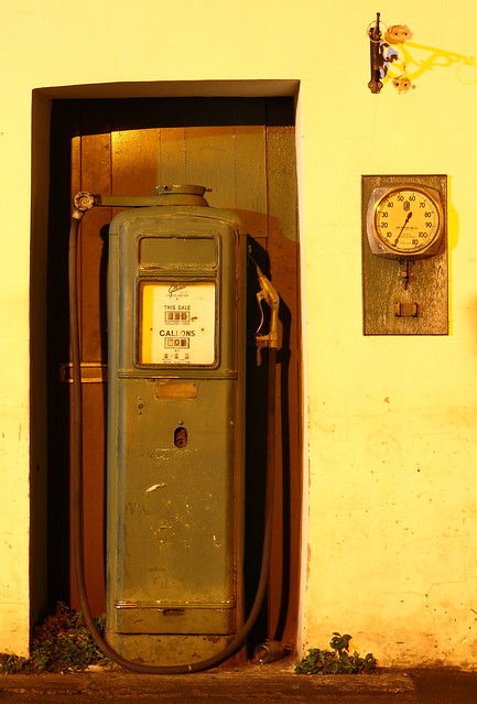
I feePersonally, a little colour correction wouldn't go a miss. They look as if they are lit only by the street lights and it's not a nice enough colour for the pump.. I'd say white balance it so it looks a bit more of it's natural colour!
Great shots though! I love the fisheye one!
Great shots though! I love the fisheye one!
- Messages
- 27,793
- Edit My Images
- Yes
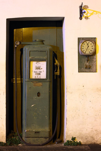
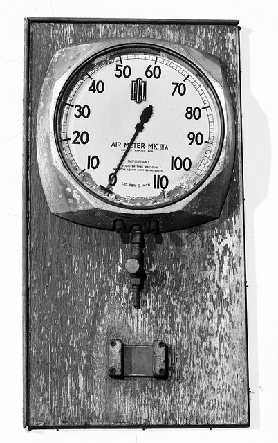
The white balance in numbers 2+3 makes me queasy (the fisheye effect doesn't add anything either) and the fourth one appears to be at an angle, which doesn't relate to the representation of the same item in the second shot. Sorry...
OP
- Messages
- 1,163
- Name
- Chris
- Edit My Images
- Yes
Thanks for the comments. It was indeed only lit by horrible orange street lights and as am still learning about adjusting the WB I struggled to get it right. Agree with the comment about the clock one being at a slight angle, Im going to go back and re-do that one ")
Thanks chaps
Thanks chaps
- Messages
- 4,435
- Name
- Martyn
- Edit My Images
- Yes
Is a face on shot of the garage doors with the pumps either side possible ?
Think that kind of shot,in b&w perhaps,would work better than tight cropped views of the pumps etc (imo)
Is the price 3&6 a gallon ?
Think that kind of shot,in b&w perhaps,would work better than tight cropped views of the pumps etc (imo)
Is the price 3&6 a gallon ?
OP
- Messages
- 1,163
- Name
- Chris
- Edit My Images
- Yes
Is a face on shot of the garage doors with the pumps either side possible ?
Think that kind of shot,in b&w perhaps,would work better than tight cropped views of the pumps etc (imo)
Is the price 3&6 a gallon ?
I dont think I would be able to get them both in unless I was to use the fisheye as the road is quite narrow given the distance between them. My kit 18-55 might, will try and have go next time.
- Messages
- 2,777
- Name
- Drake
- Edit My Images
- Yes
Don't know if you'll like this version of number 2...I'll remove it if you wish. It's maybe a bit too dark.

6366327081_9ce207bdee_z by hunter20ga, on Flickr
6366327081_9ce207bdee_z by hunter20ga, on Flickr
- Messages
- 2,748
- Name
- Julian
- Edit My Images
- Yes
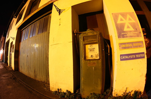
I think they could work as a set but the main issues I have are the white balance as mentioned before and also the "catalysts tested" and other signs don't fit with the vintage theme - bit too new.
Otherwise I quite like them especially the last one.
Otherwise I quite like them especially the last one.