

- Messages
- 1,695
- Name
- jason
- Edit My Images
- Yes
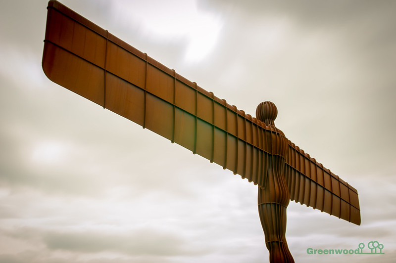
A few different edits. Sky was a blandy blandness!!
 DSC_0318 by jason greenwood, on Flickr
 DSC_0323 by jason greenwood, on Flickr
 DSC_0324 by jason greenwood, on Flickr
DSC_0318 by jason greenwood, on FlickrDSC_0323 by jason greenwood, on FlickrDSC_0324 by jason greenwood, on Flickr