

You are using an out of date browser. It may not display this or other websites correctly.
You should upgrade or use an alternative browser.
You should upgrade or use an alternative browser.
weekly -OY-'s Weekly 52 thingie for 2018 - Week 52 : Showcase (Complete)
- Thread starter -Oy-
- Start date
LC2
Negan
- Messages
- 10,451
- Name
- Tim
- Edit My Images
- Yes
- Messages
- 5,432
- Name
- Andrea
- Edit My Images
- Yes
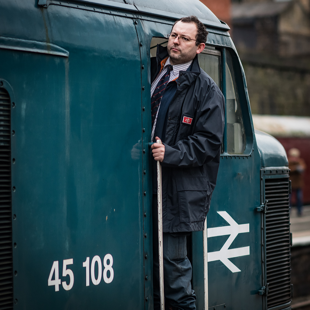
Nice one, Dave. The fact that you got eye contact is a real bonus as it draws the attention straightaway, and the man peeping out of the window adds a nice balance. Some interesting details on the engine and carriage too; as others have noted, it has a slightly vintage feel to it ")
- Messages
- 4,562
- Name
- Mark Gameson
- Edit My Images
- Yes
I like that Dave really like the feel of it. Nice details and colours

- Messages
- 4,562
- Name
- Mark Gameson
- Edit My Images
- Yes
Really like both of those Dave but my favourite its the second one very well seen and captured
- Messages
- 1,566
- Edit My Images
- Yes
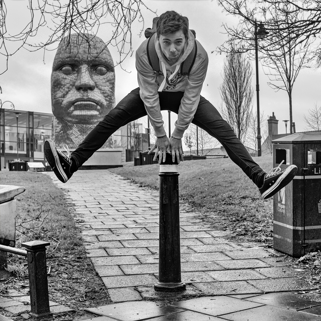
I actually like this one best for the People theme
- Messages
- 4,640
- Name
- Pete
- Edit My Images
- Yes
Nice picture of a young possibly "Jobs Worth" in the making.
- Messages
- 7,548
- Name
- susie
- Edit My Images
- Yes
Hi Dave ....I’m late getting started this year but good to see your thread. I think the first People one is my favourite, really nice composition and the muted colours suit it well, having said that .... that is a smasher of the chap with the iPad, absolute spot on focus.
- Messages
- 2,436
- Edit My Images
- No
Week 0 - I allus thowt ther were summat ah didna trust abaht Manchester fowk. Good compromise with DOF - got enough of DV in focus and blurred out distractions
Week 1 - Nice tones from that ColourPlus - just enough DOF to get detail round latch/lock and interesting textures.
Week 2 - First one for me with guard and 'passenger' - last time someone called me a customer on a train I said, I know I've paid enough to buy part of it but I only want to travel on it.
OP
-Oy-
Worzel Gummidge
- Messages
- 9,066
- Name
- Dave
- Edit My Images
- No

Last edited:
- Messages
- 1,566
- Edit My Images
- Yes
Cracking image - love the reflection which really makes it for me
LC2
Negan
- Messages
- 10,451
- Name
- Tim
- Edit My Images
- Yes
I agree with the comment that the reflections really adds to the shot, so a nice bit of composition to ensure it lined up well like that.
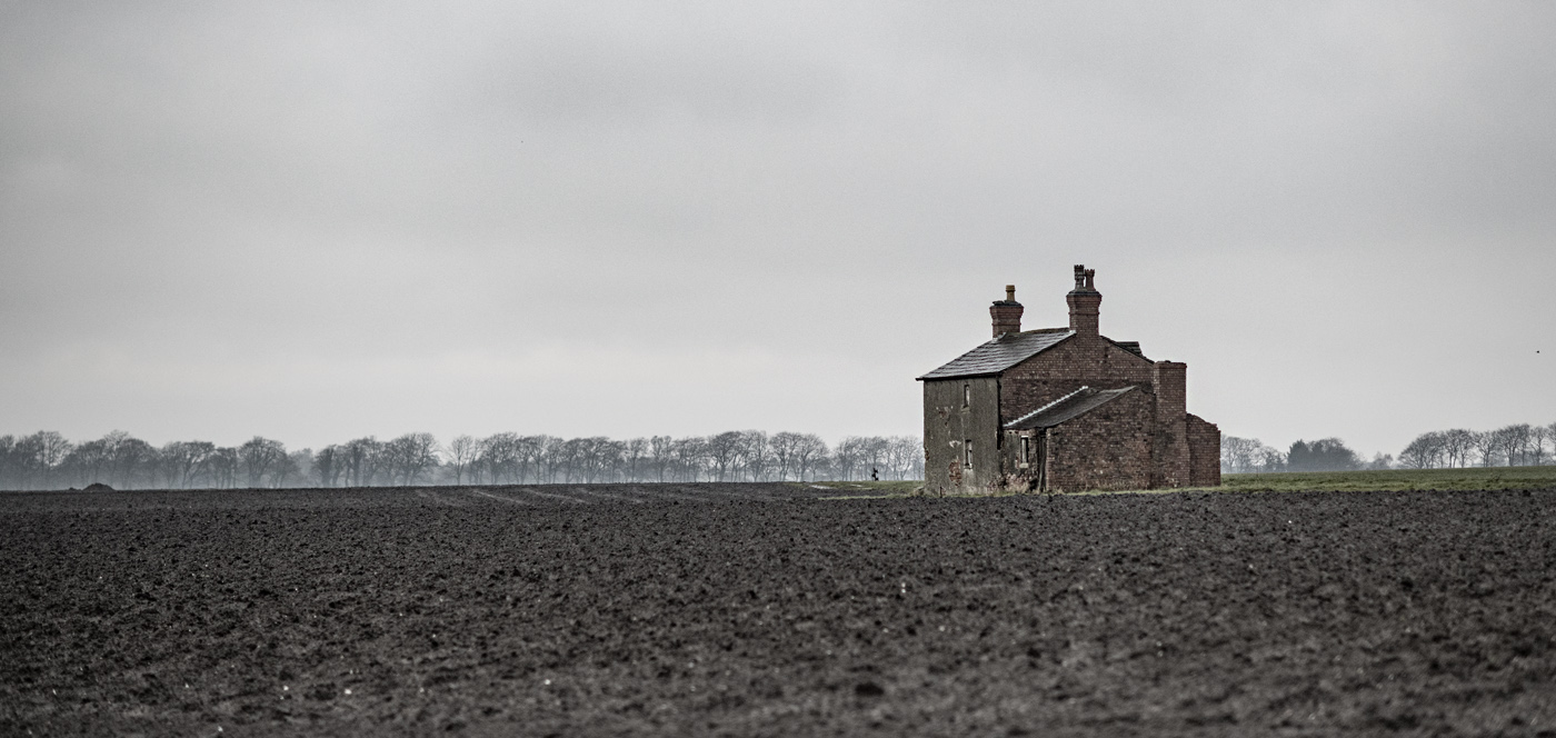
Empty you say? I wonder why. Too remote maybe, or too much renovation needed? It looks a decent place to me.
Is the image slightly desaturated, or was that the result of the light? I like the effect it has.
By the way, you link leads back to the start of page 1, which whilst okay at the moment, will be a pain when you're on page 20
Click on "Share" at the bottom of your post, or the #[Number] and a pop up will will appear with the direct link to that post, then use that in the linky
- Messages
- 1,344
- Name
- Philip
- Edit My Images
- No
Stark
Works for me Dave, reflections, leading lines and composition, what’s not to like?
Phil
Works for me Dave, reflections, leading lines and composition, what’s not to like?
Phil
- Messages
- 1,477
- Name
- Paul
- Edit My Images
- Yes
I actually like this one best for the People theme
and I totally agree, even though the person is facing away from you, the Samsung Tab with the train image counters that, nice thinking.
- Messages
- 13,760
- Edit My Images
- Yes
Lovely leading line with the flooded track Dave, and it sure looks deserted, the mist and blank sky sure make that cool building stand out
- Messages
- 9,095
- Name
- Mandy
- Edit My Images
- Yes
People - all images are nicey shot and pin sharp focus, can't choose between them.
Stark - thats a cracker of a image for the theme, love this.
Stark - thats a cracker of a image for the theme, love this.
- Messages
- 146
- Edit My Images
- No
I like that, the muted colours work very well.
- Messages
- 4,562
- Name
- Mark Gameson
- Edit My Images
- Yes
Brilliant image for Stark Dave love the reflection I love the muted colours. There is some lovely details in there.
- Messages
- 4,640
- Name
- Pete
- Edit My Images
- Yes
Oy Dave
Stark - Great image, love the colours and reflection.Grey Sky adds to the Starkness.
Pete
Stark - Great image, love the colours and reflection.Grey Sky adds to the Starkness.
Pete
- Messages
- 616
- Name
- Ross
- Edit My Images
- Yes
Great shot. Think i would have been tempted to get lower and get a bit more of the reflection in, but i like the image. Very stark.
OP
-Oy-
Worzel Gummidge
- Messages
- 9,066
- Name
- Dave
- Edit My Images
- No
Thanks @ross.anderson.58 - I’d have loved to get lower but I was already kneeling at the edge of the water up to my ankles in mud
Last edited:
OP
-Oy-
Worzel Gummidge
- Messages
- 9,066
- Name
- Dave
- Edit My Images
- No
 Week 4 - OVER