

- Messages
- 2,634
- Name
- Gareth
- Edit My Images
- Yes
Penarth Pier this morning at 5:30!
Pentax K3ii & DA* 16-50mm
-0.7EV, 0.9 soft ND grad, C-PL
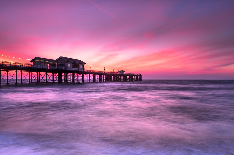 Penarth Pier by Gareth Williams, on Flickr
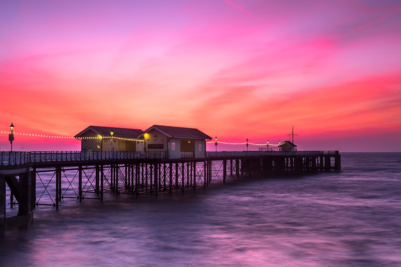 Penarth Pier by Gareth Williams, on Flickr
Pentax K3ii & DA* 16-50mm
-0.7EV, 0.9 soft ND grad, C-PL
Penarth Pier by Gareth Williams, on FlickrPenarth Pier by Gareth Williams, on Flickr") My preference is the first where the pier is just acting as a lead into the sky and sea. I can see that in the second the pier is intended to be the subject, but for me it's too dominant.
My preference is the first where the pier is just acting as a lead into the sky and sea. I can see that in the second the pier is intended to be the subject, but for me it's too dominant.

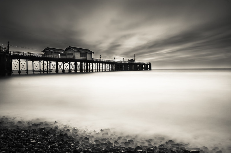 Penarth Pier long exposure