

- Messages
- 490
- Name
- James
- Edit My Images
- Yes
Evening all,
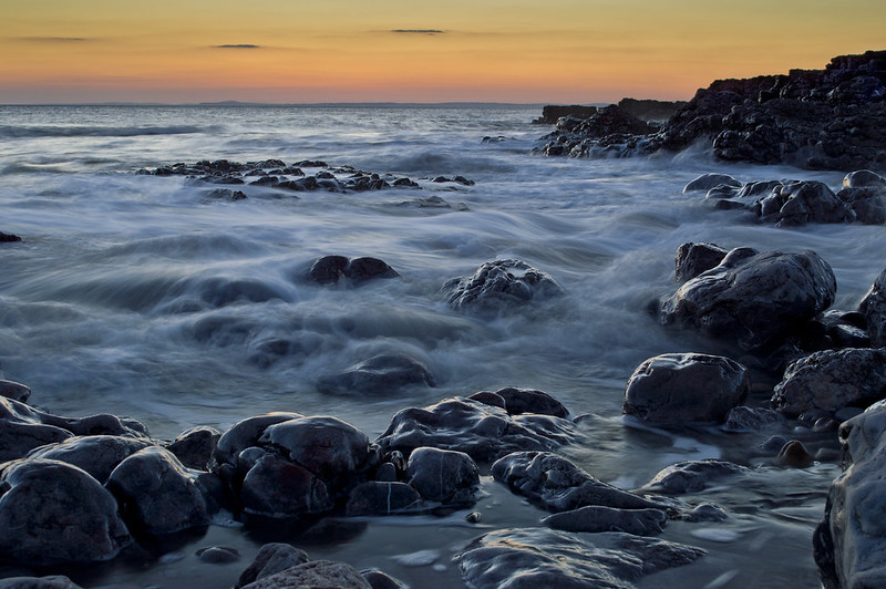
I went out for the first time in quite a while last night with a 'wispy' seawater shot and came away with the two following photographs. Please can you critique them for me. Looking at the photos on my laptop they seem quite light but the total opposite on my works monitor. The blacks look clipped to me, I've tried to 'dodge' the areas but to no avail; similarly I've tried pushing the 'lowlights' up but the photos began to look natural. Photos below:
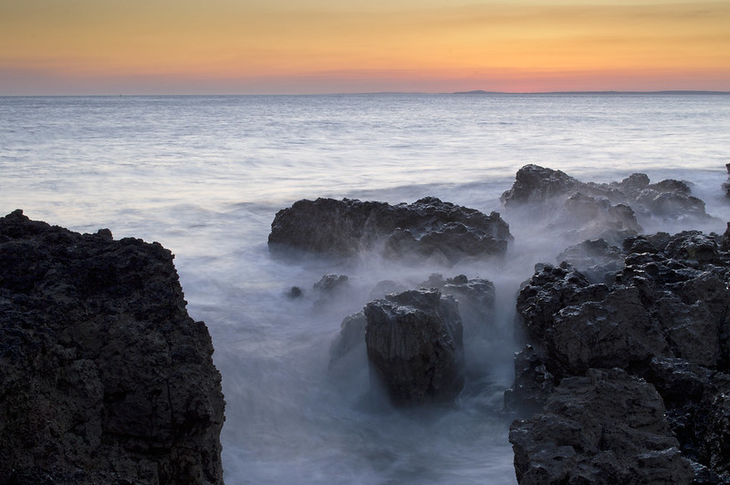
A Sea Mist
 [/url
[/url
][url=https://flic.kr/p/se2JiW]Tide Drawing In
James[/url]
I went out for the first time in quite a while last night with a 'wispy' seawater shot and came away with the two following photographs. Please can you critique them for me. Looking at the photos on my laptop they seem quite light but the total opposite on my works monitor. The blacks look clipped to me, I've tried to 'dodge' the areas but to no avail; similarly I've tried pushing the 'lowlights' up but the photos began to look natural. Photos below:
A Sea Mist
[/url][url=https://flic.kr/p/se2JiW]Tide Drawing In
James[/url]