
OP
- Messages
- 4,266
- Name
- Rick
- Edit My Images
- No

Thanks for the comments. Obviously processing is a personal thing.Hi Rick,
I like your idea for decay and both the shots are spot on. Not so keen on the processing though - sorry.
Free and whole - two very nice shots which are perfect for the theme. I especially like the condensation on Whole.
")

Thanks Gareth, much appreciatedBoth 'free' and 'whole' images are top notch Rick!
As Lee says the water droplets on your 'whole' image are perfect - makes it look so refreshing and tasty!
Very well shot indeed with terrific, vibrant colours!
 DSCF2507 by rick phillips, on Flickr
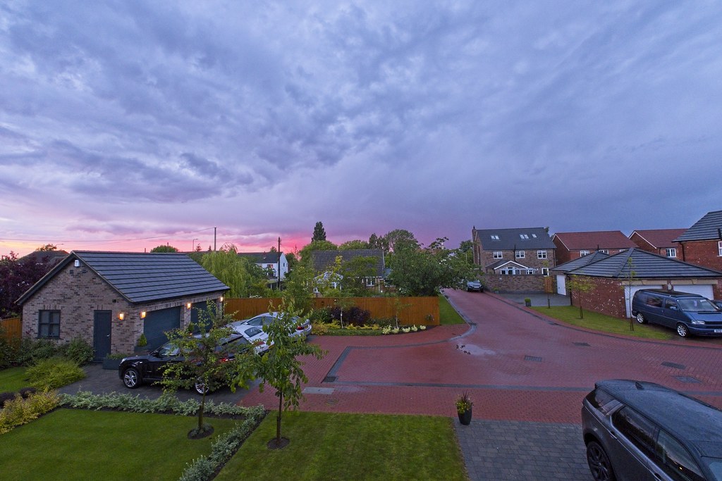
Great dramatic image Rick!
That's definitely not a 'putting-the-washing-out-to-dry' kinda sky!
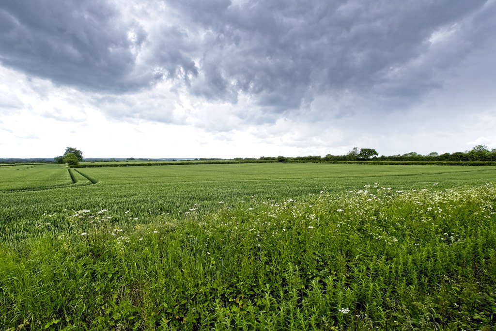
Very nice landscape, and I especially like the tractor tracks that lead directly to the tree on the left of frame....clever framing!
Love the cloud formation in this well taken image.
 DSCF2514 by rick phillips, on Flickr
 DSCF2512 by rick phillips, on Flickr
Thanks for the detailed responses, much appreciatedDistant - I like the second version better.
Cold - Fabulous colours and I like the flock of birds, the car photos can't compete sorry.
Waiting - I agree the selective colour works well for this one, but I quite like the colour version too.
Rough - Clever Idea I like it, it would be nice if the ring stood out more.
Object - both work well I would choose the first over the second but not sure why.
Wet - A dark Damp night, indeed the light on the wet ground really adds to the image.
Free - Lovely shot and the wing tip gives it context.
Entrance - The B/W suits it well.
Young - lovely portrait, either keen to get her reward for being your model or planning something mischievous.
Food - I hope it tasted as good as it looks. good colours.
Smooth - I too think it may have looked better if the glass was full, good choice though.
Above - works for the theme and interest in the different materials used.
Hot - I like this but I think maybe a really tight crop would be good. I love those sunsets too great colours.
Light - another great sunset.
Crowd - bit of glare from the blown whites but hard to control that on a phone. certainly is crowded.
Decay - I like the 1st shot better but the flat tyre is much more prominent int the second it looks more neglected
Free and Whole - both good shots I like the Whole shot with the water droplets best.
Fragile - nice landscape shot very dramatic sky and the other shots also have fabulous skies with great colours I hope you took your washing back in doesn't look like it will get dryer out there
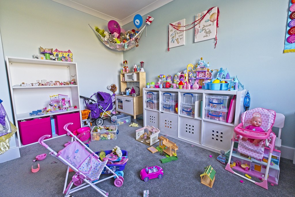
Thanks Dave, I had to bribe her with a ice lolly to help me out! She was struggling to squeeze if hard enough for the eyes to pop. Glad the BG is sufficiently OOF so as not to show the contents of our fridgeGood main focus on the toy being squashed Rick, like the oof BG and well on theme.
Thanks Dave, that was the plan. I was going to try and find a church tower with a clock, but as there was a break in the rain I took a chance and went to my village cemetery.Two very nice images for the theme Rick, my pick is the mono shot as imo it really suits the scene. Great main focus on the gravestone of Thomas and Mary for the standout and the pathway leads the viewer right in.
Thanks Gareth. Much appreciated.Super shots Rick!
Squash(ed): Great expression....she looks very determined indeed....now that I know there was a lolly on offer I can see why!
Time: Love these!! I too prefer the mono version, though the colour version is excellent too - very nice contrasts, which suits the image perfectly, and terrific composition!
Smashing!
Thanks Bob, much appreciated.TIME: Two very good shots for this theme! I think I prefer the mono version, too. The end of time! End of everything!!
Thanks Mark, I prefer the mono myself, I think if there is one scene which looks better in mono, it is a cemetery. I just thought I'd pop the colour version in so others could see what they preferred.Time - excellent shot and idea, I too prefer it in b&w, suits the scene and theme.
Thanks very muchSquash(ed)
The purple stands out well against the fairly muted tones of the treat of the photo.
Time
I like the first photo, it seems more contrasty.
Thanks IanFragile - works very well. That weather was indeed, very fragile, looking at the later images. Good colours and really like the leading line in the field
Squashed does exactly what it says on the tin - nice portrait of your daughter, nicely squashed toy and enough DOF to make it all about her and her toy
Time - I really like the mono one. I thought at first it may be a bit too bright in the top half, but the more I look at it, it looks lime the sun trying to shine down on a holy shrine
Thank you for the comments Chris, much appreciated.Rick, your squashed shot is a great idea for the theme ! It’s great to get our children involved ! Mine just think I’m a touch crazy and burst into fits of laughter !
Your take on time really made me think, definitely my favourite for the theme and I think it’s well suited to mono
 DSCF2541 by rick phillips, on Flickr
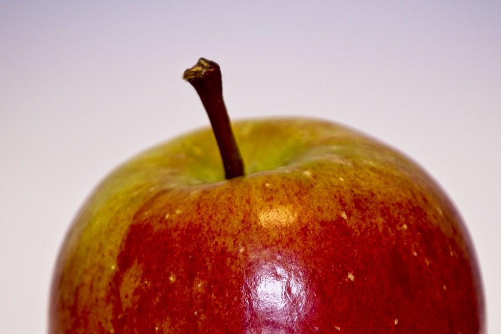 DSCF2487
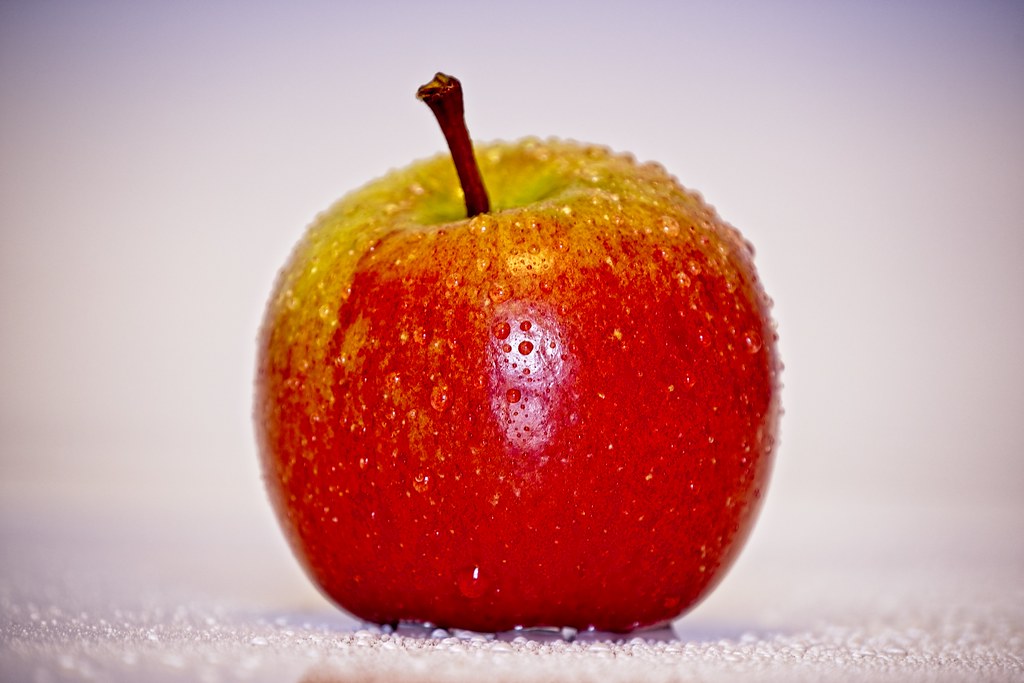 DSCF2489
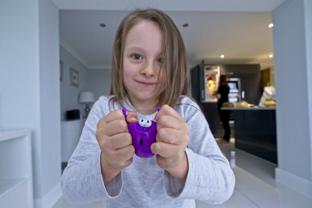 DSCF2517
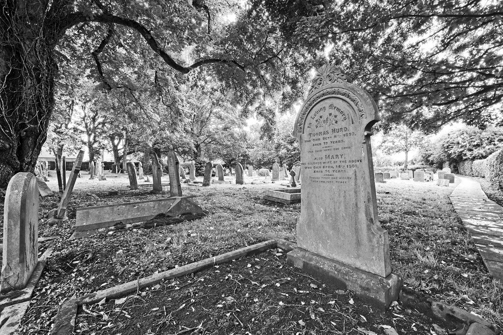 DSCF2525
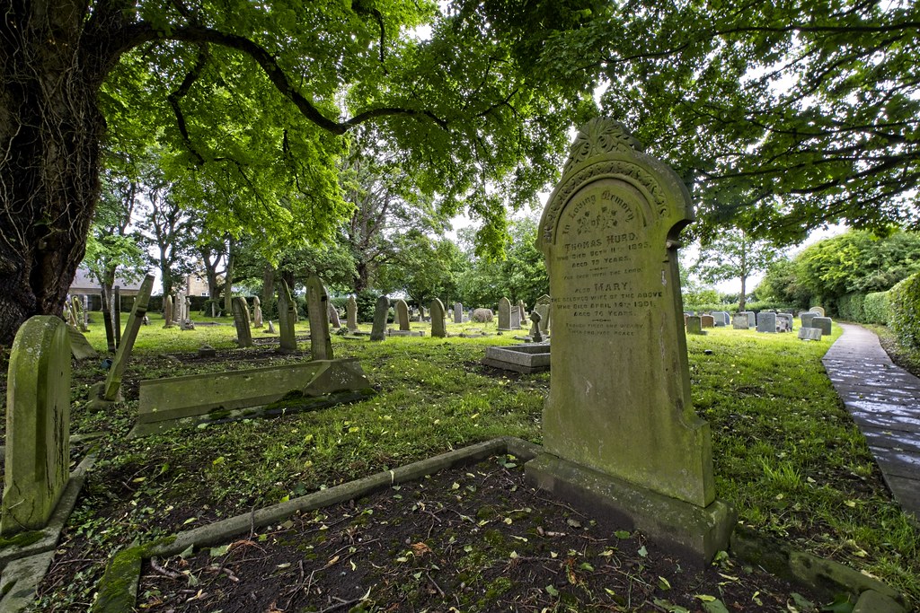 DSCF2525 copy