

OP
- Messages
- 9,715
- Name
- Stan
- Edit My Images
- Yes
Thats a great Mural, there should be more of these things dotted around all cities, having a person in the frame helps with the perspective too,
One more point the right side of the frame seems straight the left is leaning in a little, a bit of a skew needed maybe
Thanks, Allan. I noticed that too and have tried rotation, horizontal and vertical transform but to no avail.
 Week 18 Large 16847 C
")
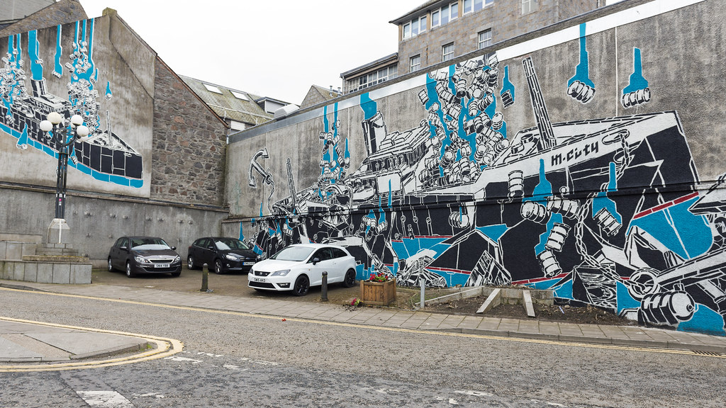 Large M-City 16840
 Architecture
 Broken Filament
 Broken Wires
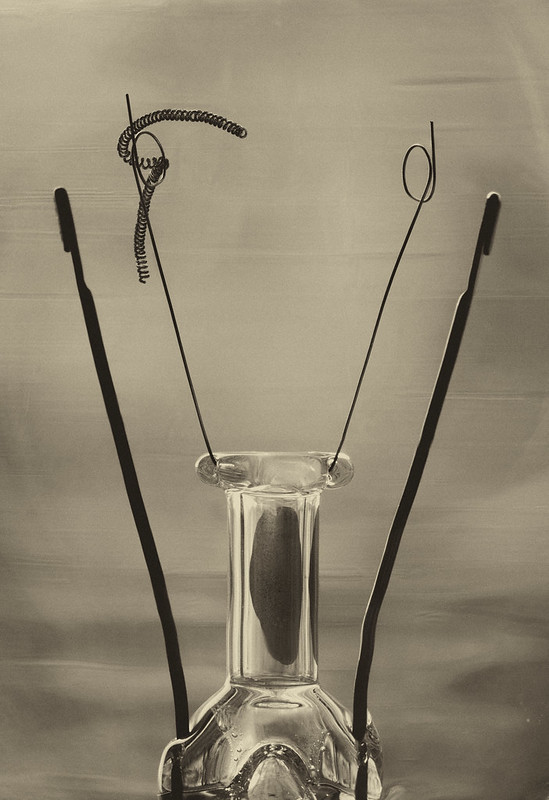 Broken Antique Wire
 Broken 16945