weekly rpn's 2020 52 Photo Challenge - Week 52 DECORATIONS Added ***COMPLETE***

I really like the processing. It works well and makes it more interesting. The music did seem in a slightly odd place for a piano, but that doesn’t detract from it, and your other shot explains it.

Edit: I’ve just viewed it larger and can now see the modern symbols. I didn’t spot them before.

Thank you and glad you spotted it in the end. It is my son's electronic keyboard.
 
Nice shot for Music - No1 is much nicer to me :)
 
  • Like
Reactions: rpn
So the music is a display? That's pretty clever. No more reaching to change the page (not that I was ever that good at reading music).
Processed with an aged photo effect I'm guessing?
 
The 1st one for me Stan. Plain and simple. Well processed too.
 
Good idea Stan. Works really well - looks like a complex musical piece to me.. but I know nothing about it :)
 
Nicely done Stan. I really like the way you've done that.

Cheers, Pete. I hope the pp suits the music.


Good idea Stan. Works really well - looks like a complex musical piece to me.. but I know nothing about it :)

Thanks, Helen. Me too, they are just dots to me.
 
Fun image Stan. Well composed and interesting. I like it a lot.
 
Well that certainly fits the theme! Great image, plenty to keep the eye occupied (not sure it fits the B&W technique though ;) )
 
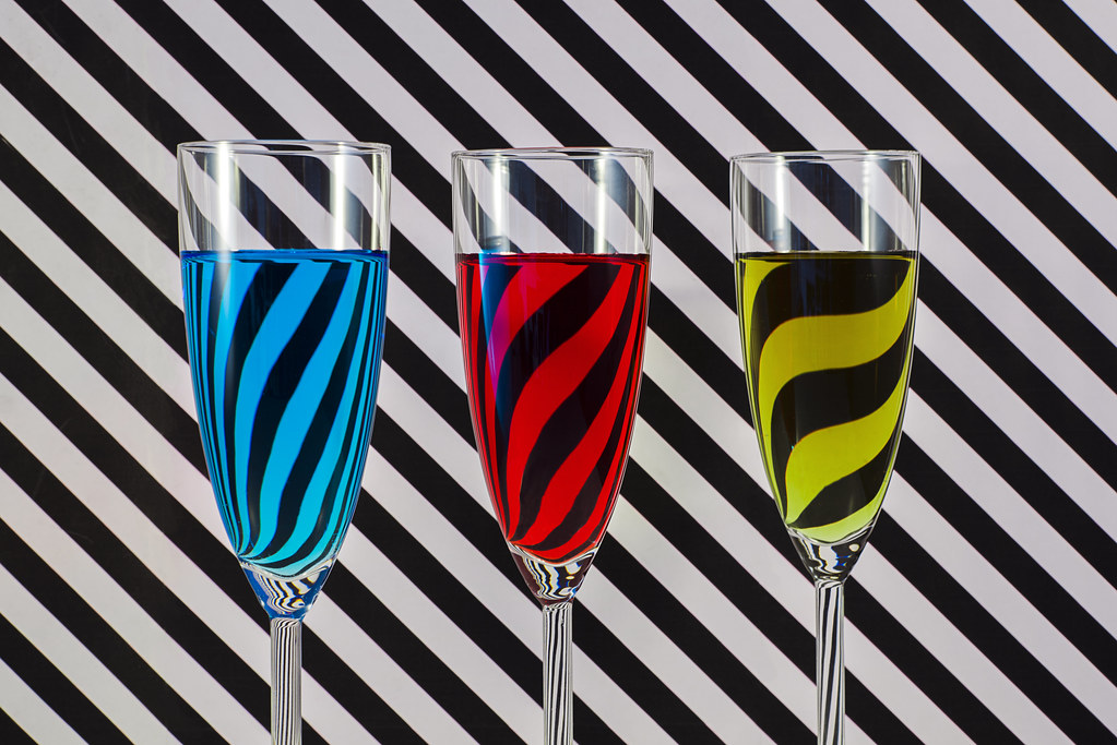
Nice try at getting Both theme and technique, Its a good example of diffraction
 
I like that Stan very creative. The colours really pop out form the background.
 
  • Like
Reactions: rpn
Lovcely stripy stuff - very creative :)
 
  • Like
Reactions: rpn
Very creative Stan, nice shoehorn on the technique, too.
But I'll let Tim make that call :D
 
Great composition - the gradation of distortion of the stripes in the glasses adds an extra dimension.
 
Love that image Stan, very nicely done.
I'm intrigued by how the lines are different in number across the glasses, even though they seem to be the same size. Distance from the background?

I'm guessing it was taken using Ilford Ortho Plus infused with kodachrome ;)
 
Love that image Stan, very nicely done.
I'm intrigued by how the lines are different in number across the glasses, even though they seem to be the same size. Distance from the background?

I'm guessing it was taken using Ilford Ortho Plus infused with kodachrome ;)

Cheers, Tim. Yes, they are at a different distance from the background. Actually I'm a Kodak Tri-X man. :giggle:
 
Music
Both of those shots look good, I slightly prefer the second shot.

Colourful
A really good image, very colourful and technically very well done.
 
Music
Both of those shots look good, I slightly prefer the second shot.

Colourful
A really good image, very colourful and technically very well done.

Thank you, Dominic.


Love the concept on that, and love the way the stripes are being by the liquid. Fun and well thought through.

Thanks, Alex.
 
Back
Top