

You are using an out of date browser. It may not display this or other websites correctly.
You should upgrade or use an alternative browser.
You should upgrade or use an alternative browser.
weekly rpn's 2020 52 Photo Challenge - Week 52 DECORATIONS Added ***COMPLETE***
- Thread starter rpn
- Start date
OP
- Messages
- 9,700
- Name
- Stan
- Edit My Images
- Yes
lovely puffin images, those colours just pop really well. the composition on the first one is great too.
Lovely image Stan. Gorgeous birds.
Thanks, Jim and Helen.
I always look forward to this time of the year to shoot them, as with a camera, not with a gun.

OP
- Messages
- 9,700
- Name
- Stan
- Edit My Images
- Yes
That's nice. Just enough difference in tones to separate from the background.
Thanks, Tim. I've to crop quite heavily to remove some background distractions and I'm happy enough with the result.
OP
- Messages
- 9,700
- Name
- Stan
- Edit My Images
- Yes
A pleasing pair of puffin pics.
Thank you, Phil. They were very obligating and happy to pose for me.
OP
- Messages
- 9,700
- Name
- Stan
- Edit My Images
- Yes
Very much like your Puffins, and your caption......a bird I have never seen!
Cheers, Clive. You have to go if you got a chance to see them, with a camera. They are most adorable.
OP
- Messages
- 9,700
- Name
- Stan
- Edit My Images
- Yes
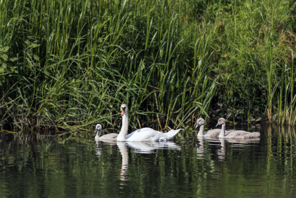 Mothering
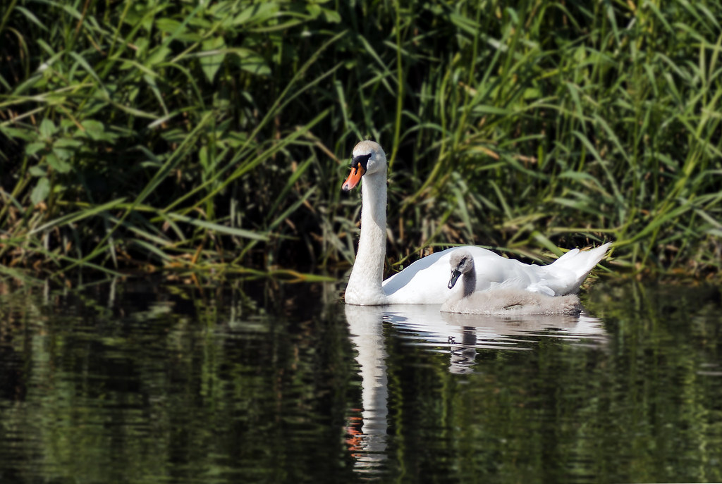 Mother & Child
 Family
OP
- Messages
- 9,700
- Name
- Stan
- Edit My Images
- Yes
#2 for me personally - the slightly tougher framing on the 2 swans and the mirrored head poses make it. Lovely detail on the two birds though - not easy with bright white swans!
Nicely done Stan. And #2 for me as well.
Thanks, Alex and Chris. #2 was my original choice for the main post but changed my mind in the last minute.
OP
- Messages
- 9,700
- Name
- Stan
- Edit My Images
- Yes
2nd one for me also Stan, not seen many ducklings this year let alone swans usually get them on the canal which is close to us
Thanks, Allan. I was told there are ducklings somewhere along the river too and will have a lookout for them.
OP
- Messages
- 9,700
- Name
- Stan
- Edit My Images
- Yes
Tough but I think number one for me, it's the look your are getting which does it! The exposure in all of them is very well controlled.
Thank you, Graham for the comments. Personally I like them all and each has its own merits.
OP
- Messages
- 9,700
- Name
- Stan
- Edit My Images
- Yes
Lovely images, it's no 2 for me as it's a simpler image. Great job
Cheers, Jim and agree with you about simplicity as to Charlie Chaplin quote "Simplicity of approach is always best"
OP
- Messages
- 9,700
- Name
- Stan
- Edit My Images
- Yes
2nd image for me too Stan, all are lovely but the 2nd is better imo.
Cheers, Dave.
OP
- Messages
- 9,700
- Name
- Stan
- Edit My Images
- Yes
Nice Swan shots Stan, 2nd for , prefer the composition.
Thanks, Clive. It looks like #2 got this week's votes!
- Messages
- 4,562
- Name
- Mark Gameson
- Edit My Images
- Yes
Snapper Choice: Lovely Puffin images Love the one of the one peeping round the rock.
Mother Nature: Another vote for No 2.
Mother Nature: Another vote for No 2.
OP
- Messages
- 9,700
- Name
- Stan
- Edit My Images
- Yes
Snapper Choice: Lovely Puffin images Love the one of the one peeping round the rock.
Mother Nature: Another vote for No 2.
Thank you, Mark.
OP
- Messages
- 9,700
- Name
- Stan
- Edit My Images
- Yes
All lovely shots but I'm with #2 too.
Thank you, Helen.
OP
- Messages
- 9,700
- Name
- Stan
- Edit My Images
- Yes
Nice set of swan family pics.
Cheers, Phil.
- Messages
- 2,833
- Name
- Pete
- Edit My Images
- No
A lovely tranquil scene Stan. Second pic for me too.
OP
- Messages
- 9,700
- Name
- Stan
- Edit My Images
- Yes
Good exposure on the swans. I'm also going for the second shot.
A lovely tranquil scene Stan. Second pic for me too.
Thanks, Dominic and Pete. Yep! #2 won it hands down this week.
OP
- Messages
- 9,700
- Name
- Stan
- Edit My Images
- Yes
Went out for a walkabout this morning around the university campus looking for inspirations for this week's theme and hopefully technique too. I spotted this and thought there are a few signs there and also the Church (bible) and the Bar (alcohol) for the juxtaposition technique!!! Maybe???
Week 27 Signs and Juxtaposition Technique
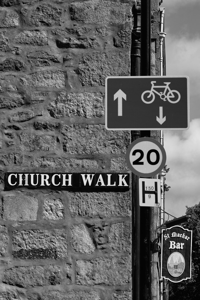 Week 27 Signs T2 2869 BW by Stan, on Flickr
Week 27 Signs and Juxtaposition Technique
Week 27 Signs T2 2869 BW by Stan, on Flickr
OP
- Messages
- 9,700
- Name
- Stan
- Edit My Images
- Yes
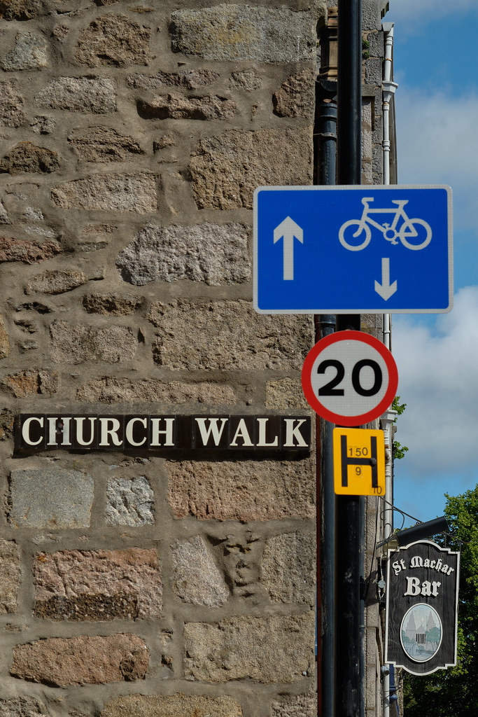 Week 27 Signs T2 2869 1
OP
- Messages
- 9,700
- Name
- Stan
- Edit My Images
- Yes
I like the B&W more and a good mix of signs. It was actually the "walk" and "cycle" bits which I initially thought were meant to be the juxtaposition!
Thanks, Graham. I didn't notice that and thanks for pointing that out.
OP
- Messages
- 9,700
- Name
- Stan
- Edit My Images
- Yes
The walk/cycle works me too. Too much church history in booze (brewing beer, communion, etc) for that to be a historian fruit me.
The black and white version is rather nice.
Thanks, Alex. Excellent comments there and very good points