

- Messages
- 4,831
- Name
- Alan
- Edit My Images
- Yes
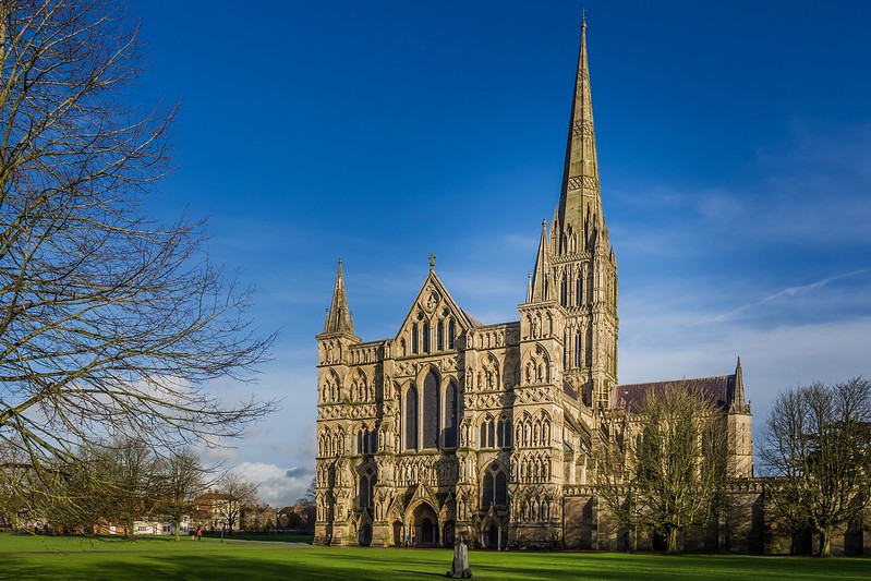
One from last week.
Some alterations in LR5 re perspective, exposure, contrast.
Would welcome any comments on either comp or PP treatment because I am not too confident with my PP.
Tried to remove the lamp standard in the front but made a right botch of it, so left it.")
 Salisbury Cathedral by Superpippo0547, on Flickr
Some alterations in LR5 re perspective, exposure, contrast.
Would welcome any comments on either comp or PP treatment because I am not too confident with my PP.
Tried to remove the lamp standard in the front but made a right botch of it, so left it.
Salisbury Cathedral by Superpippo0547, on Flickr
Last edited:
 Salisbury Cathedralv2


